Mobile-first indexing is Google's way of saying it now views your website through the lens of a smartphone user. Forget the old days of desktop priority. Today, your mobile site is the master copy—the one and only version Google reads to understand, index, and rank your entire web presence, even for people searching on a desktop.
Understanding Mobile First Indexing in Simple Terms
Imagine Google is a librarian organizing all the world's information. For years, that librarian read the big, hardcover version of every book (your desktop site) to decide where to put it on the shelves. Now, the librarian only reads the pocket-sized paperback (your mobile site) to make that same decision.
If that paperback version is missing pages, has tiny print, or is just hard to read, the book gets a lousy spot on the shelf—no matter how great the hardcover is.

This isn't just a minor technical tweak; it's a direct response to a massive shift in how we all use the internet. With over 62% of global web traffic now coming from mobile devices, Google made this the default standard for all websites by 2024.
It's a clear signal: the mobile experience is no longer a "nice-to-have." It's everything.
What This Means for Kansas City Businesses
For any local business in Kansas City, this is a game-changer. The experience a potential customer has on their phone is now what matters most to Google. A clunky, slow, or incomplete mobile site doesn't just annoy a visitor—it actively damages your ability to show up in search results for terms like "plumber in Overland Park" or "best BBQ near me."
Every part of your online presence, from your site's structure and speed to the content you display, is now judged on its mobile performance. And to make sure Google can even find all your important pages in the first place, you'll want to check out our guide on how to create an XML sitemap.
To get a clearer picture, let’s quickly break down the core concepts involved in this mobile-first world.
Mobile First Indexing Key Concepts at a Glance
This table breaks down the essential terms so you can see exactly how this shift impacts your site's performance.
| Concept | What It Means for Your Website |
|---|---|
| Indexing | Google's process of storing and organizing information. Your mobile site is what gets stored. |
| Ranking | How Google determines your position in search results. Your mobile site's quality is the key factor. |
| Crawling | How Google's bots discover your content. The "Googlebot Smartphone" is the primary visitor. |
| Content Parity | Your mobile site must have the same valuable content as your desktop site to avoid ranking loss. |
Each of these elements works together, painting a full picture of why your mobile site's health is now the foundation of your entire SEO strategy.
Why Google Prioritizes the Mobile Experience
Google's big shift to mobile-first indexing wasn't just some random technical tweak they made on a Tuesday. It was a direct reaction to a massive change in how we all live. The internet literally moved from our desks to our pockets, and search engines had no choice but to follow. This is less about algorithms and more about simply reflecting reality.
The simple truth is that most of what we do online now happens on a smartphone. For a local Kansas City business, that means your next customer is far more likely to be searching for you while walking through the Crossroads, waiting for coffee at Messenger, or sitting on their couch—not chained to a desktop computer.

The Data Behind the Decision
The numbers tell a pretty clear story. Mobile usage stats show that a whopping 62% of all website traffic now comes from mobile devices, and people have sky-high expectations for speed and usability when they're on the go. Google saw that since most searches start on a phone, its index had to be built from the mobile versions of websites to accurately reflect what most users actually see. For local searches, this is even more pronounced; think of someone looking for "emergency roof repair" during a storm—they're not running to a desktop.
A slow, clunky, or broken mobile site doesn't just annoy a user anymore. It sends them straight to your competitor and signals to Google that your website offers a poor experience, which can seriously damage your ability to rank for valuable keywords.
From Annoyance to Lost Business
This isn't just about convenience; it hits your bottom line directly. Put yourself in a customer's shoes for a second. If they land on your mobile site and can't easily find your phone number, read your service descriptions, or fill out a contact form, they're gone. No hesitation.
In a mobile-first world, your mobile website is your business's front door. If that door is hard to open, customers will simply walk away without ever seeing what you have to offer inside.
That link between a smooth mobile experience and real-world business outcomes is undeniable. It impacts everything from lead generation to online sales. Prioritizing the mobile experience isn't just "good SEO" anymore—it's a fundamental part of modern customer service. Google simply adjusted its ranking system to reward the businesses that get it.
How to Diagnose Your Mobile Readiness
So, is your website actually ready for Google's mobile-first world? Before you start tweaking things, you need a clear diagnosis. Let's run a quick health checkup on your site's mobile version to see exactly where you stand.
Think of this as a practical, step-by-step toolkit. You don't need to be a developer to perform these checks, and spotting these issues now could be the key to unlocking your rankings.
Check Your Crawler in Google Search Console
The first and most definitive test is to see which "bot" Google is using to crawl your site. Is it the old desktop crawler or the modern smartphone crawler? Google Search Console gives you a direct, no-nonsense answer.
- Log in to your Google Search Console account.
- Navigate to Settings in the menu on the bottom-left.
- Under the "About" section, look for the Crawling > Crawler row.
If it says "Googlebot smartphone," fantastic—your site is being indexed mobile-first. But if it still says "Googlebot desktop," that’s a major red flag. It means Google has found some underlying issues that are preventing it from seeing your site as truly mobile-ready.
Run the Mobile-Friendly Test
Next up, let's get a clear pass-or-fail grade on usability. Google’s own Mobile-Friendly Test gives you a quick, visual report card for any page on your site. Just pop in your URL and let it run.
The tool will show you exactly how your page looks on a smartphone and flag specific problems. It will catch things like text that’s too small to read, buttons that are too close together, or content that spills off the screen. Your goal is that green "Page is usable on mobile" message.
Conduct a Content Parity Audit
The final check is a simple side-by-side comparison. Pull up your website on a desktop computer and then open it on your smartphone. Now, put yourself in your customer's shoes and ask a few questions:
- Can I find the phone number? Is it a click-to-call link on mobile?
- Is all the important text from the desktop site visible? For a KC law firm, are practice area descriptions present? For a restaurant, is the full menu accessible?
- Are key images, videos, and contact forms present on both?
- Can I get to all the same navigation links and use the same features?
Any content, links, or functionality missing from the mobile version is effectively invisible to Google. This "content parity" audit is critical because if your most persuasive information is only on the desktop view, it's doing absolutely nothing to help your rankings.
Diagnosing these issues is the first step toward building a much stronger SEO foundation. For gathering even more performance data, integrating Google's Site Kit plugin can be a huge help. Once you have a clear picture, you can move on to targeted optimizations, including learning how to speed up a WordPress site to fix any performance lags you uncover.
Your Actionable Mobile-First SEO Checklist
Knowing the theory behind mobile-first indexing is one thing, but actually putting it into practice is a whole different ballgame. This is where the rubber meets the road. Use this checklist to turn strategy into action and make sure your website doesn't just meet Google's standards but actually impresses real people on any device.
This simple flow chart breaks down the first few steps you should take in any mobile readiness audit. It’s all about getting the technical foundation right before you dive into the content.
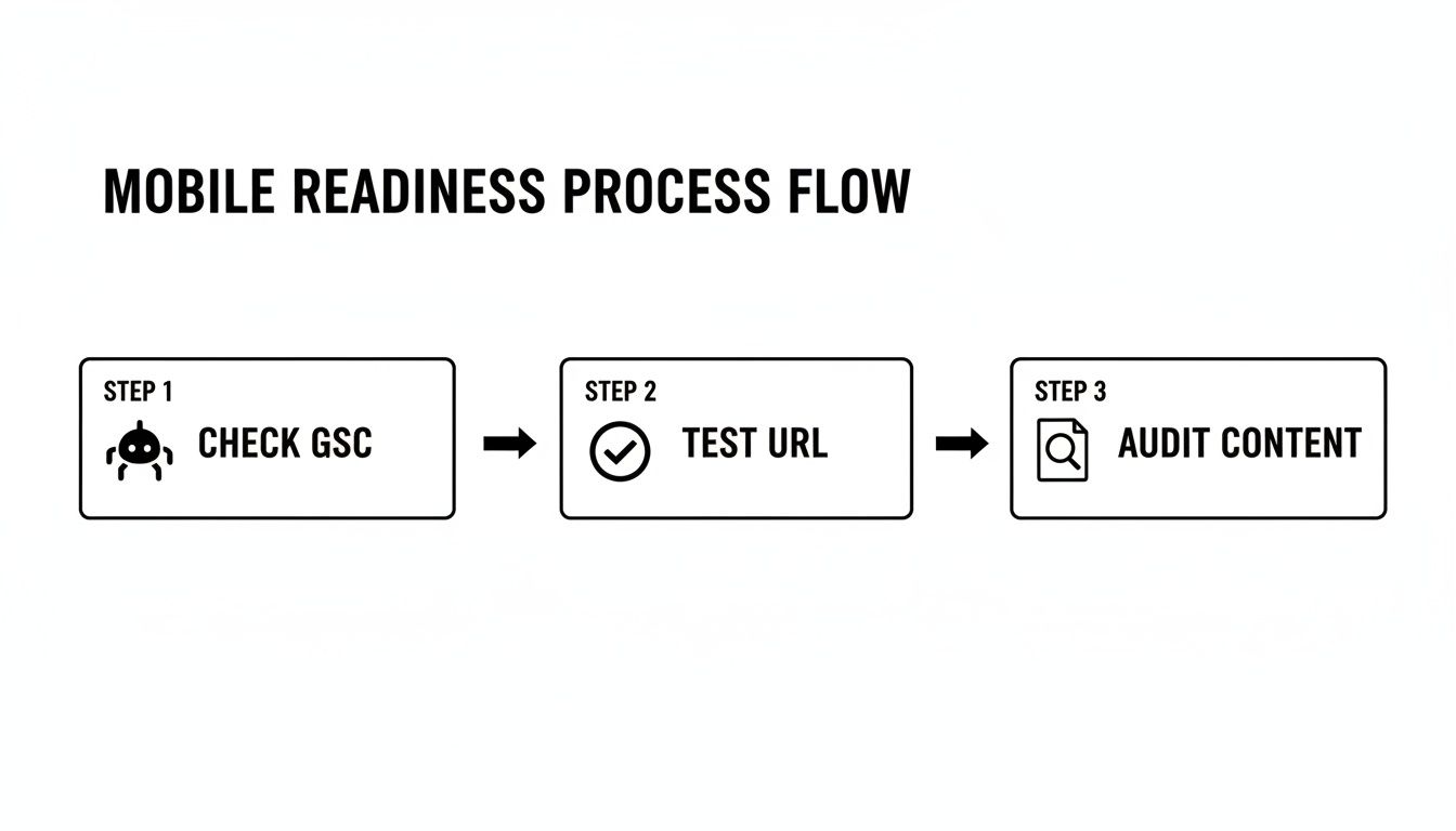
As you can see, a structured approach is key. You start with the hard data in Search Console before you even get to user-facing tests and content reviews.
Implement a Responsive Design
Your number one priority has to be a design that fluidly adapts to every screen size out there. A responsive design isn't a separate "mobile site"; it's a single, smart website that reshapes its layout to look great on desktops, tablets, and phones. Honestly, this is completely non-negotiable in today's world.
- What to do: Choose a theme or framework that’s responsive right out of the box. For WordPress, themes like Astra, Kadence, or GeneratePress are built on this principle. For Shopify, pretty much any modern theme from their official store is already responsive.
- Why it matters: It gives every user a consistent experience and tells Google you have one unified site, which makes their job of crawling and indexing much, much easier.
A responsive site is like water—it takes the shape of whatever container it's in. Whether a user is on a 27-inch monitor or a 6-inch phone, the experience should feel natural and intuitive.
Ensure Absolute Content Parity
Content parity is a simple but critical concept: everything available on your desktop site must also be present on your mobile site. We’re talking about all the text, images, videos, and links. In the mobile-first era, if Google can't see it on the mobile version, it might as well not exist.
- What to do: Pull up your key pages on a desktop and a phone, side-by-side, and compare them. Make sure important body copy, internal links, and calls-to-action haven't been hidden behind "read more" toggles or removed entirely in the name of a "cleaner" mobile look.
- Why it matters: Google's smartphone bot indexes your mobile version to figure out what your site is about. Missing content leads to "thinner" pages in Google's eyes and can directly torpedo your ranking potential.
Optimize Mobile Page Speed
Mobile users are not known for their patience. A slow-loading page is a one-way ticket to a high bounce rate, which sends a major negative signal to Google. Your job is to make your site load lightning-fast, with a special focus on Google's Core Web Vitals.
- What to do: Run your site through Google PageSpeed Insights to see where you stand. The low-hanging fruit is usually compressing images, minimizing code (CSS/JavaScript), and using a solid caching plugin like WP Rocket for WordPress. For a deep dive, check out our guide on how to optimize your website for mobile performance.
- Why it matters: Page speed is a confirmed ranking factor. A faster site creates a better user experience, which directly correlates with better engagement and, you guessed it, higher rankings.
Implement Mobile-Specific Structured Data
Structured data (or schema markup) is the special code that helps search engines understand the context of your content. It’s what powers those eye-catching rich results like star ratings or FAQ snippets right in the search results. This code must be present and identical on both your desktop and mobile versions.
- What to do: For a KC restaurant, use
Restaurantschema to show hours and cuisine. For a contractor, useLocalBusinessschema with your service area. Use a plugin like Rank Math for WordPress or an app like SEO Manager for Shopify to add your schema markup. Always double-check your work with Google’s Rich Results Test. - Why it matters: If your structured data is missing on the mobile site, you lose the chance to get those enhanced, click-worthy search results. That's an easy win you'd be handing straight to your competitors.
Common Mobile Indexing Mistakes to Avoid
Even with the best of intentions, it’s frighteningly easy to fall into a few common traps that can absolutely wreck your mobile SEO. Now that we know what mobile-first indexing is, we have to accept a hard truth: these mistakes aren't just minor annoyances for users anymore. They are direct, red-flag signals to Google that your site offers a poor experience.

Steering clear of these pitfalls is mission-critical for protecting and improving your search rankings. Let's break down the most frequent errors I see and, more importantly, how to fix them.
Hiding or Removing Content on Mobile
This is one of the biggest blunders: creating a "thinner," stripped-down version of your site for mobile users. It usually happens when designers hide important text, links, or product details behind "read more" tabs or just remove them completely to get a "cleaner" look.
Remember, Google's smartphone bot is now the primary crawler. If that bot can't see the content, it might as well not exist. This can lead to Google indexing an incomplete version of your page, which can make your rankings plummet.
Solution: Always maintain content parity. Your mobile site must have the exact same valuable text, images, and links as your desktop version. No exceptions.
Using Large Unoptimized Images
Those stunning, high-resolution images might look great on a 27-inch monitor, but they can be an absolute disaster for mobile page speed. Slow load times are a major ranking killer, as a staggering 47% of users expect a mobile page to load in two seconds or less.
An image that takes several seconds to load will frustrate visitors and send them smashing the back button. That increases your bounce rate and signals a terrible user experience to Google. For a deeper look into this, learn more about how to optimize images for the web in our detailed guide.
Solution: You have to compress and resize all images specifically for mobile screens. Use modern formats like WebP and implement lazy loading so images below the fold don't slow down the initial view. Plugins like ShortPixel or Imagify can automate this process.
Deploying Intrusive Pop-Ups
We've all been there. You click a link and are immediately met with a massive pop-up that covers the entire screen. These interstitials are especially infuriating on a small mobile device, completely disrupting the user's journey.
Google's guidelines are crystal clear: intrusive interstitials that make content less accessible can lead to a ranking penalty. This is especially true for pop-ups shown immediately after a user navigates to a page from search results.
Solution: Ditch the full-screen pop-ups and opt for less disruptive alternatives. Use smaller banners, slide-ins, or inline prompts that don't block the entire screen. This respects the user experience while still letting you get your call-to-action across. For example, a "Get 10% Off" banner at the top of the screen is far better than a screen-blocking pop-up.
How to Monitor Your Mobile SEO Performance
Optimizing your site for mobile-first indexing isn't a "set it and forget it" task. Think of it more like maintaining a high-performance engine. It needs constant monitoring and fine-tuning to keep running smoothly. To see if your efforts are actually paying off, you need to know which dials to watch and where to find them.
Your most important dashboard is Google Search Console. This is your direct line of communication with Google, giving you priceless, real-time feedback on how the search engine sees your site. Consider it your website's personal health report, straight from the source.
Key Reports to Watch
Once you're inside Search Console, there are two reports that are absolutely mission-critical for keeping tabs on your mobile performance. Paying close attention to these will help you snuff out problems before they grow and spot new ways to pull ahead of the competition.
- Mobile Usability Report: This is your pass/fail grade for mobile-friendliness. It flags specific pages with errors like "Text too small to read" or "Clickable elements too close together," giving you a clear, actionable punch list of exactly what needs to be fixed.
- Core Web Vitals Report: This report gets into the nitty-gritty of real-world user experience. It measures how fast your content loads (LCP), how quickly users can interact with it (INP), and whether the layout is stable or jumps around (CLS). A poor score here is a direct signal to Google that your site is frustrating to use on a phone.
Of course, to really get a complete picture, exploring the best SEO monitoring tools can give you even deeper insights into your site's health and rankings in a mobile-first world.
A healthy Mobile Usability report is the foundation. A strong Core Web Vitals score is what sets you apart from competitors. Both are essential for sustained success in mobile search.
Another indispensable tool is Google PageSpeed Insights. It gives you a detailed performance breakdown for any URL and offers specific, practical recommendations to improve your scores. Regularly testing your key pages here is a great way to track your progress over time. If you're just getting started, you might find our guide on how to set up Google Search Console helpful for getting everything configured.
Ultimately, consistent monitoring is what empowers you to make smart, data-driven decisions. It turns SEO from a guessing game into a measurable strategy, ensuring the time and money you invest deliver real, tangible returns.
Frequently Asked Questions About Mobile First Indexing
Even with a solid plan, it's normal to have a few questions about how all this mobile-first stuff works in the real world. Let's clear up some of the most common questions we hear from business owners.
Does Mobile-First Indexing Mean My Desktop Site Does Not Matter?
Not at all. While Google is definitely looking at your mobile site first to figure out your rankings, the experience on your desktop site is still a huge piece of the puzzle. This is especially true for B2B companies or for products that involve a complex buying decision, where a user might do their initial research on their phone but switch to a bigger screen to really dig in and make a final choice.
The goal is to provide a fantastic, consistent experience no matter what device someone is using. Think of it this way: your mobile site is what gets you in the door with Google, but your desktop site still has to deliver for the people who walk through it.
What Is the Difference Between Mobile-Friendly and Mobile-First?
Being mobile-friendly is really just the baseline. It means your site works on a phone—you don't have to pinch and zoom to read the text, and the buttons are tappable. It’s the absolute bare minimum for usability today.
Being optimized for mobile-first is a much deeper strategy. It means your mobile site is the complete, definitive version of your website. It has all the same content, structured data, and functionality as your desktop version, and it's built to be blazing fast.
Mobile-friendly is the ticket to the game; mobile-first optimization is how you win it.
How Long Does It Take to See SEO Results After Mobile Optimization?
The timeline can definitely vary. Once you’ve rolled out major improvements, you can give Google a nudge to re-crawl your site using Search Console. It might recognize the technical fixes within a few days to a couple of weeks.
But seeing a real, tangible impact on your search rankings usually takes a bit longer, typically anywhere from one to three months. A few things play into this: the scale of the changes you made, how competitive your industry is, and just how quickly Google gets around to processing your updated pages. Patience and consistent monitoring are your best friends here.
Navigating the technical details of mobile-first indexing can be challenging, but you don't have to do it alone. Website Services-Kansas City specializes in comprehensive SEO audits and WordPress optimization to ensure your site exceeds Google's standards and connects with more customers. Get in touch with us today to see how we can help your business thrive.
