Let's ditch the textbook definitions. Website user experience design is really just the art of making your website an effortless, intuitive, and even enjoyable place for your visitors to be. It’s what separates a website that feels like a frustrating maze from one that guides people exactly where they need to go without them even noticing.
What Is Good UX Design Really About?

Think of your website like a physical store. A poor user experience is like walking into a cluttered shop with narrow aisles, products with no labels, and a checkout line that snakes around the building. People get frustrated and walk out, probably for good. An actionable example of this online is a homepage that autoplays a loud video with no obvious 'pause' button.
On the flip side, great website UX is like a well-organized, brightly lit boutique. Everything is easy to find, the staff is helpful without being pushy, and checking out is a breeze. That pleasant experience doesn't just get you a sale—it builds loyalty and makes people want to come back.
More Than Just a Pretty Picture
It's a classic mix-up: confusing user experience (UX) with user interface (UI). They're related, sure, but they do very different jobs. UI is the purely visual stuff—the colors, the fonts, the style of the buttons. It’s the "look" of the store.
UX, however, is the entire experience. It’s the logic behind the store's layout, how easy it is to move around, and the feeling a customer gets while they're inside. It answers the crucial questions that decide if a visitor sticks around or bounces:
- Is the site easy to navigate? Can people find what they're looking for in just a couple of clicks?
- Is the information clear and useful? Does your content actually solve their problem or answer their question?
- Is the site accessible to everyone? Can people with disabilities use it without hitting a wall?
- Is the whole interaction enjoyable? Does the site feel professional and trustworthy?
A great website user experience design isn't about piling on more features; it’s about ruthlessly removing friction. The goal is to make the user’s journey so smooth they don't even have to think about it.
The Business Case for Better UX
Investing in UX isn't just about being "nice" to your users; it's a direct investment in your bottom line. A positive experience builds trust, encourages repeat business, and drives conversions. When users can easily do what they came to do—buy a product, fill out a form, find information—your business wins.
The financial impact is pretty staggering. A landmark study by Forrester found an almost unbelievable return: for every $1 spent on improving UX, companies could expect to earn back $100. That’s a massive 9,900% ROI.
If you want to dig into more numbers, check out the web design ROI statistics on agencyhandy.com. It all proves the same thing: building a user-focused website isn't an expense, it's a powerful engine for growth.
The Unbreakable Rules of Effective UX
Great website user experience doesn’t just happen by accident. It's built on a foundation of clear, unbreakable rules. Think of these principles less like restrictive guidelines and more like a reliable framework for creating digital spaces that just feel right. When you nail clarity, consistency, and accessibility, you craft an experience that’s effortless and builds instant trust with your audience.
These rules aren't just abstract theories. They're the practical building blocks that separate a website that frustrates users from one they love to visit again and again. When you get them right, they work silently in the background, guiding your visitors so they never feel lost or confused.
Clarity: The Cornerstone of Communication
The most fundamental rule of UX is clarity. It’s simple: if users can't figure out what your site is about, what they can do, or what happens when they click a button, they're gone. Clarity means making your site's purpose and navigation obvious from the moment someone lands on it.
A perfect example of this in action is Amazon. Despite having a mind-bogglingly huge catalog of products, the navigation is crystal clear. Categories are organized logically, the search bar is impossible to miss, and product information follows a predictable format. This level of clarity gets rid of all the guesswork and frustration, empowering millions of users to find exactly what they need with very little effort.
To achieve this, you have to prioritize simplicity above all else. Ditch the jargon, use straightforward language, and make sure every button and image has a clear job to do. A user should never have to stop and wonder, "What does this do?"
Consistency: The Key to Trust
Consistency in design is what builds that feeling of familiarity and trust. It’s all about making sure similar elements look and behave in a similar way across your entire website. This predictability lowers the cognitive load on your users—they don't have to relearn how your site works every time they click to a new page.
Think about Google's suite of apps (Gmail, Docs, Drive). The design language is consistent across the board. The menus are where you expect them to be, the icons look familiar, and the general layout feels the same, letting you switch between them without a second thought. This consistency makes the whole system feel reliable and easy.
A consistent experience assures users they are in the right place and that the system will behave as they expect. It transforms a collection of web pages into a cohesive, trustworthy brand environment.
To keep things consistent, create a simple style guide for your website. Define your core colors, fonts, button styles, and spacing, and then stick to it. This one step ensures every part of your site feels connected and professional.
This infographic breaks down the core methods for gathering the user insights you need to really nail these design rules.
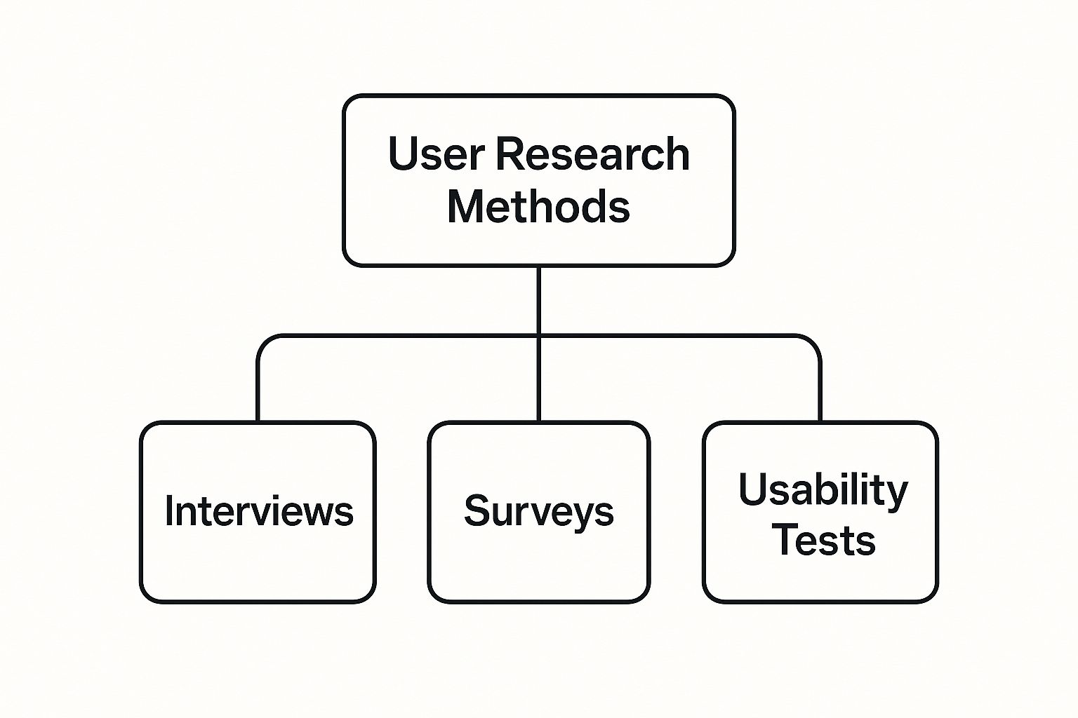
As the diagram shows, every effective design decision starts with understanding your user. This comes from structured research like interviews, surveys, and watching people actually try to use your site.
Accessibility: Designing for Everyone
Finally, let's get one thing straight: accessibility isn't an optional feature—it's a requirement. An accessible website is one that can be used by everyone, and that includes people with disabilities. This means designing for screen readers, making sure there's enough color contrast, and offering ways to navigate with just a keyboard.
Making your site accessible isn't just about following the rules; it's about opening your doors to a wider audience. Simple things, like adding descriptive alt text to your images, not only make your content available to visually impaired users but also give your SEO a nice little boost. Using clear headings and a logical page structure helps all users—and search engines—make sense of your content.
Here are three quick accessibility wins you can tackle today:
- Check Color Contrast: Use a free online tool to make sure your text is easy to read against its background.
- Add Alt Text to Images: Write a quick description of what's in your images so screen readers can explain them to users. For example, instead of "image1.jpg," write "a person smiling while using a laptop."
- Ensure Keyboard Navigation: Try getting around your site using only the "Tab" key. If you can't click on everything, some of your users can't either.
Core UX Principles in Action
These foundational principles are the bedrock of any successful website. To see how they fit together, here’s a quick breakdown of each concept and how it looks in the real world.
| Principle | Core Idea | Real-World Application |
|---|---|---|
| Clarity | Make it obvious. | A checkout button that says "Complete Purchase" instead of "Submit." |
| Consistency | Create familiarity. | Using the same color and style for all clickable links across the site. |
| Feedback | Show the result of an action. | A confirmation message that appears after a user subscribes to a newsletter. |
| Hierarchy | Guide the user's eye. | Making the most important headline the largest text on the page. |
| Accessibility | Design for everyone. | Adding descriptive alt text to images so screen readers can understand them. |
By weaving clarity, consistency, and accessibility into your design process from the start, you build a powerful, user-focused foundation. Think of these rules as a checklist you can use to audit your own site and make meaningful improvements that make things better for every single person who visits.
How to Actually Understand Your Users
Designing a website without knowing your audience is like trying to give a gift to a stranger—you’re just guessing. To create an effective website user experience design, you have to get out of your own head and start gathering real insights about the people you're trying to serve. User research is your roadmap to understanding their needs, wants, and frustrations.
The good news? You don't need a massive budget or a dedicated research team to get started. There are plenty of accessible methods that can give you the crucial data needed to make smart, user-centric decisions. When you truly understand your visitors, you stop gambling with design choices and start building experiences that actually connect.
Start with Simple User Surveys
One of the quickest ways to get direct feedback is through user surveys. With free tools like Google Forms, you can create and send out a short questionnaire in under an hour. The trick is to ask the right questions—ones that uncover motivations and pain points.
Forget generic questions like, "Do you like our website?" Instead, get specific to reveal what users are trying to do and what's getting in their way. Your goal is to get actionable answers.
Here are a few powerful questions to get you started:
- What was the main reason you visited our website today? This tells you their primary goal and what content they value most.
- Were you able to find what you were looking for? A simple yes or no is a good start, but follow it up with an open-ended question like, "If not, what were you hoping to find?"
- What one thing would you change about our site to make it better? This often uncovers surprising friction points you might have completely overlooked.
Build Actionable User Personas
Once you have some data rolling in, the next step is to distill it into user personas. Think of a persona as a fictional character who represents your ideal customer, built from the real data you've gathered. This isn't just a list of demographics; it's a tool for building empathy.
Giving your persona a name, a photo, and a backstory makes them feel real. It helps your whole team step into their shoes when making design decisions. It fundamentally shifts your thinking from, "What do I want?" to "What does 'Marketing Mary' need?"
For example, a persona for a small business owner might look something like this:
Marketing Mary, 34
Mary runs a small e-commerce shop and wears way too many hats. She's tech-savvy but incredibly short on time. Her main goal is to find tools that are easy to implement and show a clear return on investment. She gets frustrated with complicated setup processes and unclear pricing.
This simple profile immediately gives you a filter for every design choice. When you look at your homepage, you can now ask: "Is this clear and quick enough for Mary?" Personas turn abstract data into a human-centered compass. For more advanced tracking of user behavior and data, you can explore powerful tools in our customer dashboard.
Uncover What Users Really Want
Understanding broad user preferences can also sharpen your design strategy. Recent research from CMSMinds.com shows a clear trend toward minimalism and personalization.
For instance, 34.6% of website visitors strongly prefer simple information structures, while 54% want content tailored to their specific interests. This data really drives home the need for clean layouts and relevant content. A great website user experience design is often more about removing clutter than adding new features.
Building Navigation That Just Works

Navigation isn’t just a menu bar—it’s your site’s roadmap. If visitors can’t find what they need, they’ll click away before you even have a chance to impress them.
Think of navigation as a seasoned tour guide. It reads your users’ minds and leads them straight to what they want, without any dead ends or frustration.
The Foundation Of Information Hierarchy
Before wireframes or color palettes, map out a clear information hierarchy. Imagine a grocery store: dairy in one aisle, produce in another. Your content deserves that same logical layout.
For a clothing shop, for example, you’d break down categories like this:
- Men’s
- Tops
- Bottoms
- Women’s
- Tops
- Bottoms
- Kids’
- Tops
- Bottoms
This straightforward structure cuts out unnecessary clicks and stops visitors from hunting through a generic “Apparel” section. To visualize it, sketch a simple site map showing how each page connects.
Designing A User-First Primary Navigation
Your primary menu is the single most important interactive element on the page. It needs to be bold, clear, and written in terms your audience actually uses.
Keep these principles in mind:
- Limit Your Menu Items: Stick to seven items or fewer to avoid choice overload.
- Use Descriptive Labels: A link labeled WordPress Development and SEO Services outperforms a vague “Solutions.”
- Place It Predictably: Top or left-side placement meets user expectations—don’t hide the map.
A great navigation feels like a friendly guide: it asks, “Where do you want to go?” and then points you straight there.
Guiding Users With Breadcrumbs
Breadcrumbs are those little links at the top of a page that read like a trail:
Home > Women’s > Shoes > Running Shoes
They do two things: remind you where you are and let you jump back a level with one click. That constant orientation builds confidence and keeps people exploring instead of abandoning your site.
Mobile Navigation Done Right
On a phone, every pixel counts. The classic hamburger icon is familiar, but it tucks away your main links. Try a hybrid solution:
- Show critical actions—like Shop or Contact—directly in a bottom or top bar.
- Nest secondary links inside the hamburger menu.
- Make every tap target large enough so thumbs don’t fumble.
Nothing kills momentum faster than accidentally tapping the wrong link. Nail your mobile menu, and you’ll keep visitors moving through your site—no matter the screen size.
Winning with a Mobile-First Mindset
Let's be blunt: if your website stinks on a smartphone, it has failed. Period. The modern customer journey almost always starts on, or at least involves, a mobile device. That’s why a mobile-first mindset isn't just a trendy phrase—it's a non-negotiable part of building a website that actually works.
This approach flips the old design process on its head. Instead of designing a sprawling, feature-packed desktop site and then trying to cram it onto a tiny screen, you start with the most restrictive environment: the smartphone.
This forces you to be ruthless with your priorities. You have to nail down the absolute most critical content, features, and actions your users need. Once you’ve perfected that core mobile experience, you can then thoughtfully add features and expand the layout for tablets and desktops. This way, the essential stuff is solid everywhere, instead of ending up with a clunky, stripped-down mobile site that feels like an afterthought.
Why Mobile-First Matters More Than Ever
The data is just staggering. Over 74% of visitors are more likely to come back to a site if it works well on their phone. But a bad mobile experience? That has immediate and brutal consequences. An astonishing 88% of mobile users are five times more likely to ditch what they're doing if a site isn't optimized for their device.
And with 83% of consumers saying a seamless experience across all their devices is crucial, the message couldn't be clearer. Mobile isn't just another channel; for many, it's the main one. You can dig into more of these stats over at CMSMinds.com.
A mobile-first strategy isn't just about shrinking your website. It’s a philosophy that forces clarity and focus, leading to a better, more streamlined experience for all users, regardless of their device.
This intense focus on mobile doesn't just make visitors happy; it's also a huge deal for your search rankings. Google now primarily uses the mobile version of your site to index and rank it—a practice known as mobile-first indexing. A top-notch mobile UX has become a fundamental piece of any modern search engine optimization strategy.
Actionable Tips for a Superior Mobile Experience
Putting a mobile-first approach into action means making practical design choices that cater to someone on the go. It’s all about making things simple, intuitive, and fast.
Here are three concrete tips you can put to work right now:
- Design for Thumbs: People use their thumbs to navigate on phones. You need to make sure every button, link, and interactive element is big enough to be tapped easily without frustrating, accidental clicks. A minimum tap target size of 44×44 pixels is the gold standard here.
- Prioritize Readability: Small screens are no place for tiny, fancy fonts. Use clean, legible typefaces and make sure your text has plenty of contrast. A font size of at least 16px is a good starting point so users aren't constantly pinching and zooming just to read what you have to say.
- Optimize for Speed: Mobile users have zero patience. Every single second counts. Compress your images, clean up your code, and do whatever it takes to make your site load in a snap. A slow website is the fastest way to lose a customer before they've even seen what you offer.
By building your website from the smallest screen up, you lay a foundation that’s focused, fast, and completely centered on the user. This doesn't just keep your mobile visitors happy; it creates a better, more efficient website for everyone.
Learning from the Best and the Worst
Theory and principles are a great start, but nothing makes them click like seeing them in action. By dissecting real-world examples, we can see how the best brands master website user experience design and where others completely miss the mark. It's the best way to get a clear blueprint for success and a cautionary tale of what to avoid.
Let's start by looking at a company that has turned UX into a genuine competitive advantage. Airbnb’s platform is a masterclass in making a complex process feel simple, intuitive, and safe.
Their success isn't some happy accident. It's the direct result of a relentless focus on the user's journey, from the very first search to the final review.
Case Study in Excellence: Airbnb
Airbnb’s design is so effective because it systematically removes friction at every single step. The moment you land on the homepage, you’re greeted with a clean, simple search bar that gets right to the point: "Where?" and "When?". There are no distracting pop-ups or confusing options to slow you down.
And it doesn't stop there. Once you search, the results page is just as intuitive. All the key information is prioritized, including:
- High-Quality Photography: Large, beautiful images create an immediate emotional connection and let you actually picture yourself there.
- Clear Pricing: The total cost, fees and all, is shown upfront. No nasty surprises at checkout.
- Social Proof: User ratings and reviews are front and center, building instant credibility and trust.
The entire booking flow is a straightforward, step-by-step path that guides users without ever making them overthink. It's proof that a great website user experience is often about what you don't include.
By focusing on the user’s core needs—simplicity, transparency, and trust—Airbnb transforms a potentially stressful transaction into an exciting and seamless experience.
Anatomy of a Bad User Experience
Now, let's flip the script. Imagine a hypothetical e-commerce site that’s a graveyard of common UX mistakes. You land on the page, and a giant, unskippable video ad immediately starts blaring. Annoying. You finally close it, only to be confronted with a chaotic navigation menu full of vague labels like "Products," "Offerings," and "Misc."
Trying to find a specific item feels like a scavenger hunt. The product pages are even worse, featuring tiny, low-resolution images and long, unformatted blocks of text. When you finally decide to buy something, the checkout process forces you to create an account, then slaps you with unexpected shipping fees on the very last step.
Sound familiar? This kind of experience is frustrating because it violates every core principle we've talked about. It lacks clarity, consistency, and any respect for the user's time.
Each of these "small" annoyances adds up, creating a mountain of friction that drives potential customers away. The lesson is clear: a successful website doesn't just attract visitors; it makes it incredibly easy for them to stay and get what they came for.
Answering Your Top UX Design Questions
Even after you get the hang of the basics, some practical questions always seem to pop up when it's time to actually apply these website user experience design principles. Let's tackle some of the most common ones that business owners and designers run into.
What Is The Difference Between UX And UI Design?
I love using a house analogy for this.
Think of UX (User Experience) design as the architectural blueprint. It’s the fundamental structure—the flow from the kitchen to the living room, how many steps it takes to get to a bathroom, and whether the whole layout just makes sense for the people living inside. It's the core function and feel.
UI (User Interface) design, on the other hand, is the interior decorating. It’s the paint color, the style of the furniture, the light fixtures, and all the visual details that bring the space to life.
UI is a hugely important piece of the UX puzzle, but the UX is the entire journey from the front door to the back porch. A stunningly beautiful website (great UI) that’s a nightmare to navigate (terrible UX) has completely missed the point. The magic happens when the two work together, blending gorgeous visuals with an intuitive, effortless flow.
How Can I Measure The Success Of My Website's UX?
You'll want to look at this from two angles: the hard data (quantitative) and the human feedback (qualitative). When you combine them, you get the full story of how your website is really performing.
For the numbers, you can jump into a tool like Google Analytics and keep an eye on a few key metrics:
- Conversion Rate: The percentage of visitors who actually do what you want them to do, like buying a product or signing up.
- Bounce Rate: The percentage of people who land on a page and leave without clicking anywhere else. A high bounce rate can be a red flag.
- Task Completion Time: How long does it take someone to complete a key action, like finding your contact info and filling out the form?
But numbers only tell you what is happening, not why. To get that crucial insight, you need direct feedback. This can be as simple as on-site polls, user surveys, or watching a few people try to use your site in a usability test. This is where you uncover the real friction points.
Measuring UX isn't something you do once and forget. It's a constant cycle of looking at the data, listening to your users, and making smart, continuous improvements.
How Much Does Professional UX Design Cost?
The price tag for professional UX design really depends on the size and complexity of the project. For a small website, a basic UX audit might run you anywhere from a few hundred to a couple of thousand dollars.
If you're looking at a full-blown redesign for a small business, you can expect that to fall in the range of $5,000 to $25,000+.
It can feel like a big investment, but it's one that pays for itself. Great UX directly leads to more sales, builds stronger customer loyalty, and can even slash your customer support costs because things just work better.
Ready to invest in a website experience that actually drives results? Website Services-Kansas City specializes in building and fine-tuning WordPress sites that are designed to convert. Our team blends smart SEO with a user-first design approach to help your business thrive.
Check out our professional website development solutions at https://websiteservices.io.