In the competitive Kansas City market, a visually appealing website is no longer enough. To capture attention, drive conversions, and rank on Google, your site needs to be fast, intuitive, and strategically designed. The standards of yesterday are today’s baseline expectations, and falling behind means losing customers to local competitors. For businesses looking to remain competitive and relevant, it's essential to stay updated on the latest web development trends that influence how users and search engines perceive your brand.
This guide cuts through the noise to focus on 10 critical website design trends that directly impact your bottom line. We'll provide practical examples and actionable insights tailored for local businesses, e-commerce stores, and new websites looking to compete with top players like those found on sites like seo-kansas-city.com and helium-seo.com. You will learn not just what these trends are, but why they matter and how to implement them effectively. Each trend is a piece of a larger puzzle that combines user experience (UX), search engine optimization (SEO), and conversion rate optimization (CRO). Let’s explore how leveraging these trends can transform your online presence from a simple brochure into a powerful growth engine.
1. Core Web Vitals Optimization & Performance-First Design
In the competitive digital landscape, speed isn't just a feature; it's the foundation of a successful website. This is where a performance-first design philosophy becomes one of the most critical website design trends. Instead of treating speed as an afterthought, this approach prioritizes fast loading times and smooth interactions from the very beginning of the design process. It directly aligns with Google's Core Web Vitals, the essential metrics that measure real-world user experience.
These metrics evaluate three key areas of your site's performance:
- Largest Contentful Paint (LCP): How quickly the main content of your page loads. Aim for under 2.5 seconds.
- First Input Delay (FID): How fast your site responds to a user's first interaction, like a click. Aim for under 100 milliseconds.
- Cumulative Layout Shift (CLS): How visually stable your page is as it loads. Aim for a score of 0.1 or less.
Excelling in these areas is no longer optional. A high-performing site not only ranks better in search results but also drastically improves user experience, reduces bounce rates, and boosts conversion rates. Local Kansas City businesses that achieve a Lighthouse score of 90+ often see a direct, positive impact on their bottom line. For example, a local plumber whose site loads in under 2 seconds is more likely to get the emergency call than a competitor whose site is still loading after 5 seconds.
How to Implement Performance-First Design
For new businesses, building a fast website from the ground up is far easier than retrofitting an old, bloated one. Focus on lean code, optimized media, and efficient server responses.
- Compress All Images: Use tools like TinyPNG or Imagify to reduce image file sizes without sacrificing quality. A typical hero image should be under 200KB.
- Minimize Code: Minify your CSS and JavaScript files to remove unnecessary characters and shrink file sizes. Tools like WP Rocket can automate this for WordPress sites.
- Implement Lazy Loading: Ensure images and videos below the fold only load when a user scrolls to them. This is a native feature in modern WordPress.
- Leverage a CDN: Use a Content Delivery Network (CDN) like Cloudflare to distribute your site's assets across global servers, delivering them faster to users everywhere.
Actionable Insight: Regularly audit your website using Google PageSpeed Insights. This free tool provides a detailed report on your Core Web Vitals and offers specific recommendations for improvement. For WordPress users, you can learn how to speed up your WordPress site with targeted optimization strategies.
2. Minimalist & Clean Design with Strategic White Space
In a world filled with digital noise, minimalism isn't just an aesthetic; it's a strategic choice to enhance user focus and clarity. This website design trend involves stripping away non-essential elements to create a clean, intentional user interface. By prioritizing strategic white space (also known as negative space), limited color palettes, and crisp typography, minimalist design guides visitors directly to the most important content and calls-to-action, a technique perfected by brands like Apple and Basecamp.

This approach is incredibly effective for new businesses and e-commerce stores. A minimalist design reduces cognitive load on visitors, making it easier for them to navigate and find what they need. A Kansas City law firm, for example, can use a minimalist design to project professionalism and make it easy for a distressed client to find their contact information immediately, rather than overwhelming them with visual clutter. This focused experience often translates to higher user engagement and a stronger bottom line.
How to Implement Minimalist & Clean Design
For a new website, adopting minimalism from the start ensures your core message is always front and center. It's about making every element on the page earn its place.
- Establish a Clear Hierarchy: Use size, color, and placement to organize content logically, guiding the user's eye to the most critical information first.
- Limit Your Color Palette: Stick to two or three primary colors and neutrals to create a cohesive, calming visual experience.
- Embrace White Space: Use ample padding and margins around elements to give them room to breathe and improve readability. Don't be afraid of empty space; it directs focus.
- Use Purposeful Imagery: Choose high-quality images and graphics that support your content, rather than just decorating the page. One strong image is better than five mediocre ones.
Actionable Insight: Start your design process by focusing on the content, not the container. Before designing a page, write down its single most important goal (e.g., "Get user to click 'Request a Quote'"). Then, remove every element that does not directly support that goal. For WordPress users, you can learn how to choose a WordPress theme that supports a clean, minimalist aesthetic.
3. Dark Mode & Adaptive Theme Switching
Dark mode has rapidly shifted from a novelty to a user expectation, making it one of the most prominent website design trends. Instead of offering a single, static appearance, modern websites implement adaptive theme switching. This smart design respects a user's system-level preference for a light or dark interface, creating a seamless and comfortable browsing experience. It caters to users in low-light environments, reduces eye strain, and can even conserve battery life on devices with OLED screens.
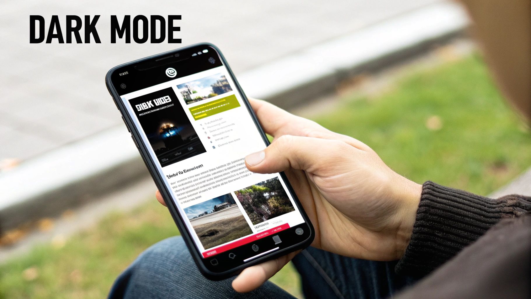
This trend signals a user-centric approach that prioritizes comfort and personalization. For new businesses and e-commerce stores, providing a dark mode option conveys a modern, sophisticated brand image. It shows that you are attuned to current user preferences, which can build trust and improve engagement. Major platforms like GitHub and countless SaaS applications now offer theme switching, setting a new standard for web interfaces. A local KC tech startup, for instance, can immediately appear more credible to a developer audience by offering this feature.
How to Implement Dark Mode
Implementing an adaptive theme is straightforward for new websites and can be a high-impact upgrade for existing ones. The key is to plan your color palette carefully to ensure readability and accessibility in both modes.
- Use CSS Custom Properties: Define your color palette using CSS variables (
--primary-color,--text-color, etc.) for easy switching between light and dark themes. - Leverage
prefers-color-scheme: Use this CSS media query to automatically apply the correct theme based on the user's operating system settings. - Provide a Manual Toggle: Always include a user-controlled toggle switch (like a sun/moon icon) in your site's header or settings menu to override the system preference.
- Test Contrast Ratios: Use a WCAG contrast checker to ensure your text is legible against the background in both modes, maintaining accessibility standards. Pure white text on a pure black background can cause eye strain; opt for an off-white on a dark gray instead.
Actionable Insight: When building your theme, use
localStorageto save a user's manual theme selection. This ensures their choice persists across sessions, so if they prefer your light theme on a dark-mode device, your site will remember their preference the next time they visit.
4. Interactive & Microinteractions Design
In a world where user engagement is paramount, small details make a big difference. This is where Interactive & Microinteractions Design emerges as a key website design trend. Microinteractions are the small, purposeful animations and visual feedback that respond to a user's actions. Instead of a static page, users experience a dynamic interface that communicates with them, confirming actions and guiding them intuitively.
These subtle animations turn a mundane task into a delightful moment. Think of a button that changes color on hover, a gentle bounce on a form submission, or a smooth transition when opening a menu. These elements serve critical functions:
- Provide Instant Feedback: Acknowledge a user's action, like an "Added to Cart" confirmation.
- Communicate Status: Show progress with loading bars or spinners.
- Guide User Attention: Draw focus to important elements or next steps.
- Enhance Brand Personality: Infuse character into the user experience, making it memorable.
When executed well, microinteractions make a website feel more human and responsive. For a local Kansas City bakery, an interactive "Build Your Own Cake" feature could use microinteractions to make the process fun and engaging, leading to more online orders.
How to Implement Microinteractions
The goal is to enhance, not distract. Effective microinteractions are subtle, fast, and purposeful. They should feel like a natural part of the user interface.
- Focus on Key Actions: Apply animations to high-value interactions like "Add to Cart" buttons, form fields, and navigation menus.
- Keep It Fast: Ensure animations are swift (ideally under 300ms) to avoid frustrating users with delays.
- Use CSS First: Prioritize CSS transitions and animations over JavaScript for better performance.
- Ensure Accessibility: Animations should not interfere with screen readers or cause issues for users with motion sensitivity. Use the
prefers-reduced-motionmedia query.
Actionable Insight: Start by mapping out your primary user journey. Identify key touchpoints where feedback could prevent confusion or add delight, such as form validation (e.g., a green checkmark for correct input) or button states (hover, active, success). To dive deeper, you can explore the principles of a great website user experience design to ensure your interactions are effective.
5. Voice Search Optimization & Conversational UI
As smart speakers like Alexa and Google Assistant become household staples, the way users search for information is fundamentally changing. This shift makes voice search optimization one of the most forward-thinking website design trends. Instead of typing short phrases, people are asking full, conversational questions. A successful website must be structured to answer them directly.
This trend involves creating a conversational user interface (UI) and structuring your content to align with natural speech patterns.
- Conversational Keywords: Focus on long-tail, question-based phrases like "What are the best BBQ restaurants in downtown Kansas City?" instead of just "KC BBQ."
- Structured Data: Use schema markup (specifically FAQ and Local Business schema) to help search engines understand your content and present it as a direct voice answer.
- Direct Answers: Aim for your content to be featured in Google's "Position Zero" or Featured Snippets, as this is often the source for voice search results.
For local businesses, this is a massive opportunity. A site optimized for voice can capture high-intent "near me" searches, driving foot traffic and sales. Imagine a user asking their phone, "Hey Google, find a roofer in Overland Park that offers free estimates." The business whose website directly answers this question is the one that gets the lead.
How to Implement Voice Search Optimization
Optimizing for voice is about clarity and structure. Your goal is to make it incredibly easy for both users and search engines to find the answers they need on your site.
- Create FAQ Pages: Build dedicated pages that answer common customer questions in a clear, concise question-and-answer format.
- Use Natural Language: Write your website copy in a conversational tone that mirrors how people actually speak. Read your copy aloud; if it sounds unnatural, rewrite it.
- Implement FAQ Schema: Use plugins like Rank Math or Yoast SEO to easily add FAQ schema markup to your pages, spoon-feeding answers to Google.
- Optimize Local SEO: Ensure your Google Business Profile is complete and accurate with hours, address, and services to capture location-based voice queries.
Actionable Insight: Identify the top 5-10 questions your customers ask. Create a dedicated FAQ section on your homepage or service pages that answers these questions directly. Use an online tool to generate FAQ schema and add it to the page to significantly increase your chances of being featured in voice search results.
6. Mobile-First Responsive Design with Progressive Web Apps (PWAs)
With the majority of web traffic now coming from mobile devices, designing for the smallest screen first is no longer a choice; it's a necessity. This mobile-first design approach ensures a seamless experience for mobile users and directly supports Google's mobile-first indexing, which prioritizes the mobile version of a site for ranking. This trend has evolved with the rise of Progressive Web Apps (PWAs), which merge the best of websites and native apps.
PWAs elevate the user experience by offering app-like features directly in the browser, such as:
- Offline Access: Content remains accessible even without an internet connection.
- Push Notifications: Engage users with timely updates and promotions.
- Home Screen Installation: Users can add your site to their home screen for easy access.
For e-commerce stores and small businesses, PWAs provide an app-like experience without the high cost and maintenance of developing separate native apps for iOS and Android. A local KC coffee shop could use a PWA to allow customers to browse the menu offline and receive a push notification when their mobile order is ready.
How to Implement a PWA Strategy
Integrating PWA features can significantly improve mobile engagement and retention. Start by ensuring your site is fully responsive, then layer in PWA functionalities.
- Implement Service Workers: A service worker is a script that enables features like offline access and push notifications.
- Create a Web App Manifest: This JSON file controls how your PWA appears and behaves when installed on a user's device (e.g., app icon, splash screen).
- Test on Real Devices: Go beyond browser emulators and test your site's functionality on various physical smartphones and tablets.
- Use Push Notifications Sparingly: Avoid spamming users. Use notifications for valuable updates like order status or exclusive offers.
Actionable Insight: Begin by focusing on a flawless mobile-first foundation before adding PWA features. A fast, intuitive mobile site is the prerequisite for a successful PWA. You can learn how to optimize your website for mobile to ensure you meet modern user expectations and SEO standards.
7. Accessible Design & WCAG Compliance
Web accessibility (often abbreviated as a11y) has evolved from a niche consideration into a foundational requirement for modern web design. This trend focuses on making websites usable for everyone, including people with disabilities. Adhering to the Web Content Accessibility Guidelines (WCAG), particularly the 2.1 AA level, is now the standard for creating inclusive digital experiences. This goes far beyond just legal compliance.
An accessible website benefits all users and directly impacts your bottom line. It enhances usability, strengthens SEO, and expands your market reach to a wider audience. Prioritizing accessibility means ensuring:
- Proper Heading Structure: Logical and hierarchical use of H1-H6 tags for screen readers.
- Keyboard Navigability: All interactive elements are reachable and usable with the Tab key.
- Sufficient Color Contrast: Text is clearly legible against its background.
- Alternative Text for Images: Descriptive alt text allows screen readers to convey visual information.
For businesses, especially in e-commerce and local services, an accessible site isn't just ethical; it's a competitive advantage. A restaurant in Kansas City with an accessible website ensures that a user with a visual impairment can easily read the menu and make a reservation, capturing business that competitors might lose.
How to Implement Accessible Design
Building accessibility into your design and development process from the start is the most efficient approach. It involves a mix of technical best practices and thoughtful user experience design.
- Use Semantic HTML: Structure your content with appropriate tags like
<nav>,<main>, and<button>to provide context for assistive technologies. - Ensure Proper Color Contrast: Aim for a contrast ratio of at least 4.5:1 for normal text. Use a tool like WebAIM's Contrast Checker to verify your color palette.
- Write Descriptive Alt Text: For every functional image, provide alt text that clearly describes its content and purpose. For example,
alt="Kansas City skyline at sunset"is better thanalt="city". - Test with a Screen Reader: Use free tools like NVDA (Windows) or VoiceOver (Mac) to navigate your site and understand the experience of visually impaired users.
Actionable Insight: Use the WAVE Web Accessibility Evaluation Tool, a free browser extension, to run a quick audit of your pages. It visually flags potential WCAG errors and provides specific feedback, giving you a clear starting point for improving your site's accessibility and overall user experience.
8. Dynamic Content & Personalization
The era of a one-size-fits-all website is over. Today, one of the most impactful website design trends is the shift toward dynamic content and personalization. Instead of showing the same static page to every visitor, this approach uses data like user behavior, location, and past interactions to tailor the experience. This creates a more relevant and engaging journey for each individual.
This trend is about making users feel understood. It transforms a website from a simple brochure into a smart, responsive sales tool. Key examples include:
- E-commerce: Showing "Recommended for You" sections based on browsing history, similar to Amazon.
- SaaS: Displaying case studies relevant to a visitor's industry.
- Local Services: Highlighting location-specific offers or contact information.
A Kansas City realtor could use personalization to show listings from a visitor's previously viewed neighborhoods on the homepage, or a local service business could display testimonials from clients in the visitor's specific city (e.g., "See what your neighbors in Lenexa are saying"). This level of personalization is a conversion powerhouse.
How to Implement Personalization
Getting started with dynamic content is more accessible than ever for new businesses. The key is to begin with the data you already have and expand from there.
- Segment Your Audience: Use tools like Google Analytics to group visitors by behavior, demographics, or traffic source.
- Leverage First-Party Data: Use information from user logins, purchase history, and on-site activity to create tailored offers.
- Start with Simple Geotargeting: Change headlines or offers based on the visitor's IP address location (e.g., "Landscaping Services for Johnson County").
- Use Personalization Plugins: For Shopify or WordPress sites, apps like Personizely can help you implement dynamic content without custom code.
Actionable Insight: Begin by personalizing your homepage call-to-action based on the visitor's location. A Kansas City-based business, for example, could show a special offer to local visitors while displaying a standard message to everyone else. This simple change can immediately make your site feel more relevant and increase local conversions.
9. Sustainable & Green Web Design
In an era where consumers increasingly support brands that share their values, sustainability is a powerful differentiator. Green web design is a trend that focuses on reducing the environmental impact of websites by minimizing their digital carbon footprint. This approach involves creating energy-efficient, lean digital experiences that not only perform well but also align with corporate social responsibility goals and resonate with environmentally conscious audiences.
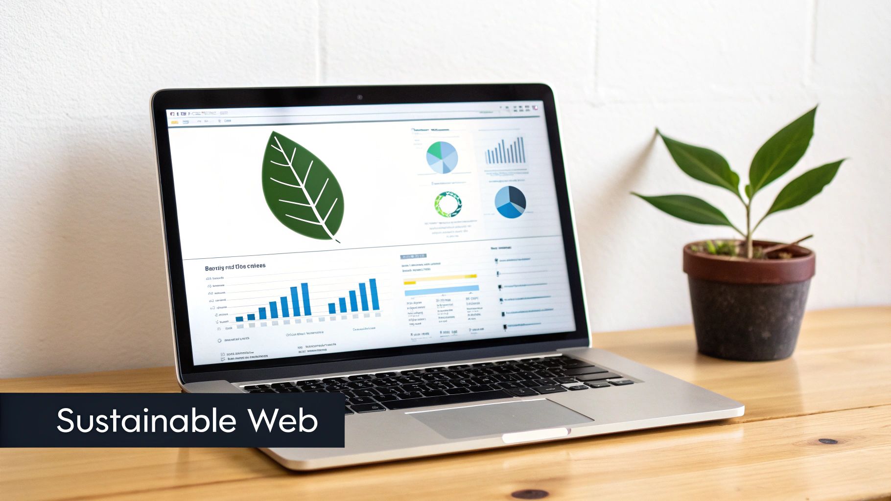
The internet consumes a massive amount of electricity, and every byte transferred requires energy. A green website is designed to be lightweight and efficient, reducing the server processing power and energy needed to deliver content to the user. This often leads to a faster, more streamlined user experience, which directly benefits SEO and Core Web Vitals. For small businesses in the organic or ethical markets, such as a farm-to-table restaurant in the Crossroads Arts District, an eco-conscious site isn't just a trend; it's a core part of their brand identity.
How to Implement Green Web Design
Building a sustainable website is about making conscious, efficient choices at every stage of development. Start by auditing your current assets and hosting environment.
- Choose Green Hosting: Switch to a hosting provider powered by renewable energy. Companies like Kinsta and GreenGeeks are leaders in this space.
- Optimize All Media: Aggressively compress images and use modern, efficient formats like WebP. Avoid auto-playing videos and large background media.
- Implement a Dark Mode: Offer a dark mode option. OLED screens use significantly less power when displaying dark pixels, saving energy on user devices.
- Write Clean, Efficient Code: Remove any unused CSS and JavaScript to reduce file sizes. Prioritize system fonts over custom fonts to eliminate extra HTTP requests.
Actionable Insight: Use the free Website Carbon Calculator to estimate your site's carbon emissions. This tool provides a tangible benchmark and highlights areas for improvement, turning an abstract concept into a measurable goal for your business. You can even add a badge to your site's footer to showcase your commitment.
10. SEO-Optimized Design & Technical Architecture
A visually stunning website is ineffective if no one can find it. That's why one of the most enduring website design trends is the adoption of an SEO-first design philosophy. This approach integrates search engine optimization directly into the website's foundation, ensuring that design, content, and technical structure work together to maximize visibility on search engines like Google. It moves SEO from a post-launch checklist item to a core component of the initial strategy.
This technical architecture is built on several key pillars:
- Semantic HTML: Using correct HTML5 tags (like
<article>,<section>,<nav>) to help search engines understand your content's meaning and structure. - Logical Heading Hierarchy: Structuring content with a single
<h1>tag followed by a clear<h2>,<h3>, and so on, to create a logical outline for both users and crawlers. - Internal Linking: Strategically linking pages within your site to distribute authority and guide users to relevant content.
For a KC-based service business, this means structuring their site so that Google clearly understands which page is for "Plumbing Repair in Leawood" versus "HVAC Installation in Olathe." This siloed structure is crucial for ranking in specific local service areas. A key aspect of a website's technical architecture is ensuring optimal site structure and content discoverability by performing a thorough internal link audit.
How to Implement SEO-Optimized Design
For any new business, building with SEO in mind is non-negotiable. It's about making your site easily understandable to search engine crawlers from day one.
- Use Descriptive URLs: Create clean, keyword-rich URL slugs (e.g.,
yourdomain.com/kansas-city-roofing-company) before publishing a page. - Implement Schema Markup: Add structured data to your site to help Google understand specific information, like product details, business hours, or FAQs, which can result in rich snippets.
- Optimize All Images: Use descriptive filenames (e.g.,
kitchen-remodel-kansas-city.jpg) and write relevant alt text for every image. - Prioritize a Clear Site Structure: Plan your website's hierarchy and navigation logically before you start building. A flat, organized structure is better than a deep, complex one.
Actionable Insight: For WordPress users, install a plugin like Rank Math or Yoast SEO. These tools provide real-time feedback and a guided checklist to ensure your pages and posts are optimized correctly. You can also learn more about on-page optimization to master the foundational elements of a technically sound website.
Website Design Trends: 10-Point Comparison
| Trend | Implementation Complexity (🔄) | Resource Requirements (⚡) | Expected Outcomes (📊) | Ideal Use Cases (💡) | Key Advantages (⭐) |
|---|---|---|---|---|---|
| Core Web Vitals Optimization & Performance-First Design | Medium–High — frontend/dev work and ongoing monitoring | Medium — CDN, image tools, developer time | Faster load times; improved SEO and conversion | E‑commerce, new sites competing for visibility | Significant SEO uplift; lower bounce; better UX |
| Minimalist & Clean Design with Strategic White Space | Low–Medium — design discipline and testing | Low — designer time, selective imagery | Cleaner UX; faster perceived performance | Landing pages, small business sites, portfolios | Improves focus on CTAs; easier maintenance |
| Dark Mode & Adaptive Theme Switching | Medium — design variants and accessibility testing | Low–Medium — design assets and CSS theming | Higher comfort in low light; improved engagement | SaaS, apps, content sites with night usage | Reduces eye strain; modern aesthetic; saves OLED battery |
| Interactive & Microinteractions Design | Medium — animation design and careful implementation | Medium — frontend dev time, performance testing | Increased engagement; clearer action feedback | Onboarding flows, checkout, CTA-heavy pages | Enhances perceived speed and brand personality |
| Voice Search Optimization & Conversational UI | Medium — content strategy shift and schema work | Low–Medium — content creation, schema tooling | Better visibility for spoken queries; featured snippets | Local services, FAQ-driven sites, mobile searches | Captures voice traffic; improves featured snippet chances |
| Mobile-First Responsive Design with PWAs | High — service workers, offline logic, testing | High — experienced devs, testing on devices | App-like speed; offline access; better mobile SEO | E‑commerce, mobile-first audiences, news apps | Installable, offline, push notifications; cost-efficient vs native apps |
| Accessible Design & WCAG Compliance | Medium–High — accessibility-first process and audits | Medium — testing tools, developer training, QA | Legal risk reduction; broader audience; SEO benefits | All public sites; government; e‑commerce | Inclusive UX; improved reputation; reduced liability |
| Dynamic Content & Personalization | High — data, segmentation, and testing systems | High — analytics, tooling, privacy/compliance effort | Higher conversions, engagement, AOV | E‑commerce, SaaS, high-traffic sites | Tailored experiences drive revenue and retention |
| Sustainable & Green Web Design | Low–Medium — optimization choices and hosting selection | Low–Medium — green hosting, image/code optimization | Lower energy use; faster pages; brand differentiation | Eco brands, SMEs with CSR priorities | Reduces carbon footprint; performance and brand benefits |
| SEO-Optimized Design & Technical Architecture | Medium — SEO integrated into design/development | Medium — SEO tools, dev and content effort | Improved organic visibility and long-term traffic | Content sites, local businesses, e‑commerce | Strong organic growth; reduced reliance on paid media |
Putting These Trends Into Action for Your Website
Navigating the landscape of website design trends can feel overwhelming, but the journey through concepts like performance-first design, interactive elements, and accessibility reveals a single, powerful truth: a successful website is built for its users. The trends we've explored are not fleeting styles; they are fundamental shifts toward creating digital experiences that are faster, more intuitive, and more inclusive for everyone.
The common thread weaving through all these modern approaches is the emphasis on user experience (UX) as the primary driver of success. A minimalist layout with strategic white space isn't just about aesthetics; it improves focus and reduces cognitive load. Similarly, optimizing for Core Web Vitals directly impacts user satisfaction and search engine rankings, while accessible design ensures your message reaches the widest possible audience.
From Trend to Tangible Results
Adopting these strategies is no longer optional for businesses aiming to thrive online. Each trend offers a direct path to tangible business outcomes.
- For E-commerce Stores: Implementing microinteractions provides instant feedback during checkout, reducing cart abandonment. Dynamic content can personalize product recommendations, directly boosting sales and average order value.
- For Local Small Businesses: A mobile-first design optimized for voice search ("near me" queries) is critical for capturing local traffic. Adhering to accessibility standards ensures you can serve every member of your community.
- For New Websites: Building on an SEO-optimized architecture from day one is the most efficient way to gain visibility. Prioritizing performance and a clean, minimalist aesthetic establishes credibility and trust right from the start.
Mastering these website design trends is not about chasing novelty. It’s about building a resilient, high-performing digital asset that serves your audience and achieves your business goals. By focusing on the core principles of speed, accessibility, and user-centricity, you create a foundation that will not only perform well today but also adapt to the innovations of tomorrow. Think of your website not as a static brochure but as a dynamic, evolving tool for growth.
Ready to transform these website design trends from ideas into a high-performance reality? The team at Website Services-Kansas City specializes in building and optimizing websites that are not only visually stunning but also technically engineered to rank high and convert visitors. Contact us today for a comprehensive audit and discover how our expert approach to web design and SEO can elevate your digital presence.