Before you can lower your website's bounce rate, you have to get one thing straight: a bounce isn't automatically a bad thing. Some bounces are perfectly fine—even good!
A "good bounce" is when someone lands on your site, finds exactly what they were looking for (like your phone number), and leaves. Mission accomplished. A "bad bounce" is when they land, get frustrated by a slow page or confusing layout, and click away.
What Is Your Bounce Rate Really Telling You?
Jumping straight into "fixes" without understanding the why is a classic mistake. I’ve seen countless website owners see a high bounce rate and immediately assume their site is a failure. But context is everything.
Think about it. If someone lands on your "Contact Us" page, jots down your address, and leaves, they got what they needed. That’s a successful visit, even though it technically counts as a bounce in your analytics.
Now, if a user hits one of your core product pages and bails within seconds, that's a different story. That’s a red flag. It could point to a whole host of issues—painfully slow load times, a confusing design, or a major disconnect between your ad copy and the actual landing page.
Good Bounces vs. Bad Bounces
Figuring out which is which is the real first step. The goal isn't just to make a number go down; it's to improve the experience for your visitors so they stick around when they should.
Here’s a practical way to tell the difference:
- A Good Bounce (Example): A user searches "what time does your store close," lands on your hours page, gets the info, and leaves. Your content did its job perfectly. The average time on page might be 15 seconds, and that's okay.
- A Bad Bounce (Example): A visitor lands on your "Services" page from an ad, spends 5 seconds scanning, and leaves. This indicates a problem. Maybe the page didn't load fast enough, or the value of your services wasn't immediately clear.
A high bounce rate on a single-purpose page like "Contact Us" can be completely normal. But a high bounce rate on your homepage? That often points to a much deeper issue with how you're presenting your value or guiding users.
Setting Realistic Goals: How Do You Stack Up?
Your website’s bounce rate doesn’t live in a bubble. What’s considered "high" varies wildly depending on your industry and the type of site you run. For example, it’s natural for a blog to have a higher bounce rate than an e-commerce store. Readers often land on an article, get the info they need, and head out. Shoppers, on the other hand, are expected to browse.
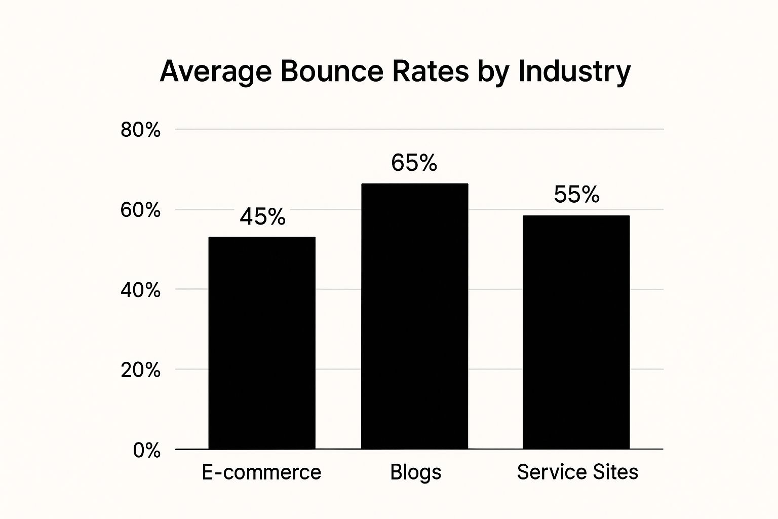
As the graphic shows, a blog can expect a higher bounce rate, whereas an e-commerce site should be aiming for a much lower number to keep people clicking from product to product.
To give you a clearer picture, let's look at some industry-specific benchmarks.
Bounce Rate Benchmarks by Industry
This table provides a summary of average bounce rates across various industries to help you set realistic goals for your website.
| Industry | Average Bounce Rate |
|---|---|
| Food & Drink | 65.52% |
| News | 56.52% |
| Finance | 51.71% |
| Real Estate | 44.52% |
| E-commerce | 42.33% |
These numbers show just how much bounce rates can differ. Seeing that the food and drink industry hovers around 65.52% while finance is closer to 51.71% helps you set achievable targets. If you run a real estate site with a 50% bounce rate, you're actually doing better than average.
Knowing where you stand is the key. You can dig into more website traffic statistics to see how these numbers shift and what they mean for your specific goals.
Improve User Experience to Keep Visitors On-Site
Once you've got a handle on why people are bouncing, it's time to walk in their shoes. A confusing or frustrating user experience (UX) is the fastest way I’ve seen to lose a potential customer. Your product could be incredible, but if people get annoyed just trying to find it, they’re gone.
Creating a smooth, intuitive path for your visitors isn’t just a nice-to-have; it’s the bedrock of keeping them engaged. This means taking a hard look at your site from a fresh perspective and smoothing over every little bump in the road.
Prioritize a Mobile-First Design
Let’s be honest: it’s no longer enough for your site to simply "work" on a phone. With well over half of all web traffic now coming from mobile devices, a mobile-first design is non-negotiable. If your mobile site is just a shrunken-down, clunky version of your desktop view, you're actively pushing away a huge chunk of your audience.
A bad mobile experience is a bounce rate killer. I've seen it time and again. Visitors faced with tiny text, buttons that are impossible to tap, or images that take forever to load will leave without a second thought.
Here’s an actionable insight: Open your website on your phone right now. Can you easily read the text without pinching to zoom? Can you tap on the main menu links with your thumb without accidentally hitting something else? If the answer to either is no, you have a critical problem to fix.
- Responsive is the bare minimum. Your site has to automatically adapt its layout to fit any screen, from a massive desktop monitor to the smallest smartphone.
- Think "thumb-friendly." Every button, link, and navigation element needs to be easily tappable with a thumb. Spacing is key—don't cram clickable items together. For example, ensure buttons have at least 44×44 pixels of tappable area.
- Simplify your forms. Nobody wants to fill out a complex form on a tiny screen. Keep them short, use auto-fill features where you can, and make sure the input fields are large and clear.
A mobile-first approach does more than just cater to phone users. It forces you to focus on what's truly important, stripping away the clutter to prioritize core content. This disciplined approach ends up benefiting users on all devices.
Build Clear and Logical Navigation
Imagine walking into a huge department store with no signs. You wouldn't have a clue where to find anything and would probably just walk out. Your website's navigation is the digital version of those signs.
Your menu should be simple, logical, and exactly where people expect it to be. Visitors shouldn't have to play detective to find basic information. A well-structured navigation system makes it effortless for them to explore deeper into your site, which is precisely how you lower your bounce rate. If you're starting from scratch, our guide on WordPress development for SEO shows how to build user-friendly navigation from the ground up.
Actionable Insight: Limit your main navigation menu to 5-7 top-level items. A menu with "Home," "About," "Services," "Blog," and "Contact" is far more effective than one cluttered with ten different options. Use dropdowns sparingly for sub-categories.
The data on this is crystal clear. A 2023 analysis found a direct link between bounce rate and pages per session. Websites with the lowest bounce rates, like PayPal at a stunning 19.5%, saw visitors clicking through 7-8 pages on average. At the other end of the spectrum, sites with bounce rates over 85% often saw users leave after viewing just one or two pages.
Make Your Content Easy to Read
The psychology of reading online is simple: people don't read, they scan. If a visitor lands on a page and is greeted by a massive wall of text, their brain immediately sends up a red flag. It feels like work, so they hit the back button.
This is where smart formatting becomes your best friend. You have to break up your content into bite-sized, digestible chunks that are easy on the eyes.
Here are a few actionable wins for readability:
- Use Whitespace: I can't stress this enough. Generous spacing between paragraphs and around images gives your content room to breathe, making the page feel less intimidating. Increase your line height to 1.5x the font size for better readability.
- Choose Legible Fonts: Stick with clean, simple web fonts like Arial, Helvetica, or Open Sans. And make sure the font size is comfortable to read on any device—16px is a great starting point.
- Write Short Paragraphs: This is non-negotiable for web content. Keep every paragraph to three sentences, max. It forces you to be concise and makes your writing incredibly scannable.
- Use Headings and Lists: H2s and H3s create a visual roadmap for the reader. For example, turn a paragraph listing product benefits into a bulleted list. This draws the eye and highlights key takeaways.
By simplifying the user's path and making your content a breeze to scan, you’re tackling the biggest reasons people bounce. A great user experience turns a fleeting visit into a meaningful one, encouraging people to stick around, click deeper, and ultimately convert.
Make Your Site Faster—It’s the Quickest Win

If you’re looking for a technical fix that delivers an immediate punch against a high bounce rate, your first stop should always be site speed. Let’s be honest: user patience online is measured in milliseconds. A slow-loading website isn't just a minor hiccup; it's a surefire way to make someone click away before they even see what you have to offer.
Improving how fast your pages load is one of the most reliable, data-backed methods for convincing visitors to stick around. The numbers don't lie. A page that loads in under one second can see a bounce rate as low as 7%. Let that creep up to just three seconds, and it can jump to 11%. Wait five seconds, and you’re looking at a staggering 38% bounce rate.
This isn't just hypothetical. The BBC discovered they lost about 10% of their total users for every extra second their site took to load. It’s a massive domino effect. You can dig into more page load time statistics yourself, but the takeaway is simple: speed keeps people on your site.
Stop Uploading Huge Images
One of the most common speed killers I see is large, unoptimized images. We all want our sites to look great with high-resolution photos, but those beautiful images often come with a hidden cost: massive file sizes that drag your load times into the mud. The good news? You can shrink these files dramatically without anyone noticing a difference in quality.
This process is called image compression, and it needs to be a non-negotiable step in your content workflow. Instead of uploading that 2 MB photo straight from your camera, you can almost always get it well under 200 KB.
Actionable Insight: Before uploading any image to your website, run it through an online tool like TinyPNG first. Aim for a file size under 150kb for large banner images and under 100kb for in-content images.
- TinyPNG: A super simple and free online tool. You just drag and drop your PNG or JPEG files, and it works its magic.
- Imagify: If you're on WordPress, this plugin is a lifesaver. It automatically compresses images as you upload them, so you can set it and forget it.
- ShortPixel: Another excellent WordPress plugin that gives you more granular control over the compression settings, which is great for pixel-perfect designs.
Use Browser Caching to Your Advantage
Browser caching is a clever way to make your site feel lightning-fast for repeat visitors. Here’s how it works: when someone first visits your site, their browser has to download all your assets—your logo, stylesheets, scripts, etc. Without caching, it has to do this all over again every single time they click to a new page.
Caching tells the user's browser to save those static files. So, the next time they visit or navigate to another page, their browser just loads the files from its local memory instead of re-downloading them from your server.
This simple tweak makes a world of difference for returning users. Pages load almost instantly, creating a smooth experience that encourages them to browse longer. It’s a small thing that has a huge impact on perception.
For anyone on WordPress, this is incredibly easy to set up. Plugins like W3 Total Cache or WP Rocket handle all the technical heavy lifting for you. A faster site is also a fundamental part of solid search engine optimization, so you’re getting a double benefit.
Tidy Up Your Hosting and On-Page Requests
Your website's performance starts with its foundation: your hosting provider. If you're on a cheap, overloaded shared hosting plan, you're fighting an uphill battle from the start. A quality host provides a fast server response time, which is critical.
Beyond hosting, you need to think about how many "things" a browser has to load for your page to appear. Every image, script, and font is a separate HTTP request. The more requests, the longer the wait.
Here’s an actionable insight: Open your website in Chrome, right-click and select "Inspect," go to the "Network" tab, and reload the page. Look at the number of requests at the bottom. If it's over 100, you have room for improvement.
- Combine Files: Use a plugin or tool to merge your separate CSS and JavaScript files into one of each. This drastically cuts down the number of requests.
- Use Lazy Loading: This is a brilliant technique that only loads images and videos when a user is about to scroll them into view. Why load everything at the bottom of the page if the user never gets there?
- Do a Plugin Audit: It’s so easy to let plugins pile up on WordPress. Every active plugin can add its own scripts and styles, slowing things down. Be ruthless. If you don't absolutely need it, deactivate and delete it.
Treating site speed as an ongoing priority, not a one-time fix, will pay off. These technical tweaks create a fundamentally better user experience that directly convinces visitors to stay.
Create Content That Captures and Holds Attention
Your site can be lightning-fast with a beautiful design, but if the content falls flat, people will still leave. The real work of lowering your bounce rate starts with creating content that doesn't just attract visitors but gives them a reason to stay, click around, and actually engage.
It's all about making your content "sticky." It needs to grab a visitor the second they land, instantly confirm they’re in the right place, and then make it compelling for them to continue their journey on your site.
Align Your Content With User Intent
The number one reason for a quick bounce? A massive disconnect between what a user expects and what they actually find. Someone searching for "best budget hiking boots" who lands on a generic shoe category page is going to feel baited. They wanted a curated list, not a messy catalog they have to sift through themselves.
Meeting user intent means your landing page has to immediately solve the problem that brought them there. If your page title promises a specific solution, the content visible on their screen—without scrolling—has to start delivering on that promise.
Practical Example: If your blog post is titled "How to Fix a Leaky Faucet in 5 Easy Steps," the very first paragraph should say something like, "Before you call a plumber, you can often fix a leaky faucet with a few common tools. Let's start by turning off the water supply." This immediately signals to the reader they are in the right place and that the solution is at hand.
Your headline makes a promise, and your opening paragraph is the proof. If you don't deliver on that promise within the first few seconds, you’ve already lost them. Make sure your value proposition is impossible to miss.
Build a Web of Internal Links
A single piece of content should never be a dead end. Internal links are your best tool for turning a single page view into a full-blown session. You're essentially creating pathways that guide users deeper into your site, showing them more of your expertise along the way.
It’s about building a "content web," not just a collection of isolated pages. Each link should feel like the next logical step. For example, in an article about "social media marketing tips," you’d naturally link out to more detailed guides on "creating an Instagram content calendar" or "running effective Facebook ads."
Here’s an actionable insight: As you write, think of it as a conversation. When you mention a related concept, ask yourself, "Would the reader benefit from a deeper dive on this?" If so, that's a perfect spot for an internal link. Aim for 3-5 relevant internal links per 1,000 words.
- Use Descriptive Anchor Text: Ditch generic phrases like "click here." Use anchor text that tells the user exactly what they'll get, like "explore our advanced SEO strategies." It’s better for users and for SEO.
- Link Deeply: Don’t just send everyone back to your homepage. Link to relevant blog posts, specific product pages, or case studies that add real value to the page they're currently on.
- Don't Go Overboard: Stuffing too many links into your content is distracting and just makes it hard to read. Add links where they genuinely help the reader, not just for the sake of it.
By building these smart connections, you not only keep people on your site longer but also show search engines that your site has a strong, organized structure. For a real-world look at this in action, check out the internal linking we use in our guide on the Outrank SEO platform.
Use Multimedia to Boost Engagement
Let's be honest, not everyone wants to read a wall of text. People consume information differently, and bringing in multimedia is a fantastic way to appeal to a wider audience. Videos, infographics, and high-quality images break up long blocks of text, making your content easier to scan and way more engaging.
Just adding a short, explanatory video can have a massive impact on how long someone stays on a page. In fact, pages with video content consistently show significantly lower bounce rates.
Actionable Ideas to Get You Started:
- Embed Explainer Videos: If you have a complex product, a short video showing how it works is far more powerful than paragraphs of text trying to describe it. A 90-second animated video can dramatically increase time on page.
- Create Custom Infographics: Use a tool like Canva to turn statistics from your article into a shareable infographic. This makes complex data easy to understand at a glance and encourages social sharing.
- Use High-Quality, Relevant Images: Instead of a generic stock photo, use a screenshot with annotations that illustrates a specific step in your guide. This adds immense practical value.
When you transform your pages from static documents into dynamic experiences, you give visitors more reasons to stick around and see what else you have to offer.
Use A/B Testing For Continuous Improvement
Here’s the thing about lowering your bounce rate: it’s never really "done." The strategies we’ve covered are a fantastic starting point, but to get lasting results, you have to treat it as an ongoing process of refinement. This is where you shift from making educated guesses to letting real data guide your decisions.
You need to systematically challenge your own assumptions. That headline you think is pure genius? It might be totally confusing your audience. The call-to-action button color you love? Visitors might be scrolling right past it. The only way to know for sure is to test one version against another and let your users’ behavior declare the winner.
This is the whole idea behind A/B testing, also known as split testing. It’s hands-down your most powerful tool for optimization. You simply show one version of a page element (Version A, the "control") to one segment of your traffic, and a second version (Version B, the "variation") to another. Whichever one results in better engagement—and a lower bounce rate—wins.
How To Run Meaningful A/B Tests
Getting started with A/B testing is probably easier than you think. Tools like Optimizely or VWO make it surprisingly simple to set up experiments without needing a developer on standby. The real trick is being strategic about what you test. Don't just change things at random. Focus on the elements that have the biggest potential impact on a user's decision to stick around.
A few high-impact elements I always recommend testing first include:
- Headlines: Pit a question-based headline ("Tired of High Bounce Rates?") against a benefit-driven one ("Lower Your Bounce Rate in 30 Days").
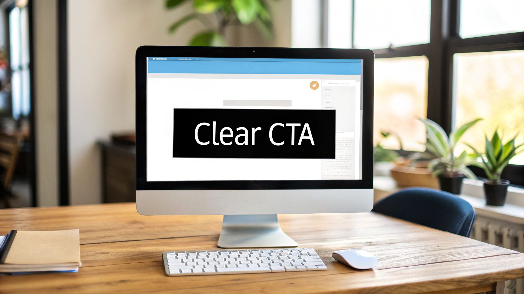
- Calls-to-Action (CTAs): Does "Get Started Now" outperform "See Pricing"? Test the button text, the color, and even where you place it on the page.
- Page Layout: Try a clean, single-column layout against a multi-column design and see which one guides the user’s eye more effectively toward your goal.
- Media: Does a page with a short video at the top hold attention better than one with a static hero image?
The golden rule of A/B testing is to only change one variable at a time. If you change the headline, the button color, and the main image all at once, you’ll have no idea which change actually drove the results.
A/B Testing Ideas to Reduce Bounce Rate
Sometimes, the hardest part is just knowing where to start. This table gives you a few practical ideas for elements you can test on your key landing pages. Think of it as a starting point to get the gears turning.
| Element to Test | Control (Version A) | Variation (Version B) Example |
|---|---|---|
| Headline | "Our Revolutionary Marketing Software" | "Get More Leads with Less Work" |
| Call-to-Action (CTA) Button Text | "Submit" | "Get Your Free Demo" |
| CTA Button Color | Blue | Bright Orange or Green |
| Hero Image | Stock photo of an office | Photo of a happy customer using the product |
| Page Layout | Testimonials at the bottom of the page | Testimonials moved directly below the hero section |
| Social Proof | "Join our community" | "Join 10,000+ happy customers" |
| Form Fields | 5 fields (Name, Email, Phone, Company, Size) | 2 fields (Name, Email) |
Remember, the goal is to form a hypothesis ("I believe changing the button color to orange will increase clicks") and then run a clean test to prove or disprove it. Let the data speak for itself.
Go Deeper With Heatmaps
While analytics tell you what users are doing (like bouncing), they often fail to explain why. This is where user behavior tools like heatmaps are invaluable. Heatmaps give you a visual overlay of where people are clicking, how far they're scrolling, and where their mouse hovers.
Practical Example: A heatmap might show a "cold" spot over your primary call-to-action button, meaning very few people are clicking it. But it shows a "hot" spot on an unlinked sentence nearby. This tells you that your button text is unclear, but the sentence is resonating. Your A/B test is now clear: change the button text to reflect the wording in that popular sentence.
Or, a scroll map might reveal that 90% of your visitors never even see the critical CTA you placed at the bottom of the page. This kind of insight is gold; it tells you exactly where to focus your next A/B test—moving that CTA higher up.
Use Exit-Intent Pop-Ups The Smart Way
Let's be honest: pop-ups can be incredibly annoying. But when used intelligently, they can be a powerful tool for catching a user just before they bounce. The secret is exit-intent technology, which only triggers the pop-up when a user's cursor moves up toward the address bar or back button.
Instead of being a jarring interruption, it becomes a final, helpful offer.
- E-commerce site: Offer a 15% discount code on their first purchase, but only on product pages.
- SaaS company: Provide a link to download a relevant case study specific to the feature page they were viewing.
- Blog: Invite them to subscribe to your newsletter to get more tips on the topic they were just reading about.
The goal isn't to block their path. It’s to make one last, compelling, context-aware offer that reminds them why they came to your site in the first place. When your pop-up solves a problem or presents an irresistible deal, it stops being a nuisance and becomes a valuable resource.
Frequently Asked Questions
When you start digging into bounce rate, a few common questions always seem to pop up. Let's tackle them head-on with some practical, no-fluff answers to help you make real improvements to your site.
What Is a Good Bounce Rate for a Website?
This is the big one, and the honest answer is: it depends. There’s no single magic number that defines a “good” bounce rate. It really comes down to your industry, your goals, and even the type of page you're looking at.
That said, here are some general benchmarks to give you a rough idea of where you stand:
- 26-40% is typically considered excellent (often seen on e-commerce sites).
- 41-55% is a perfectly healthy average.
- 56-70% is on the higher side, but it's not always a red flag (common for blogs).
Instead of chasing an arbitrary industry figure, it’s much more effective to benchmark your own site's performance and work on improving it from there. Actionable Insight: In your analytics, look at your bounce rate over the last 3 months. Your goal should be to lower that number by 5-10% over the next 3 months, not to match some industry average overnight.
The key is to focus on the user journey, not just the number. A low bounce rate on a product page is fantastic. A high one on your "Contact Us" page could simply mean people found your address and left—which is exactly what they came for.
Can a High Bounce Rate Hurt My SEO Rankings?
While Google has said that bounce rate isn't a direct ranking signal, it's a huge clue about user satisfaction. And search engines are all about understanding user behavior.
Imagine this scenario: someone searches for a keyword, clicks your link, stays for just a few seconds, then immediately hits the back button to click a competitor's link. This action, often called "pogo-sticking," sends a powerful signal to Google that your page didn't deliver on its promise.
If this happens consistently, it can absolutely hurt your rankings over time. Search engines want to show the best, most relevant results. So, any effort you put into improving user engagement—which naturally lowers your bounce rate—is a smart move for your long-term SEO health.
How Do I Fix a High Bounce Rate on One Specific Page?
If you spot a single page with a bounce rate that's through the roof, it’s usually a sign that something specific is off. This calls for a more surgical approach.
First, figure out that page's main job and where its traffic is coming from. Is there a mismatch between the ad, social post, or search result that brought the visitor there and what they actually see on the page?
Here’s an actionable checklist to diagnose the issue:
- Check Page Speed: Use Google's PageSpeed Insights tool. Does the page load in under 3 seconds? If not, start with image optimization.
- Review "The Fold": Look at what a user sees without scrolling. Does the headline match the ad copy or meta description that brought them here? Is the value proposition immediately obvious?
- Break Up Text: If the page is text-heavy, add a relevant image or pull-quote after the first two paragraphs to make it less intimidating.
- Add a Clear Path Forward: Make sure there's an obvious button or link within the first section of the page. Don't make users scroll to the bottom to find out what to do next. Give them a reason to click deeper into your site.
Ready to turn those bounces into conversions? The team at Website Services-Kansas City specializes in comprehensive SEO audits and WordPress development that build a better user experience from the ground up. Let us help you keep visitors on your site longer.