Staring at your abandoned cart numbers can feel like watching money walk right out the door. The short answer to how to reduce shopping cart abandonment is to attack the biggest friction points in your checkout—think surprise shipping costs and forcing people to create an account.
Every cart someone leaves behind is a massive opportunity, not just a lost sale.
Why Shoppers Leave and How to Bring Them Back
That sinking feeling you get seeing a dozen carts filled but only a few actually converting? It's a universal frustration for any small business owner. But instead of seeing it as a failure, you've got to reframe it as direct feedback from your would-be customers. They’re telling you exactly what’s stopping them from clicking "buy."
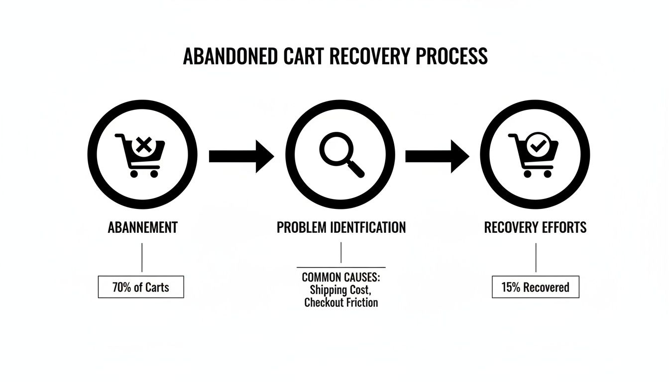
This isn't just your store; the problem is massive and growing. The global shopping cart abandonment rate has crept up to around 70%. Let that sink in: nearly seven out of every ten shoppers bail without finishing their purchase. For e-commerce businesses, this adds up to an estimated $260 billion in recoverable sales revenue lost every year.
Getting to the "Why" Behind the Abandonment
To start plugging the leaks in your sales funnel, you first have to understand why they exist. Shoppers aren't just changing their minds at random—specific, tangible obstacles are pushing them away. Tackling these head-on is the only way to turn that lost interest into loyal customers.
More often than not, the reasons shoppers leave boil down to two things: unexpected surprises and unnecessary friction.
- Surprise Costs: This is the undisputed champion of conversion killers. A customer sees a price on the product page and agrees to it, only to get hit with high shipping fees or taxes at the very last step. It feels like a bait-and-switch, and it shatters trust instantly.
- Forced Account Creation: Look, a lot of people just don't want to commit to creating a new account for a one-time purchase. Requiring it puts up a huge wall right before the finish line.
- A Complicated Checkout: Too many steps, confusing forms, or a clunky mobile experience will drain a customer's patience fast. This is closely tied to your site's overall usability. If visitors are already frustrated before checkout, you might also want to figure out how to reduce website bounce rate.
- Lack of Trust: No clear security badges? No customer reviews? A site that just looks unprofessional? Shoppers will think twice before handing over their credit card details.
The core insight here is that every abandoned cart tells a story. It's a data point showing a potential customer who was interested enough to add an item but was stopped by a specific roadblock in your process.
This table gives you a quick-glance guide to the most common reasons people leave and the first thing you should do to fix each one. Use it to help prioritize your next steps.
Top Reasons for Cart Abandonment and Actionable Fixes
| Common Abandonment Reason | Your First Actionable Fix |
|---|---|
| Unexpected Shipping Costs | Show a shipping cost estimator on the cart page or offer free shipping over a certain threshold. For example, a banner stating "FREE shipping on orders over $50!" |
| Forced Account Creation | Enable a guest checkout option. It's a non-negotiable for modern e-commerce. For example, present "Checkout as Guest" as the most prominent button. |
| Long or Complicated Checkout | Reduce the number of form fields and combine steps where possible (e.g., billing and shipping). Aim for a one-page checkout process if possible. |
| Security Concerns | Add trust badges (SSL, payment logos like Visa/PayPal) and customer testimonials directly in the checkout. A testimonial saying "Fast, secure checkout!" can work wonders. |
| No Express Payment Options | Integrate one-click payment methods like Apple Pay, Google Pay, or Shop Pay. These should be displayed at the very start of the checkout, not just the end. |
| Poor Mobile Experience | Test your entire checkout process on a real phone. For example, make sure form fields automatically trigger the correct keyboard (numeric for credit cards, text for names). |
Think of each fix as removing one more reason for someone to say "no." By reframing cart abandonment this way, you can move from frustration to action.
For a broader dive into actionable tactics, check out this comprehensive guide on strategies to reduce cart abandonment and win back lost sales. The rest of this playbook will give you a clear, step-by-step plan for diagnosing these problems and putting effective solutions in place.
Pinpointing Your Leaks with Checkout Analytics
Guesswork won't get you very far when you're trying to fix a leaky checkout funnel, but solid data will. To really understand how to cut down your cart abandonment rate, you have to become a bit of a detective, and your checkout analytics are the scene of the crime. Tools like Google Analytics 4 (GA4) are absolutely essential for seeing exactly where people are dropping off.
Instead of just throwing random fixes at the wall and hoping something sticks, analytics let you perform surgical strikes. You can stop guessing and start knowing precisely which step in your checkout process is causing the most friction.
Setting Up Your Checkout Funnel
For anyone running a Shopify or WordPress (with WooCommerce) store, setting up a checkout funnel report is your first critical move. In GA4, you do this by creating a Funnel exploration report. This report creates a visual map of the path users take from one step to the next, starting from adding an item to their cart all the way to that final thank-you page.
The whole point is to map out your specific checkout stages. A pretty standard e-commerce funnel usually looks something like this:
- View Cart: The customer looks over the items in their cart.
- Begin Checkout: They hit the button to start the actual purchase process.
- Add Shipping Info: The customer enters their delivery address.
- Add Payment Info: They pull out their credit card or log into another payment service.
- Purchase: The transaction is a success.
Once you have this configured, GA4 will show you the number of users who complete each step and, more importantly, the percentage who bail. This data is the bedrock for all your optimization efforts. For a deeper look at monitoring user behavior, our guide on how to track website traffic can give you some valuable context.
This whole process is about moving from identifying the problem to implementing a successful recovery plan.
The key takeaway here is that recovery isn't a single action. It's a process that has to start with a clear diagnosis of the problem.
Interpreting the Data to Find Leaks
With your funnel report up and running, you can now pinpoint your biggest leaks. Just look for the largest percentage drop-off between any two consecutive steps. That’s your red flag—your primary area of concern.
For example, you might see a massive 45% drop-off between the "Add Shipping Info" step and the "Add Payment Info" step. That's a huge signal. It strongly suggests that your customers are seeing their shipping costs for the very first time at this stage and immediately getting sticker shock. The problem isn't your payment options; it’s the unexpected fees. Actionable Insight: Implement a shipping calculator on the cart page before checkout begins to eliminate this surprise.
On the other hand, a big drop-off right at the "Add Payment Info" stage might point to totally different issues. Maybe you don't offer enough payment options like PayPal or Apple Pay. Or perhaps your site is missing the security badges and trust signals needed to make customers feel safe enough to type in their credit card details. Actionable Insight: Add logos for Visa, PayPal, and Apple Pay directly below the payment fields to build immediate confidence.
Data tells a story. A high drop-off on the shipping page screams "unexpected costs," while a drop-off on the payment page points to trust issues or a lack of convenient options.
By analyzing this flow, you can form a data-backed hypothesis. Your next moves are no longer based on generic advice but on the specific behavior of your customers on your site. This targeted approach is infinitely more effective than trying to fix everything at once. Focus your energy where the data shows the biggest fire.
Designing a Frictionless Checkout Experience
Once your analytics have helped you spot the leaks in your funnel, it’s time to start plugging the holes. A clunky, confusing, or frustrating checkout process is a guaranteed conversion killer, no matter how good your product is. The goal is to create an experience so smooth and intuitive that customers glide from cart to confirmation without a second thought.
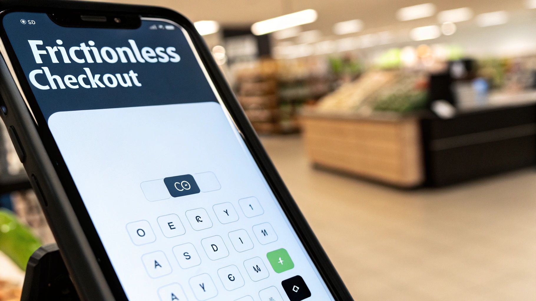
This isn’t about flashy design; it’s about ruthlessly removing obstacles. Every extra click, every unnecessary form field, and every moment of confusion adds friction, giving shoppers another reason to hit the back button. Your job is to pave a clear, simple path to purchase.
Eliminate Friction with Guest Checkout
Forcing a customer to create an account before they can buy is one of the most common—and most damaging—mistakes in e-commerce. It’s a massive barrier, especially for first-time buyers who aren't ready to commit to a long-term relationship with your brand. In fact, required account creation is responsible for more than 25% of abandoned carts.
The solution couldn't be simpler: always offer a guest checkout option.
Think about it from their perspective. They've found a product they love and are ready to hand over their money. Suddenly, they're hit with a form demanding they create a username, dream up a secure password, and confirm their email. The momentum is completely lost, and the purchase instantly feels like a chore.
By offering a guest checkout, you're sending a clear message: "We respect your time and just want to make this easy for you." You can always invite them to create an account after the purchase is complete, framing it as a convenient way to track their order.
Set Clear Expectations with a Progress Bar
Nobody likes being stuck in a process without knowing how close they are to the finish line. A multi-step checkout without a visual indicator of progress can feel endless, causing anxiety and a powerful urge to abandon ship.
A simple progress bar is a powerful UX tool that manages customer expectations. It visually communicates where they are in the process and, just as importantly, how many steps are left.
A typical progress indicator includes stages like:
- Cart Review: Where the customer confirms their items.
- Shipping: Where they enter their delivery details.
- Payment: The final step to enter payment information.
- Confirmation: The successful completion of the order.
This visual guide reduces uncertainty and makes the whole thing feel more manageable. It reassures the shopper that they're making steady progress, which keeps them engaged and moving forward.
Streamline Forms with Autofill and Smart Design
Filling out long, tedious forms is a pain, especially on a mobile device. Every single field you can eliminate or simplify is a direct win for your conversion rate. Your mission is to make data entry as effortless as possible.
One of the best ways to do this is by implementing address auto-fill. Using tools like the Google Places API, customers can start typing their address and a list of verified suggestions pops up. They just select the correct one, and the city, state, and zip code fields populate automatically.
Beyond that, stick to these form design best practices:
- Single-Column Layout: Keep your forms in a single, vertical column. It’s much easier for the eye to follow, especially on a phone.
- Use a "Same as Shipping" Checkbox: Don't make people type their address twice. A simple checkbox to copy shipping details over to the billing section is a non-negotiable.
- Clearly Label Fields: Place labels above the input fields, not inside them as placeholder text that vanishes the moment someone starts typing.
Speed is also a massive factor here. A slow-loading checkout page will kill your momentum and drive people away. If your site feels sluggish, you can learn more about how to speed up your WordPress site in our detailed guide.
Optimize Relentlessly for Mobile Shoppers
Optimizing for mobile is no longer optional; it’s the main event. Mobile shoppers abandon their carts at a staggering rate of 80-85%, compared to just 66-73% on desktop. With the majority of e-commerce traffic now coming from smartphones, failing to design for small screens is a recipe for lost sales. Discover more insights about mobile shopping behavior on Marketing Land.
A truly frictionless mobile checkout needs a thumb-friendly design. That means:
- Large Buttons and Tap Targets: Make sure all buttons and clickable links are big enough to be easily tapped without accidentally hitting something else. For example, your "Complete Purchase" button should span the full width of the screen.
- Simplified Navigation: Hide complex menus and provide a clear, linear path through the checkout process.
- Numeric Keypads for Number Fields: Automatically trigger the numeric keyboard for fields like phone numbers, zip codes, and credit card details. It’s a small detail that makes a huge difference.
- Minimize Typing: Use dropdowns, steppers for quantity, and autofill wherever possible to reduce the amount of manual typing needed.
By focusing on these practical UX changes, you can transform your checkout from a frustrating obstacle course into a seamless path to purchase. Each small tweak works to remove friction, build momentum, and ultimately help you figure out how to reduce shopping cart abandonment effectively.
Building Customer Trust from Homepage to Purchase
In e-commerce, trust isn't a feature—it's the entire foundation your business is built on. Let's be honest, no one is handing over their credit card details if they feel even a hint of uncertainty. Building that confidence doesn't start at the checkout page. It's a relationship that begins the moment someone lands on your homepage and needs to be reinforced at every single step.
A classic mistake is saving all the trust signals for the final payment form. By that point, it’s usually too late. A skeptical shopper has already had a dozen chances to hit the "back" button. The real goal is to weave trust into the fabric of your site, creating a secure environment that makes customers feel safe from the get-go.
Displaying Essential Security Badges
The most fundamental trust signal is site-wide security. These days, shoppers are savvy enough to look for that little padlock icon in their browser's address bar. This is powered by an SSL certificate, which encrypts the data flying between your customer's browser and your site, protecting their sensitive information. Not having one is a massive red flag that screams your store isn't secure.
According to a study from Baymard Institute, a staggering 25% of shoppers ditch their carts purely due to concerns about credit card security. Just making security seals visible can tackle this fear head-on.
Beyond the basic SSL, you need to be showing off the logos of trusted payment providers like Visa, Mastercard, PayPal, and Shop Pay. Placing these in your site's footer and then again on the checkout page reinforces that you work with reputable financial giants. It's a bit like borrowing their credibility, and it gives your store an instant boost. If you're just starting, our guide on how to install an SSL certificate is the crucial first step.
Leveraging the Power of Social Proof
Nothing builds confidence faster than seeing that other people have already bought from you—and loved it. This is social proof, the simple idea that we tend to follow the actions of others because we assume it's the right thing to do. For an online store, this means reviews, testimonials, and user-generated content are your best friends.
Don't just bury reviews on your product pages. Sprinkle your best ones everywhere:
- Homepage: Feature a couple of your best five-star reviews or customer testimonials, ideally with photos.
- Product Pages: Show star ratings right under the product title and then list the full reviews further down the page.
- Checkout Page: A small, reassuring quote from a happy customer right next to the "Complete Purchase" button can be the final nudge someone needs. For example: "I was so impressed with how quickly my order arrived! – Jane D."
The key here is authenticity. Vague, generic praise like "Great product!" doesn't move the needle. You want to showcase reviews that get specific—mentioning the product's benefits, your awesome customer service, or lightning-fast shipping. Real stories from real people are your most powerful marketing tool.
Making Policies Crystal Clear
Ambiguity is the absolute enemy of trust. Customers need to know the "what ifs" before they'll commit to a purchase. What if it doesn't fit? What if it shows up damaged? What if I just don't like it? Your return policy, privacy policy, and shipping info need to be dead simple to find and understand.
Instead of hiding these in a footer link nobody clicks, make them a visible and reassuring part of the shopping experience.
Strategic Policy Placements:
- Return Policy: Mention your "30-Day Money-Back Guarantee" or "Hassle-Free Returns" right on your product pages, maybe near the "Add to Cart" button.
- Shipping Info: Add a shipping cost estimator to the cart page or display a clear banner that says "Free Shipping on Orders Over $75."
- Privacy Policy: While the full legalese can live on its own page, a short, simple statement like "We respect your privacy and will never share your information" on the checkout page provides critical reassurance.
When a customer feels informed and knows there's a safety net, their hesitation melts away. By transparently weaving security seals, social proof, and clear policies into your site, you build a fortress of trust that directly fights shopping cart abandonment.
Automating Your Sales Recovery Campaigns
Even with a perfectly slick checkout, people will leave. Life happens—the dog starts barking, a kid needs help with homework, or maybe they just second-guess the purchase for a moment. This is where your safety net comes in: automated sales recovery campaigns that work around the clock to bring those almost-customers back.
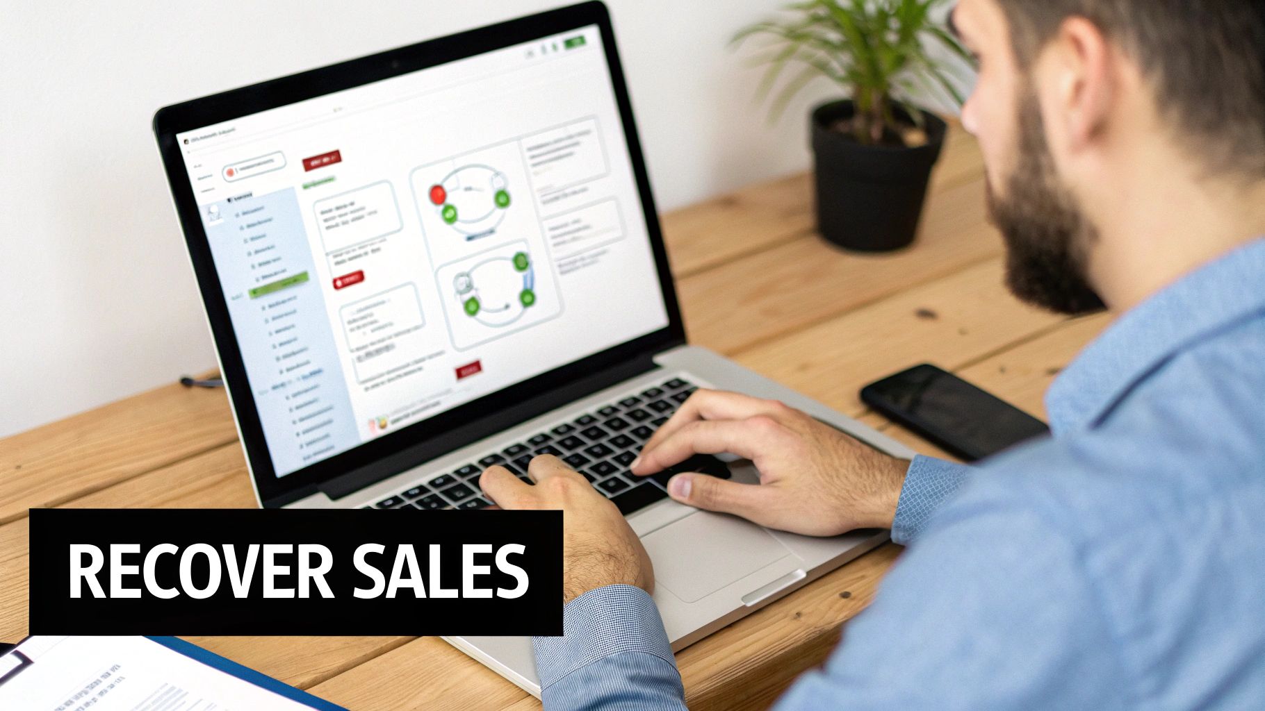
Think of these campaigns as your tireless automated sales team. Instead of just letting that potential revenue fade away, you can build a system in tools like Shopify, Klaviyo, or Mailchimp that gently reminds, incentivizes, and coaxes shoppers to finish what they started. Forget generic, one-size-fits-all templates; a well-timed, thoughtful sequence can make a world of difference.
The Proven Three-Part Email Sequence
Sending a single "you forgot something" email is better than nothing, but a strategic, multi-part series is where the real money is. This approach lets you build your case over a few days, escalating from a simple reminder to a more compelling offer without feeling spammy. You stay top-of-mind and get a few shots at addressing whatever stopped them in the first place.
Here’s a proven framework that hits the sweet spot between being helpful and persuasive, designed to win back sales without being pushy.
Data from email marketing platform Klaviyo shows that businesses generated over $60 million in sales from abandoned cart emails alone in a single three-month window. This isn't a minor tweak; it's a significant revenue channel.
This structured approach respects the customer's journey while giving you the best possible shot at closing the sale. The best part? Once it's set up, it runs on pure autopilot.
Email 1: The Gentle Nudge
The first email is all about a light touch. This isn't a hard sell. You're operating under the assumption that they simply got sidetracked. Timing is absolutely everything here—you need to send this message fast, while the products are still fresh in their mind.
- Timing: 1-2 hours after they abandon the cart.
- Subject Line Strategy: Keep it simple and helpful. "Did you forget something?" or "Your items are waiting for you" works perfectly.
- Core Message: Gently remind them of the items they left behind. Be sure to include images of the products and a big, clear button that links directly back to their pre-filled cart. Crucially, don't offer a discount yet. Many people will convert with just this simple reminder.
This initial message often sees incredibly high open rates—frequently over 40%—because it’s so timely and relevant.
Email 2: The Value-Add or Incentive
If that gentle nudge didn't seal the deal, it’s time to sweeten the pot a little. This shopper might be more sensitive to price, or perhaps they just need a bit more convincing. Your second email introduces a clear reason for them to come back now.
- Timing: 24 hours after abandonment.
- Subject Line Strategy: Create a sense of opportunity. Something like "An offer just for you" or "Your items are selling fast!" can be very effective.
- Core Message: This is your chance to introduce a small incentive, like a 10% discount or free shipping. If you’d rather not discount, focus on value instead. Remind them of your product benefits, showcase a glowing five-star review, or highlight your hassle-free return policy to build more trust.
This email is designed to catch those who were on the fence, giving them that extra push they need to overcome their hesitation. It’s a key step in learning how to reduce shopping cart abandonment for a more cost-conscious audience.
Email 3: The Final Call
Your third and final email is all about creating a sense of friendly urgency. This is your last real shot at recovering the sale before the lead goes completely cold. The tone should be helpful but firm, letting them know this is their last chance to act on the offer or secure the items they wanted.
- Timing: 48-72 hours after abandonment.
- Subject Line Strategy: Use urgency and a touch of scarcity. "Your cart is about to expire" or "Last chance for 10% off" works wonders.
- Core Message: Remind them that their cart will be cleared soon or that their special discount code is expiring. Reiterate the key product benefits and finish with a strong, clear call-to-action. You can also suggest a few alternative products in case the original items just weren't the right fit.
This three-part flow is a powerful engine for revenue recovery and a core strategy in any playbook on how to increase online sales.
Effective Cart Recovery Email Sequence
Here’s a quick-reference table to help you build out your own three-part email recovery series.
| Email Stage | Timing After Abandonment | Subject Line Strategy | Core Message Goal |
|---|---|---|---|
| The Gentle Nudge | 1-2 Hours | Simple & Helpful ("Your cart is waiting") | Be a friendly reminder; assume they just got distracted. |
| The Incentive | 24 Hours | Offer-driven ("A little something for you") | Introduce a small discount or reinforce product value to overcome hesitation. |
| The Final Call | 48-72 Hours | Urgency-focused ("Last chance to order") | Create a fear of missing out; prompt immediate action before the cart expires. |
Following this framework gives you a simple yet powerful system for turning abandoned carts into revenue.
Best Practices for SMS Recovery
SMS is another incredibly powerful recovery channel, but because it’s so personal, it requires a different touch. You absolutely must have explicit consent (an opt-in) to text your customers, and your messages need to be even more concise.
- Keep it Short & Sweet: Get straight to the point. "Hi [Name], you left items in your cart at [Your Store Name]. Complete your purchase here: [Link]."
- Time it Carefully: Never send texts late at night or super early in the morning. Stick to normal business hours to avoid being intrusive.
- One and Done is Best: Unlike email, a multi-text sequence can feel like harassment. A single, well-timed SMS is usually the smartest approach.
By automating both your email and SMS follow-ups, you create a comprehensive recovery system that catches shoppers at different points of hesitation, turning lost carts into completed sales.
Common Questions on Cart Abandonment
Even with a killer strategy in place, a few nagging questions always seem to pop up. Let's tackle some of the most common ones I hear from store owners. Clearing these up will help you fine-tune your approach and feel a lot more confident about your game plan.
Think of this as a quick-reference guide for those "what if" moments.
What Is a Good Shopping Cart Abandonment Rate?
I get this question all the time. While the industry average floats around a stubborn 70%, a truly "good" rate is all about your specific business. A store selling custom furniture is naturally going to have a higher abandonment rate than one selling phone cases. It’s just a different buying process.
Instead of getting hung up on a magic number, focus on your own progress. A really well-tuned store can often get its rate down between 55-60%. The best move you can make is to benchmark where you are right now and aim for a real, tangible improvement.
Aiming for a 5-10% decrease from your current abandonment rate is a fantastic—and totally achievable—first goal. It's about making steady gains, not comparing yourself to vague industry stats.
Should I Offer a Discount in My First Abandonment Email?
It’s so tempting to lead with a discount, but hold off. Your first email, which should land in their inbox about an hour after they leave, is most effective as a simple, helpful reminder. Life happens. People get distracted, the dog starts barking, the boss walks in—often, a gentle nudge is all it takes.
If you offer a discount right out of the gate, you risk training your customers to abandon carts on purpose just to score a deal. That’s a fast way to chip away at your profit margins.
Save that discount for your second or third email in the sequence. By that point, if they still haven't come back, you can be much more confident that price is the real issue.
How Can I Fix High Shipping Costs If I Can't Offer Free Shipping?
For most small stores, offering free shipping on everything just isn't in the budget. I get it. If that’s you, your most powerful weapon is transparency. The number one reason shipping costs kill a sale is the surprise factor at the very last step of checkout.
Here are a few practical ways to handle shipping costs without going broke:
- Offer Tiered Shipping Options: Give your customers a choice. A cheap-but-slower standard option next to a pricier expedited one empowers them. They get to decide what’s more important: saving money or getting it fast.
- Implement a Free Shipping Threshold: This is a classic win-win. "Free shipping on orders over $75" not only softens the blow but also actively encourages shoppers to add more to their cart. It’s a great way to boost your average order value.
- Use a Shipping Cost Calculator: Drop a simple calculator on your cart page. Letting people see the cost before they even start checking out completely removes that painful sticker shock.
By being upfront and offering choices, you turn shipping from a deal-breaker into just another part of the decision. For a deeper look at overall strategies, explore these top tips on how to reduce shopping cart abandonment for even more ideas. Tackling these common friction points head-on will put you in a much stronger position to turn those almost-sales into loyal customers.
At Website Services-Kansas City, we specialize in building and optimizing WordPress and Shopify stores that turn visitors into customers. If you're ready to plug the leaks in your sales funnel and create a seamless checkout experience, we can help. Learn more about our expert web development and SEO services today.