When it comes to your website, optimizing your images isn't just a technical box to check. It's a fundamental part of a smart strategy that directly impacts how fast your site loads, how visitors feel about your content, and ultimately, how you rank on Google. It’s about choosing the right format, compressing the file, and resizing it perfectly for the web.
Why Image Optimization Is Your Secret SEO Weapon
Let's be blunt: images are often the single heaviest element on a webpage. When they're bloated and unoptimized, they create a massive performance bottleneck that can torpedo your website's success.
This is because page speed is a confirmed, major ranking factor for Google. A slow website sends a clear signal of a poor user experience, which can lead to lower rankings and a drop in organic traffic. It’s that simple.
The effect on your visitors is even more immediate. Studies have shown that slow-loading pages lead to a staggering 53% abandonment rate from mobile visitors. And since Google now operates on a mobile-first indexing model, a sluggish mobile experience is a serious liability for your search engine optimization efforts.
The Real Cost of Slow Images
We're not just talking about bounce rates. Slow-loading images frustrate people, chip away at their trust in your brand, and can hit your bottom line hard.
Think about an e-commerce store where a potential customer clicks away before the product image even finishes loading. Or a blog where a reader gets impatient and leaves before they can even read your brilliant insights. Every second counts.
This is exactly the kind of issue Google PageSpeed Insights is designed to catch. It will often flag unoptimized images as a major performance problem.

You’ll frequently see "Properly size images" listed as a top opportunity for improvement, with a clear estimate of how much time you could save.
Think of it this way: Every unoptimized image is a small speed bump for your visitors. A few of them together can turn your user's journey into a frustratingly slow crawl, often ending before they reach their destination.
This direct line connecting image weight, load time, and user behavior is precisely why mastering image optimization is non-negotiable for web performance.
To help you get started, here's a quick look at the core concepts we'll be diving into.
Core Pillars of Image Optimization at a Glance
This table breaks down the fundamental areas of image optimization. Getting these three pillars right is the foundation for a faster, better-performing website.
| Pillar | What It Is | Why It Matters |
|---|---|---|
| File Format | Choosing the right type of image file (like JPEG, PNG, or WebP) for the job. | Different formats have unique strengths for quality and file size. The right choice saves kilobytes without sacrificing visual appeal. |
| Compression | Using tools to reduce the image's file size, with or without a slight loss in quality. | Smaller files mean faster load times. This is the single biggest factor in reducing the "weight" of your pages. |
| Dimensions | Resizing an image to the exact pixel dimensions it will be displayed at on the screen. | Prevents the browser from having to download a huge image only to shrink it down, which wastes bandwidth and time. |
By focusing on these three areas, you can make a massive, immediate improvement to your site's speed and user experience.
Choosing the Right Image Format
Picking the right image format isn't just a technical detail—it's a strategic decision that directly affects your site's speed and how good your visuals look. Don't just grab the first file you see. Think of each format as a specialized tool. The real goal is hitting that sweet spot between a crisp, clear image and the smallest possible file size.
Actionable Insight: Before you save any image, ask yourself: "Does this image need a transparent background?" If the answer is no, you can immediately rule out PNG and focus on JPEG or WebP, which offer much better compression for photographic content. This single question can save you from using unnecessarily large files.
This infographic really drives the point home, showing just how dramatic the difference can be. It compares original file sizes to their optimized versions and the direct impact on load time.
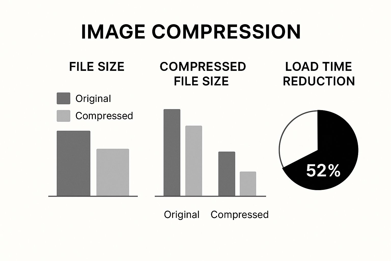
As you can see, a few smart choices can easily slash file sizes by over 50%. That translates directly into a faster, better experience for your visitors.
Modern Formats WebP and AVIF
The real game-changers for web images today are WebP and AVIF. These formats were built from the ground up for the web, and their compression is far superior to the older options.
- WebP has become the go-to for most situations. It strikes an amazing balance between quality and small file size, making it perfect for blog post images, product photos—you name it. It even supports transparency like a PNG but at a fraction of the file weight.
- AVIF takes things a step further, offering even better compression than WebP, especially for high-detail images. This makes it a fantastic choice for those critical visuals like hero banners where every single kilobyte matters. The file size savings are huge, though its browser support isn't quite as universal as WebP's just yet.
This is where smart tools come in. Modern CDNs can automatically detect a user's browser and serve the best possible format, often reducing file sizes by 25-50% compared to a standard JPEG. You can learn more about these advanced image delivery techniques over on digidop.com.
From my experience, a great strategy is to default to WebP for its broad support and excellent performance, but keep a JPEG as a fallback. This way, users on older browsers still get a fast-loading image, and you don't have to compromise on speed for everyone else.
To help you decide, here’s a quick breakdown of how these new and old formats stack up against each other.
Image Format Comparison WebP vs AVIF vs JPEG vs PNG
| Format | Best For | Key Feature | Browser Support |
|---|---|---|---|
| WebP | All-around use; photos, graphics, icons | Excellent compression with transparency support | Excellent |
| AVIF | High-impact visuals like hero images | Superior compression for maximum size reduction | Good, but growing |
| JPEG | Complex photographs with many colors | Universal support and good for photos | Universal |
| PNG | Logos and graphics needing transparency | Lossless quality preserves sharp details | Universal |
This table should make it clear that while WebP and AVIF are the future, the classic formats still have a role to play.
When to Use JPEG and PNG
Even with these powerful new formats, the classics aren't obsolete. Knowing when to stick with them is part of a smart image strategy.
JPEG (or JPG) is still a rock-solid choice for complex photographs—think detailed landscapes or portraits with tons of colors and subtle gradients. Its compression is designed for exactly this kind of image, and since it’s supported by every browser ever made, it's a completely safe bet. Just remember, it can't handle transparency.
PNG, on the other hand, is your specialist for any image that needs a transparent background. This makes it essential for logos, icons, and any simple graphic where you need perfectly crisp edges. PNGs use "lossless" compression, meaning no detail is lost, which is critical for brand assets. Use PNG-24 when you need high-quality transparency and PNG-8 for simpler graphics with fewer colors to keep the file size down.
Mastering Image Compression and Resizing
Once you've picked the right format, it's time to tackle the real heavy lifters of image optimization: compression and resizing. These two steps are where you'll shed the most weight from your image files before they ever get near your website. It’s a bit like packing a suitcase for a trip—you don't just toss everything in. You fold, roll, and arrange things to make it all fit without paying for an overweight bag.
Image compression is the digital equivalent, using clever algorithms to make files smaller. You'll run into two main types:
-
Lossless Compression: Think of this as a perfect vacuum seal. It shrinks the file size without tossing out any of the original data. When you "unzip" it, everything is exactly as it was, with zero quality loss. This is perfect for logos, icons, or technical drawings where every single pixel counts.
-
Lossy Compression: This is where the magic really happens for most photos on the web. Lossy compression is smart; it selectively removes bits of data that the human eye isn't likely to notice anyway. The trade-off is a tiny, often unnoticeable, drop in quality for a massive reduction in file size.
For almost every photo you'll use, lossy compression is the way to go. The file size savings are just too good to pass up. A good rule of thumb is to aim for about 75% quality during compression. That’s usually the sweet spot between a crisp, clear image and a super-lightweight file.
A Practical Workflow with Free Tools
The best part? You don't need to shell out for expensive software like Photoshop. Free online tools like Squoosh and TinyPNG are incredibly powerful and dead simple to use. They even show you a live preview, so you can dial in the settings and find that perfect balance yourself.
Actionable Insight: Here's a quick 3-step workflow. 1) Open your image in Squoosh. 2) On the right-hand side, select "MozJPEG" and drag the quality slider down to 75. 3) Look at the preview. If it still looks great, check the new file size. If it's under 200KB, you're good to go. If not, try nudging the slider down to 70. This takes less than 30 seconds per image.
See that little slider and the file size info at the bottom? It lets you visually check that the quality is still great while watching the file size plummet. In this example, we’ve shaved off over 80% of the original weight. That's a huge win.
Why Sizing Before You Upload Is a Must
Just as critical as compression is resizing your images to the right dimensions before you upload them. One of the most common performance-killing mistakes I see is someone uploading a giant 4000-pixel photo and just letting CSS or HTML shrink it down to fit a 600-pixel container.
This is a terrible practice. The user's browser is forced to download the entire, oversized image, wasting data and time, only to display a much smaller version. The fix is simple: figure out the largest size the image will ever be displayed at on your site and resize it to those exact dimensions.
Correct sizing and compression aren't just best practices; they're fundamental. A good target for most website images is between 1280 and 1920 pixels wide, with the final file size staying well under 200KB. This is all about speed.
Even a tiny delay has real consequences. Research shows that bumping page load time from just 1 second to 3 seconds can increase your bounce rate by a staggering 32%. You can dig deeper into how image size affects user behavior in this detailed guide.
This data proves that every single kilobyte matters. By mastering these hands-on techniques, you're not just making files smaller—you're directly improving the user experience and protecting your SEO.
How to Turn Your Images into SEO Assets
Fast-loading images are non-negotiable for a good user experience, but their value for SEO runs much deeper than just speed. Every single image you upload is a chance to communicate directly with search engines. You're telling them what your content is about and opening up new ways for people to find you.
Think of your images as little visual billboards for your brand, scattered all across Google's search results.
This whole process really kicks off before you even hit the "upload" button. Your file names are the first, most straightforward clue you can give a search engine crawler. A generic name like IMG_4077.jpg is a massive missed opportunity.
Instead, get into the habit of creating descriptive, keyword-rich file names that spell out exactly what the image shows. Always use hyphens to separate words and aim for something that's concise but still paints a clear picture.
Crafting a Winning File Name
The idea is to be descriptive without going overboard and sounding like a keyword-stuffing robot. Just imagine you're explaining the image to someone who can't see it.
- Bad:
photo1.webp - Good:
golden-retriever-puppy-playing-in-grass.webp - Also Good:
blue-nike-air-max-running-shoe.webp
This simple change instantly gives Google a ton of context, helping it understand and categorize your visual content way more effectively.
Writing Alt Text That Works for Everyone
Alt text (or alternative text) is what shows up if an image can't load for some reason. But more importantly, it’s what screen readers use to describe images to visually impaired users, making it a critical part of web accessibility. It also happens to be a powerful SEO signal.
Your alt text should be a clear, concise description of what’s in the picture. It's a great spot to include a relevant keyword, but its primary job is to be descriptive.
"A common mistake is stuffing alt text with keywords. Instead, write for humans first. A good rule of thumb is to describe the image as you would to a friend over the phone. If a keyword fits naturally, great. If not, don't force it."
For a photo of a café, you might write alt="Modern coffee shop with exposed brick walls and customers working on laptops." This works perfectly for accessibility while also giving search engines valuable contextual clues. This is a core part of any solid SEO strategy, helping you get an edge in a packed market. You can dive deeper into these kinds of tactics in our guide on how to outrank your SEO competition.
Great SEO means using unique images with thoughtful file names and alt text. This dramatically increases your chances of showing up in Google Image search. While compression and sizing build the technical foundation for a fast site, it's this descriptive text that boosts your discoverability. You can get more details on how these elements work together from these insights on image sizing.
Advanced Image SEO Tactics
Ready to take things a step further? Here are a few more advanced strategies to really make your images work for you:
-
Image Captions: While not a direct ranking factor, captions get read way more often than body text. A sharp, well-written caption can boost user engagement, and that is a positive signal to Google.
-
Image Sitemaps: If your website is heavy on visuals—like an e-commerce store or a photography portfolio—creating a dedicated image sitemap is a smart move. It helps Google discover all your visual content, even images that are loaded with JavaScript.
-
Structured Data: Using schema markup (specifically
ImageObject) lets you feed search engines explicit details about your images, like the creator, copyright info, and licensing. This can help your images earn rich results and stand out even more in search.
Using Lazy Loading and Responsive Images
Once you've nailed down your file formats and compression, it's time to get a bit more sophisticated. Two techniques that are absolutely essential for modern web performance are lazy loading and responsive images.
These methods are all about being smarter with how and when images get delivered to a user's browser, which can have a massive impact on your load times and Core Web Vitals scores.
Give Your Initial Page Load a Break with Lazy Loading
Lazy loading is a beautifully simple concept with a powerful punch. Instead of forcing a user's browser to download every single image on a page the moment it loads, you defer the off-screen images. They only start loading when the user actually scrolls down and they're about to pop into view.
For long blog posts or pages with image-heavy galleries, this is a total game-changer. It dramatically cuts down the initial page weight, making that first paint happen so much faster.

The best part? Implementing it is often surprisingly easy.
Modern browsers now support native lazy loading with just a single HTML attribute: loading="lazy". In many cases, performance plugins and modern web platforms handle this for you automatically. For example, our team often integrates these features during WordPress development and SEO to make sure our clients' sites are as fast as possible right out of the gate.
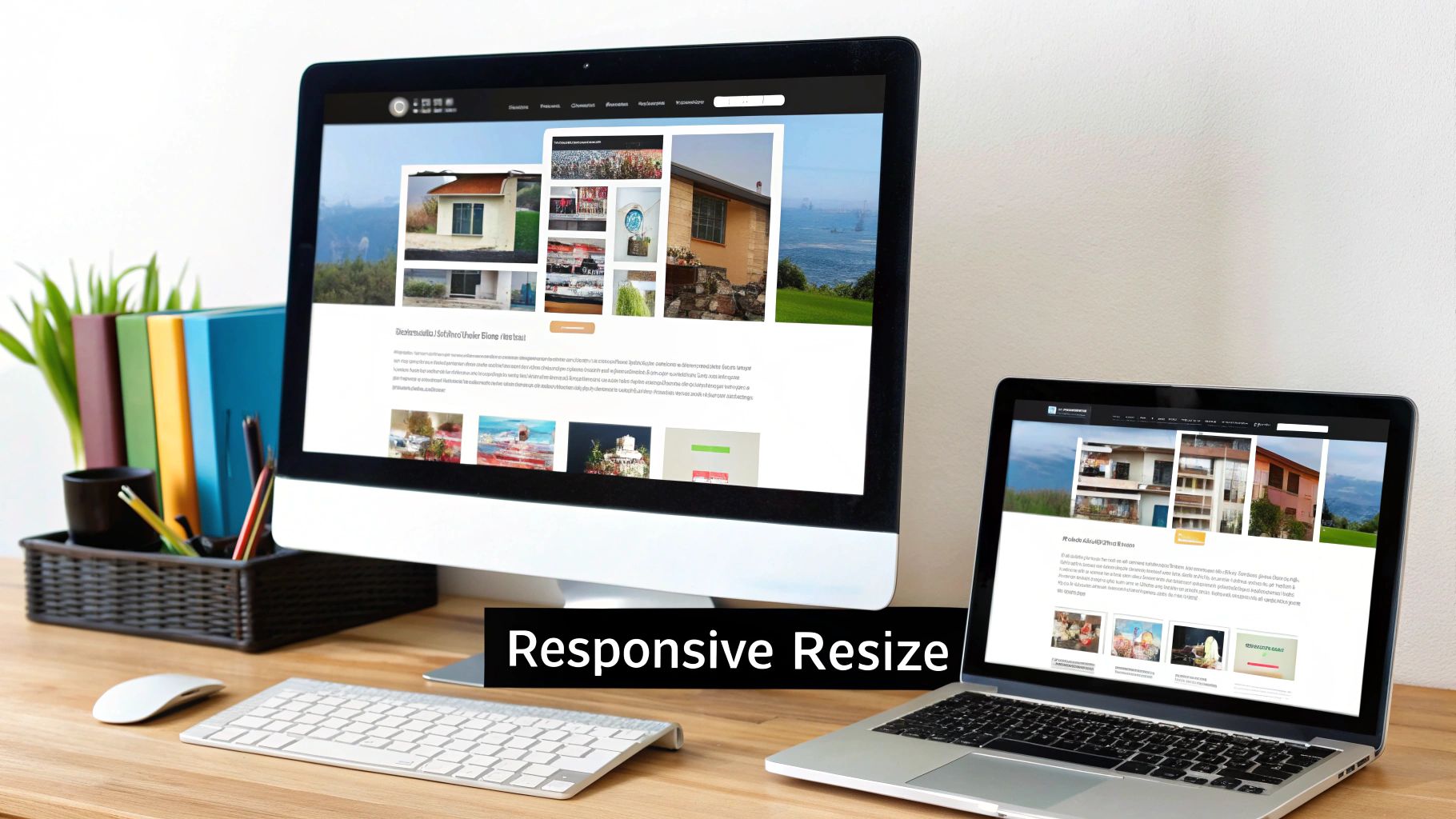
Serving the Right Image with Srcset
Responsive images solve a totally different, but equally important, problem: sending the right-sized image for each user's device. A huge, crystal-clear image designed for a 27-inch desktop monitor is complete overkill on a small mobile screen—it just wastes bandwidth and slows everything down.
This is where the srcset attribute comes in. It's a piece of HTML that lets you give the browser a menu of different-sized images to choose from.
The browser is smart enough to look at the user's screen size and resolution, then pick the most appropriate image from the list. Mobile users get a small, fast-loading image, while desktop users still get that crisp, high-quality version they expect.
Here’s a practical, copy-pasteable example of how srcset works in the real world:
<img src="small-image.jpg"
     srcset="small-image.jpg 480w,
             medium-image.jpg 800w,
             large-image.jpg 1200w"
     sizes="(max-width: 600px) 480px,
            (max-width: 900px) 800px,
            1200px"
     alt="A descriptive alt text for the image">
This code essentially tells the browser, "Hey, if the screen is this wide, use this image. If it's wider, use that one." It makes your site faster and more efficient for absolutely everyone.
Think of lazy loading and
srcsetas a sophisticated delivery system. Instead of shipping one giant, oversized package to every customer, you send a perfectly sized package just in time, right when they need it. This efficiency is key to delighting users and search engines.
This whole approach ties back to the modern philosophy of photo optimization: balancing quality and file size. Current best practices often point to quality settings between 70-80%, which can slash file sizes by 50-70% with almost no noticeable drop in visual quality. You can find more insights on how image quality impacts load speeds on ProPhotoStudio.net.
When you combine smart compression with these intelligent delivery techniques, you create a truly optimized visual experience that keeps your site fast and your visitors happy.
Your Image Optimization Questions Answered
Even with the best game plan for optimizing your images, you're bound to run into specific questions along the way. Getting those questions answered clearly is what turns a good workflow into a great one. This section is all about tackling the most common queries that pop up, giving you the practical know-how to handle just about any situation.
We’re diving into everything from automation tools to the nuances of optimizing logos and background images, building on the core concepts we’ve already covered.
What Is the Best Tool to Automate Image Optimization?
Let's be real—manually compressing every single image is a nightmare, especially if you're running a larger site. Automation is your best friend for keeping things speedy without burning hours of your time. The "best" tool really boils down to how you work.
-
For WordPress Users: You can't go wrong with a solid plugin. Tools like Imagify or Smush are fantastic because they work right inside your dashboard. They automatically compress and resize images the second you upload them, making the whole process completely hands-off.
-
For Developers: If you're building something more custom, services like Cloudinary or Imgix offer incredibly powerful APIs. They can transform and serve the perfect image format and size on the fly, delivering a totally tailored experience for every user on any device.
-
For Quick, One-Off Jobs: Need to optimize just a few images right now? Free web-based tools are the way to go. My personal favorites are Squoosh and TinyPNG. They're dead simple to use and get the job done fast.
How Should I Optimize SVG Images and Logos?
Optimizing SVGs is a different beast entirely. Since they’re made of code, not pixels, traditional compression doesn't apply. This vector format is absolutely perfect for logos and icons because they scale flawlessly on any screen without losing an ounce of quality. So instead of compressing, you need to minify the code.
Minification is just a fancy word for stripping out all the junk—unnecessary data, comments, and extra characters—that design software like Adobe Illustrator leaves behind. The easiest way to handle this is with a free online tool like SVGOMG. Just upload your SVG, and it instantly cleans up the code, often making the file size significantly smaller.
The goal with SVGs isn't about crushing pixels; it's about code efficiency. A clean, minified SVG is feather-light and renders instantly, which is exactly what you want for sharp, scalable brand assets.
How Does Image Optimization Affect My Core Web Vitals Score?
Image optimization has a huge, direct impact on your Core Web Vitals—the key metrics Google uses to judge user experience. In fact, ignoring your images is one of the fastest ways to fail these critical tests.
Here’s the breakdown of how they're all connected:
-
Largest Contentful Paint (LCP): This is the big one. Huge, unoptimized images are a leading cause of poor LCP scores. They simply take too long to download and render on the screen, delaying when a visitor sees your page's most important content.
-
Cumulative Layout Shift (CLS): Ever been on a page where the text suddenly jumps down? That's CLS. If you don't tell the browser an image's dimensions (width and height) in your HTML or CSS, it won't know how much space to reserve. When the image finally loads, it shoves everything else around, creating a jarring experience and a terrible CLS score.
-
First Input Delay (FID): While not as direct, image optimization still plays a role here. When you properly compress images and use lazy loading, you free up the browser's main thread. This means it can respond much faster to user interactions—like clicks and taps—which helps improve your FID score (and its successor, Interaction to Next Paint).
At Website Services-Kansas City, we bake these advanced image optimization strategies into every website we build, ensuring your site is not just beautiful but also blazingly fast. To see how our expert development and SEO services can transform your online presence, check out our solutions at https://websiteservices.io.