If you want to improve your website's conversion rate, you have to start with the data. It's that simple. The first step is to get a crystal-clear picture of your current performance, figure out exactly where people are leaving, and only then start making targeted changes.
This isn't just about grabbing a few numbers; it's about building a diagnostic map that will guide every decision you make from here on out.
Establishing Your Conversion Baseline
Before you can even think about improving your conversion rates, you need a solid starting point. A lot of businesses get hung up on a single, site-wide conversion rate, but that one number hides all the good stuff—the insights you can actually use.
Real optimization begins when you dig into your existing data to create that performance baseline. This helps you pinpoint specific friction points and opportunities before you change a single button or rewrite a headline.
Segment Your Data for Deeper Insights
That one big, average conversion rate? It's a vanity metric. To find information you can act on, you have to segment your audience. Jump into your analytics platform (like Google Analytics) and start breaking down your conversion data by these three critical dimensions:
- Traffic Source: Where are your best visitors actually coming from? For example, are visitors from your Instagram ads converting, or are they just browsing?
- Device Type: How does the experience—and the conversion rate—differ between desktop, mobile, and tablet users? A low mobile conversion rate might point to a clunky checkout form on small screens.
- New vs. Returning Visitors: Are you converting people on their first visit, or are loyal returners doing all the heavy lifting? If only returning visitors convert, your first-impression messaging might be weak.
This first cut often uncovers some surprising patterns. You might find your mobile conversion rate is half of your desktop rate, which is a massive red flag for a UX problem on smaller screens. Or maybe you'll see that email traffic converts like crazy, telling you it's time to double down on growing that subscriber list.
Understand How Traffic Source Impacts Conversions
Not all traffic is created equal. The channel a visitor uses to find your site has a huge impact on their likelihood to convert. Understanding these differences helps you set realistic expectations and focus your efforts where they'll have the biggest impact.
Average Conversion Rates by Traffic Source
| Traffic Source | Average Conversion Rate | Key Characteristic |
|---|---|---|
| Direct Traffic | ~3.3% | Visitors already know you; they're warm leads. |
| Email Marketing | ~2.8% | Highly engaged audience receiving targeted outreach. |
| Organic Search (SEO) | ~2.3% | Capturing users with high intent for specific needs. |
| Paid Social | ~1.6% | Often top-of-funnel; good for awareness, lower intent. |
| Paid Search (PPC) | ~1.5% | Can be high intent but often requires a strong offer. |
As you can see, visitors who come directly to your site or from an email list are already familiar with your brand and are much more likely to take action. This is why building a strong brand and a loyal email list is so important for long-term growth.
This infographic really drives home how crucial design choices are, especially on your homepage. They have a direct and immediate impact on whether a user sticks around or bounces.
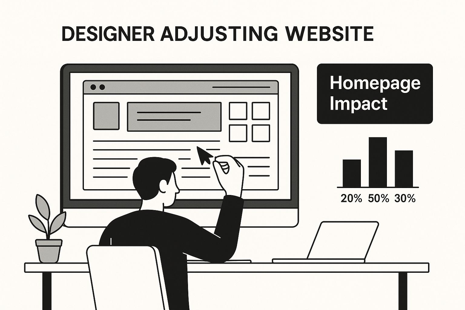
A clean, intuitive layout is non-negotiable. It has to guide visitors toward the actions you want them to take from the second they land on your site.
Set Up Meaningful Conversion Goals
If you aren't tracking specific actions, you're flying blind. You need to look beyond just the final sale and set up micro-conversions in your analytics to monitor the small but critical steps along the customer journey.
A micro-conversion is a small step a user takes on the path toward your main goal (the macro-conversion). Tracking these helps you see exactly where users are succeeding or dropping off in your funnel.
Some of the most valuable micro-conversions to track include:
- Adding a product to the cart
- Signing up for a newsletter
- Downloading a whitepaper or guide
- Watching a product demo video
Actionable Insight: If you see that 20% of users add an item to their cart, but only 3% complete the purchase, you don't have a product problem—you have a checkout problem. This tells you to focus all your energy on optimizing the payment and shipping steps.
By keeping an eye on these smaller commitments, you can see which parts of your search engine optimization strategy are working to engage users long before they pull out their credit card. This foundational data gives you a complete picture of your funnel's health, turning vague problems into specific, solvable challenges.
Designing a Frictionless User Experience
Once you’ve got a clear picture of your current performance, it's time to dive into what your visitors actually experience on your site. A confusing or frustrating user experience (UX) is the single fastest way to lose a potential customer. Smoothing out these friction points is everything when it comes to guiding visitors toward a conversion.
Your website’s design isn’t just about looking good; it's about creating a clear, intuitive path for people to follow. If they can’t find what they need in a few seconds, they're not going to stick around and play detective.
Make Site Navigation Intuitive
A visitor should land on your site and instantly get a sense of where to go next. When you hit them with complex menus, vague labels, or a chaotic site structure, you're just creating work for them. That's a recipe for a high bounce rate. The goal is to make finding information feel completely effortless.
Think of your navigation menu as a roadmap. It needs to be logical, concise, and built around what your most important customers are actually looking for.
- Simplify Your Main Menu: Keep your top-level menu items to the absolute essentials. Use plain language like "Services" or "Products" instead of confusing industry jargon like "Synergistic Solutions."
- Use a Prominent Search Bar: For an e-commerce site, place the search bar in the header, make it wide, and use placeholder text like "Search for products, brands…" to encourage use.
- Ensure a Clear Path to Checkout: The journey from adding an item to the cart to finishing the purchase has to be dead simple. For a deeper dive, check out our insights on optimizing the checkout process on our blog.
By making it easier for users to move through your site, you reduce their mental workload and let them focus on why they came to you in the first place: the value you offer.
Optimize for a Flawless Mobile Experience
Let's be clear: mobile optimization isn't just a feature anymore—it's a baseline requirement. A huge chunk of your traffic is coming from smartphones, and if your site is a pain to use on a small screen, you’re literally pushing customers away.
A responsive design that magically fits any screen size is just the start. You have to think about the mobile user's context. They're often on the go, multitasking, and have zero patience for slow-loading pages or clunky interfaces.
A seamless mobile experience requires more than just a responsive layout. It demands touch-friendly buttons, easily readable text without zooming, and forms that are simple to fill out on a small screen.
Actionable Insight: Open your website on your own phone and try to complete a purchase. Is your thumb accidentally tapping the wrong link? Is typing your address into a tiny form field frustrating? These small annoyances are conversion killers. Use larger tap targets (at least 48×48 pixels) and enable autofill on form fields.
This is one of the biggest areas where businesses drop the ball. A few small frustrations on a phone can lead directly to an abandoned cart and a lost sale.
Prioritize Blazing-Fast Page Speed
Page speed has moved beyond being a simple tech metric. It's now a core part of the user experience with a massive impact on your bottom line. Slow pages are a major source of frustration and a direct cause of high bounce rates. Every single second you can shave off your load time directly helps your conversion rate.
The impact of loading speed on conversions is huge. Research analyzing over 1,200 websites found a direct link between faster pages and more sales. Specifically, sites that load in one second can see conversion rates three times higher than sites that take five seconds to load. It gets even better: they perform up to five times higher than sites that lag for 10 seconds.
This means if your site takes five seconds to load, you could potentially triple your conversions just by getting that down to one second. Here are a few things you can do right now to speed things up:
- Compress Your Images: Giant image files are the most common culprit for slow pages. Use a tool like TinyPNG or an image optimization plugin to compress your images without making them look grainy.
- Enable Browser Caching: This trick stores parts of your site in a visitor's browser, so it doesn’t have to reload every single thing when they come back. Most website platforms offer a simple plugin or setting for this.
- Minimize HTTP Requests: Every image, script, and CSS file on your page creates a separate request to your server. Consolidating these files can slash the number of requests and speed things up significantly.
A fast, clean, and logical site design removes barriers, builds trust, and makes the journey from a curious visitor to a happy customer as smooth as possible.
Writing Copy and CTAs That Actually Convert

While a smooth, frictionless design gets people in the door, it’s your words—your copy and your calls to action (CTAs)—that convince them to stay and buy. Think of your copy as your best salesperson, working 24/7. To be effective, it has to be sharp, persuasive, and completely dialed into what your visitor needs.
Great copy does more than just list features. It taps into the reader's problems and emotions, positioning your offer as the only logical solution.
Craft Headlines That Communicate Instant Value
Your headline is your first—and sometimes only—shot. You have about three seconds to grab a visitor’s attention and assure them they’re in the right place. A vague, clever-sounding headline that doesn't immediately explain what you do is a guaranteed conversion killer.
The best headlines are specific and laser-focused on the benefit. Forget the corporate jargon like "Innovative Cloud Solutions." Instead, go for something that speaks directly to a customer's goal: "Get 50% More Done with Our Automated Cloud Workflow." The first one is forgettable; the second promises a real, tangible result.
Here are a few headline formulas I’ve seen work time and time again:
- Promise a specific benefit: "Finally, an Accountant Who Saves You More Than They Cost."
- Address a pain point directly: "Stop Wasting Hours on Invoicing. Automate It in 5 Minutes."
- State your value proposition clearly: "The Easiest Way to Build a Professional Website for Your Business."
A strong headline makes a promise. The rest of your page needs to deliver on it.
Write Body Copy That Solves Problems
Okay, the headline did its job. Now the body copy has to hold their attention and build the case. The trick is to stop talking about yourself—your company history, your team, your features—and start talking about the customer.
A simple but incredibly powerful framework is Problem-Agitate-Solve. Show them you understand their problem, poke the bruise a little, and then present your product as the ultimate relief.
Practical Example: Imagine you're selling a project management tool.
- Problem: "Tired of juggling spreadsheets, emails, and sticky notes to track your projects?"
- Agitate: "Important deadlines get missed, team communication breaks down, and you spend more time managing the chaos than doing the actual work."
- Solve: "Our tool brings all your tasks, files, and conversations into one clear dashboard, so you can deliver projects on time, every time."
This approach shifts the focus from what your product is to what it does for the customer. People don't buy a drill; they buy the ability to hang a picture. Your copy should always sell the outcome, not just the tool.
It’s a subtle shift, but it’s everything. Every sentence should answer the visitor's unspoken question: "What's in it for me?"
Design CTAs That Drive Action, Not Hesitation
Your Call to Action is the moment of truth. It's where you ask for the conversion. It’s also where so many websites completely drop the ball with weak, generic, and uninspired language. Words like "Submit," "Click Here," or "Download" are functional, but they don’t create any desire.
A powerful CTA is a benefit-driven command. It tells the user exactly what they're getting and why they should be excited about it.
Take a look at this CTA from Wikipedia). It's direct, but there's room for improvement.
"Donate to Wikipedia" is clear, but something like "Keep Wikipedia Free" connects the action to the value. Your CTA text should always reinforce why they should click.
Let's compare some common options:
| Vague & Passive | Action-Oriented & Specific |
|---|---|
| Submit | Get My Free Marketing Plan |
| Learn More | See Pricing and Plans |
| Subscribe | Join 10,000+ Smart Marketers |
The second column feels completely different, right? It creates momentum and eliminates uncertainty by telling the user exactly what happens next.
And don't forget the design. Your CTA button needs to pop. Use a contrasting color that stands out, make it big enough to easily tap on a phone, and give it plenty of white space so it doesn't get lost. Your copy and CTAs are the engine of your conversion machine—tune them up, and you’ll see the results.
Building Trust to Overcome Hesitation
Let's be honest: every single person who lands on your website arrives with a healthy dose of skepticism. They don't know you. They don't know if your product is any good. And in the back of their mind, they're always a little worried about getting ripped off.
Before you can even think about asking for the sale, you have to break down that wall of doubt. Building trust isn't a one-and-done task; it's about weaving multiple signals of credibility and security into the very fabric of your site. The goal is simple: make potential customers feel so secure and confident that buying from you feels like the smartest decision they could make.
Showcase Authentic Social Proof
One of the fastest ways to build credibility is to let your happy customers do the selling for you. When a new visitor sees that other people just like them have had a great experience, their defenses immediately start to come down. That's the power of social proof.
But it has to feel real. A generic, one-sentence review like "Great product!" just doesn't cut it anymore—it feels fake. You need to focus on gathering genuine, detailed feedback that tells a real story.
- Customer Testimonials: Don't just post a quote. Add a name, a photo, and maybe their company or city to give it a human touch. For example: "This software saved our team 10 hours a week." – Jane Doe, CEO of a real company.
- Detailed Case Studies: This is where you show, not just tell. A solid case study walks through a customer's problem, shows exactly how your solution fixed it, and—most importantly—provides real numbers to back it up (e.g., "Helped them increase lead generation by 45% in three months").
- Third-Party Reviews: Displaying ratings from trusted platforms like Google, Yelp, or industry-specific review sites gives you unbiased validation you could never create yourself.
Actionable Insight: Don't just bury this stuff on a "Testimonials" page. Sprinkle these powerful trust signals on your homepage, product pages, and especially near the checkout to give people that final nudge of confidence right when they need it most. Place a key testimonial right below your main "Buy Now" button.
Be Radically Transparent
Nothing kills a conversion faster than hidden fees and last-minute surprises. On the flip side, radical transparency shows you respect your customers and builds a foundation of trust that can seriously improve website conversion rates. Being completely upfront isn't just a nice-to-have; it's non-negotiable.
This starts with crystal-clear pricing. No confusing tiers, no hidden charges. If you charge for shipping, show those costs early in the process, not as a nasty surprise on the final checkout screen.
Transparency goes way beyond pricing. A clear, easy-to-find return policy can dramatically reduce cart abandonment. When people know they have an easy way out if something isn't right, they feel much safer hitting that "buy" button.
Practical Example: On your product page, include a small section called "Shipping & Returns" with two simple bullet points: "Free 3-day shipping on all orders" and "Easy 30-day returns, no questions asked." This simple addition can overcome major purchase anxiety.
Your privacy policy and terms of service should also be easy to find in your website's footer. Sure, not everyone will read them word-for-word, but just having them there sends a powerful signal that you're a professional operation with nothing to hide.
Display Visible Security and Authority Signals
Finally, you need to provide clear visual cues that your website is a safe place to do business. These trust signals often work on a subconscious level, reassuring visitors that their personal and financial information is locked down tight.
Make sure these elements are front and center, especially on pages where you're asking for sensitive info, like your checkout page or contact forms.
To give you a clearer picture, I've broken down the most common trust signals and the specific worries they help solve for your customers.
Essential Trust Signals and Their Impact
| Trust Signal Type | Primary User Concern Addressed | Implementation Example |
|---|---|---|
| Security Badges | Is my payment information safe? | Displaying well-known logos like Norton, McAfee, or SSL certificates (e.g., "Secured by SSL"). |
| Payment Logos | Do you accept my preferred payment method? | Showing logos for Visa, Mastercard, PayPal, and other options you accept. |
| Professional Guarantees | What happens if I'm not satisfied? | Clearly stating your money-back guarantee or satisfaction policy near the "buy" button. |
| Contact Information | Are you a real business I can reach? | Providing a physical address, a phone number, and a clear path to get in touch. |
This table is a great starting point for auditing your own site. Each signal addresses a specific, common fear that can stop a sale in its tracks.
And when visitors have questions, make it dead simple for them to reach a real person. If you're looking for an example of how to present this information effectively, you can get in touch with our team through our own professional contact us page.
Ultimately, every single element on your site either builds trust or chips away at it. By focusing on genuine social proof, radical transparency, and visible security signals, you create an environment where visitors feel comfortable, confident, and ready to convert.
Creating a System for Continuous Optimization
Boosting your website's conversion rate isn't a one-and-done task. It’s a constant process of learning, testing, and tweaking. The websites that consistently outperform their competitors aren't just getting lucky or throwing massive, risky redesigns at the wall to see what sticks.
Instead, they have a deliberate, data-driven system for continuous optimization. This approach turns small, incremental improvements into massive long-term growth. It’s about moving beyond gut feelings and building a reliable engine to understand what your users really want.

Choosing the Right Testing Method
Before you start running experiments, you have to know what tools are in your toolbox. There are three main ways to test changes, and each one is built for a different job. Picking the right one is absolutely critical for getting clean, actionable results you can trust.
- A/B Testing: This is your workhorse. You test just one change at a time, pitting your current version (the "control") against a new version (the "variation"). Example: Testing a green "Buy Now" button against a red one to see which gets more clicks.
- Split URL Testing: Think bigger. This is like A/B testing, but for entire pages. You're testing two completely different designs hosted on separate URLs. Example: Testing a single-column product page layout against a two-column layout.
- Multivariate Testing: This is the advanced, high-traffic option. It lets you test multiple changes on a single page all at once. Example: Testing two headlines, three images, and two CTAs simultaneously to find the best combination.
For most businesses just getting started, A/B testing is the perfect entry point. It's straightforward and gives you clear insights into how small changes can make a big difference.
Forming a Strong Hypothesis
Every single test you run must start with a solid hypothesis. Without one, you’re just guessing, and your results will be all over the place. A good hypothesis is a clear, testable statement that follows a simple but powerful structure: "If I change [X], then [Y] will happen, because [Z]."
Let's break that down:
- The Change (X): What, specifically, are you altering?
- The Expected Outcome (Y): What metric are you trying to improve?
- The Rationale (Z): Why do you think this will work? What data or insight supports it?
A strong hypothesis isn't just a guess; it's an educated prediction based on data or user feedback. It forces you to think critically about why a change might work, turning a random shot in the dark into a structured experiment.
Practical Example: A weak idea is, "Let's test a new headline." A strong hypothesis is: "If we change the headline from 'Our Marketing Software' to 'Save 10 Hours a Week on Marketing Tasks,' then we will increase demo sign-ups, because our customer surveys show that time-saving is the most desired benefit." See the difference?
Uncovering the Why with Qualitative Tools
Your analytics can tell you what users are doing, but they can't tell you why. That's where qualitative tools come in. They add the human story to your data, helping you see your site through your customers' eyes.
Heatmaps are fantastic for this. They give you a visual map of where users click, scroll, and hover. You might discover that dozens of people are clicking on a beautiful image that isn't actually a link—a clear sign of user frustration and a golden opportunity for a quick UX win.
Session recordings take it a step further. You can literally watch a video of a user's entire journey on your site. See them hesitate on a form, get lost in your navigation, or completely miss your main call to action. These recordings are where the "Aha!" moments happen—the ones that lead to your most impactful tests.
The goal here is steady, relentless improvement. In 2025, the average global eCommerce website conversion rate hovers around 3.34%. But the top-performing sites are hitting over 11%, and that gap is only getting wider. They do it by experimenting constantly. You can check out more conversion rate benchmarks on amraandelma.com.
When you build a system that combines quantitative data with these qualitative insights, you create a powerful feedback loop. Data shows you where the problem is, user behavior tools show you why it's happening, and a strong testing process lets you prove your solution works. That cycle is the key to systematically driving your conversion rates higher.
Common Questions About Website Conversion
As you start digging into optimizing your site, you're going to have questions. Everyone does. Getting a handle on these key concepts from the get-go helps you set realistic goals and keeps you focused on what actually moves the needle. Let's run through some of the most common questions that come up when we talk about improving website conversion rates.
What Is a Good Conversion Rate?
This is the big one, and the honest answer is always: it depends. There’s no magic number for a "good" conversion rate. It's a moving target that changes wildly depending on your industry, business model, the price of your product, and even where your traffic is coming from.
A high-end B2B software company, for instance, might be thrilled with a 0.5% conversion rate on demo requests. On the other hand, an e-commerce store selling everyday consumer goods might be shooting for 3-5% on actual sales. The real goal is to stop worrying about generic benchmarks and start focusing on your own performance.
Instead of chasing an arbitrary industry average, your only job is to consistently improve your own baseline. If your rate was 1.5% last quarter and it's 1.8% this quarter, you're winning.
Use industry averages as a loose guidepost, but make your main objective a steady, incremental improvement of your own numbers, month after month. That's how you build real momentum.
How Long Does It Take to See Results from CRO?
Let's be clear: Conversion Rate Optimization (CRO) is a marathon, not a sprint. Sure, a simple A/B test on a call-to-action button might give you a clear winner in a couple of weeks (assuming you have enough traffic), but significant, lasting gains come from a long-term, systematic process.
Setting the right expectations is everything. You aren't looking for one magical tweak that doubles sales overnight. You're aiming for a series of small, data-driven wins that compound on each other over time.
A single, proper testing cycle can easily take a month or more from start to finish. A typical process might look something like this:
- Data Gathering & Hypothesis (1-2 weeks): Poring over analytics, heatmaps, and user feedback to spot a problem and form a solid hypothesis.
- Test Development (1 week): Actually designing and building the new version for your experiment.
- Running the Test (2-4 weeks): Letting it run long enough to gather statistically significant data.
- Analysis & Implementation (1 week): Crunching the numbers and pushing the winning variation live.
True, sustainable growth in conversions is measured in quarters, not days.
What Are the Biggest Mistakes in Conversion Optimization?
Knowing what not to do is just as important as knowing what to do. So many businesses get fired up about optimization only to make a few common, avoidable mistakes that completely derail their efforts.
Here are the top pitfalls to watch out for:
- Testing Without a Hypothesis: Randomly changing button colors "to see what happens" is gambling, not a strategy. Every single test needs to be built on a clear "if we change X, then Y will happen, because…" hypothesis that’s backed by data or real user insight.
- Stopping Tests Too Soon: It's so tempting to call a test when one version pulls ahead after a few days. Don't do it. You absolutely must wait until your test reaches statistical significance (usually a 95% confidence level) to be sure the results aren't just a fluke.
- Ignoring Qualitative Feedback: Your analytics tell you what is happening, but they can't tell you why. If you ignore the goldmine of qualitative data from user surveys, session recordings, and feedback forms, you're missing the human story behind the numbers—and the most powerful ideas for your next test.
Steer clear of these traps, and you'll build a much more disciplined, effective, and ultimately more profitable optimization process.
Ready to turn these insights into action? At Website Services-Kansas City, we specialize in comprehensive website audits and SEO strategies that pinpoint your biggest opportunities for growth. Let our experts build a data-driven plan to improve your website conversion rates.