If you're not using dedicated landing pages for your marketing campaigns, you are absolutely leaving money on the table. A landing page is a single, standalone web page built for one specific marketing campaign. It’s the place a visitor lands after they click a link in an ad, an email, or a social media post, and it’s designed with a single, focused goal.
Why Landing Pages Are a Non-Negotiable Growth Tool
Let's get right to it. Sending paid traffic or your hard-earned email subscribers straight to your homepage is one of the most common—and costly—mistakes I see businesses make.
Think of your homepage as a general store. It’s built to serve all kinds of visitors with different goals. It’s cluttered with navigation menus, multiple links, and competing calls to action, all fighting for attention.
A landing page, on the other hand, is a specialist. It’s a focused, distraction-free environment engineered to achieve one specific goal. This laser focus is precisely why it’s so powerful.
The Power of a Single Goal
Imagine a visitor clicks on your ad for a "Free SEO Audit."
If they end up on your homepage, they suddenly have to hunt for that audit offer among your blog, services, and about pages. It’s a confusing experience, and most people will just get frustrated and leave.
But what if they land on a page dedicated only to the free SEO audit? The path forward is crystal clear. The headline reinforces the offer they just clicked, the copy quickly explains the benefits, and a single form asks for their information. This clarity dramatically boosts the odds of them converting.
By removing navigation menus and other distracting links, a landing page keeps the user focused on the one action you want them to take. This simple change creates a direct, uninterrupted journey from ad click to lead capture, and it can skyrocket your conversion rates.
The data backs this up, and the numbers are pretty staggering. Landing pages have proven to be one of the most effective tools for turning visitors into customers, blowing traditional signup methods out of the water.
Take a look at how different signup methods stack up.
Conversion Rate Comparison Standard Website Elements vs. Dedicated Landing Pages
This table offers a quick, at-a-glance comparison of how well different website elements convert visitors, highlighting just how dominant dedicated landing pages are.
| Signup Method | Average Conversion Rate |
|---|---|
| Dedicated Landing Pages | 4.0% |
| Wheel of Fortune Forms | 2.9% |
| Standard Signup Boxes | 0.6% |
The difference is stark. While a standard signup box might convert less than 1% of visitors, a well-designed landing page converts 160% better than other signup methods. It's not just a minor improvement; it’s a completely different level of performance.
This graphic really drives the point home, visualizing the huge gap in conversion rates.
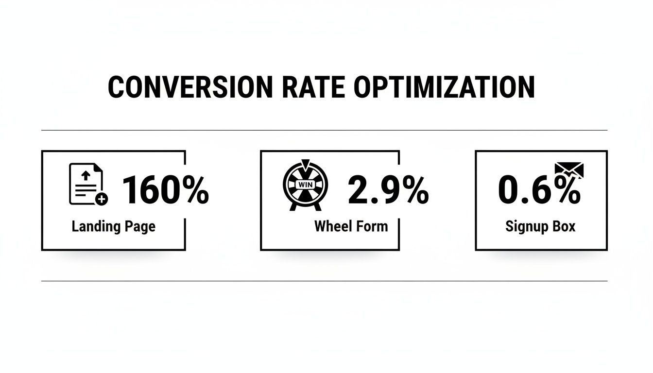
The data makes it obvious: a dedicated landing page isn't just a "nice-to-have." It’s an essential tool for driving action.
More Than Just Conversions
Beyond the raw conversion numbers, effective landing pages give your business several other key advantages:
- Generate Deeper Insights: By tracking performance on a campaign-specific page, you get clean, unambiguous data on what messaging, offers, and designs truly resonate with your target audience.
- Improve Ad Campaign Performance: Ad platforms like Google reward relevance. Sending traffic to a highly relevant landing page improves your Quality Score, which often leads to lower ad costs and better ad positions.
- Support Business Goals: Whether your goal is generating leads, selling a product, or growing your email list, a dedicated landing page is the most direct and effective tool to get you there.
This focused approach is a cornerstone of any successful SEO for lead gen strategy. By perfectly aligning your ad, your offer, and your landing page, you create a seamless experience that guides potential customers straight toward becoming valuable leads.
Mapping Your Strategy Before You Build
Jumping straight into a landing page builder without a clear plan is like starting a road trip without a map. You might end up somewhere interesting, but it almost certainly won't be your intended destination.
A high-converting landing page is won or lost long before you choose a single color or font. This upfront strategic work is what separates pages that get results from those that just take up server space. It’s all about defining exactly what you want to achieve and who you need to persuade to do it.
Without this clarity, you're just guessing.
Define One Crystal-Clear Goal
Your landing page needs one job, and one job only. Trying to make it do too many things is the fastest way to kill its effectiveness. Every single element on the page—every word, image, and button—must serve this single purpose.
Is your goal to:
- Generate leads? The page should be built around capturing an email in exchange for a valuable resource, like an ebook, webinar, or free consultation.
- Sell a specific product? The entire page must zero in on the benefits of that single item, leading the user directly to a "Buy Now" button.
- Schedule demos? Your main call-to-action (CTA) should be a big, bold "Book a Demo" button, supported by copy that highlights what the user will gain from the call.
A landing page with multiple offers can gut your conversion rates by up to 266%. By giving visitors a single, focused path, you eliminate decision fatigue and make it ridiculously easy for them to take the one action that matters most.
For example, a Kansas City plumbing company running a Google Ad for "emergency pipe repair" should send people to a page exclusively about that service. The goal is to get the visitor to call a phone number right now, not to browse the company's blog or learn about kitchen remodeling.
Get Inside Your Audience's Head
Once you have your goal, you need to understand the person on the other side of the screen. Generic personas like "Small Business Owner Sarah" are a start, but you need to go way deeper to write a message that actually connects.
Think about the real problems and motivations that drive their decisions. What keeps them up at night? What are they secretly afraid of? What outcome do they desperately want?
Your landing page copy needs to speak directly to these core drivers. This means shifting from talking about what your product does to what it does for them. Frame your offer as the clear and obvious solution to their specific pain point.
Conduct Smart Competitive Analysis
Finally, you need to know what you're up against. A quick look at your competitors' landing pages can reveal huge opportunities. You're not looking to copy them; you're looking for gaps and ways to stand out from the noise.
Check out the pages of both your direct local rivals and the big national players in your industry.
- What's their main offer? Are they giving away a guide, a free trial, or a discount?
- What language do they use? Note the headlines and key benefit statements they're pushing.
- What proof do they provide? Look for testimonials, case studies, or trust badges.
- What are they missing? Maybe their page is slow, the copy is weak, or the offer just isn't compelling. These are your openings.
This process also helps you understand the search landscape. To truly compete, you need to know what users are looking for. A crucial part of this is learning how to conduct keyword research to see the exact phrases your audience uses. This ensures your message aligns perfectly with their search intent, making your page more relevant and effective from the moment they land.
By identifying these elements, you can build a landing page that doesn't just enter the conversation—it leads it.
Crafting a Message That Resonates and Sells
Alright, you’ve got your goal locked in and you know exactly who you’re talking to. Now it's time to translate that strategy into an actual blueprint for your landing page. This is where you sketch out the structure and the message that will walk a visitor from curious clicker to happy customer.
Forget about fancy design software for now. Seriously. A pen and paper or a simple whiteboard is all you need to create a powerful wireframe.
A wireframe is just the skeleton of your page. It’s a low-fi map that shows where everything goes, making sure the story you’re telling flows logically before you ever get bogged down in colors and fonts. Your only focus here is placing the key pieces that build your argument and drive people to act.

Blueprinting Your Core Elements
Before a single word of copy gets written, you need to map out where these critical sections will live. Each one has a specific job to do in persuading your visitor.
- The Hero Section: This is the first thing anyone sees. It absolutely must have your magnetic headline, a subheadline that adds a little more detail, and your main call-to-action (CTA) button.
- Social Proof: Right below the hero, plan a spot for testimonials, client logos, or star ratings. Trust is the currency of the internet.
- The Problem & Solution: Carve out some space to hit on the pain point your audience is feeling, then swoop in and introduce your offer as the perfect fix.
- Benefits Breakdown: Use bullet points or icons to quickly list the tangible results. How does your offer make their life easier, better, or more profitable?
- The Final CTA: Don't make them scroll back up. End the page with one last, strong call-to-action that restates the offer and makes it dead simple to convert.
This simple structure creates a narrative that hooks them, builds trust, solves their problem, and then clearly asks for the conversion.
Writing Headlines That Stop the Scroll
Your headline is, without a doubt, the most important piece of writing on the entire page. If it doesn't grab someone's attention and promise a clear benefit, nothing else matters. The rest of your page might as well be invisible.
A great headline speaks directly to the visitor's dream outcome.
Let's imagine a local Kansas City lawn care company. Their first draft might be: "Professional Lawn Care Services." It’s true, but it’s also a total snooze-fest.
A much better, benefit-driven headline? "The Greenest Lawn on the Block, Without Lifting a Finger." See the difference? This version sells the result, not the process. It taps into that desire for a beautiful yard and the pure convenience of having someone else do the work.
Your headline has one job: get the user to read the next sentence. Focus on a clear, compelling benefit that solves a problem or fulfills a desire. Data shows you have about 8 seconds to capture someone's attention online—your headline is your first and best shot.
Crafting Body Copy That Builds a Case
Once the headline has their attention, the body copy has to deliver on that promise. This is where you lay out the undeniable case for your offer, but it’s critical to ditch the corporate jargon and avoid just listing features.
The trick is to connect every single feature back to a real-world benefit for the user.
- Feature: Our mowers use advanced mulching blades.
- Benefit: Which means your lawn gets natural fertilizer with every cut, making it healthier and more vibrant.
- Feature: We offer flexible scheduling.
- Benefit: So you can get a perfectly manicured lawn without disrupting your busy week.
This approach turns boring technical details into compelling reasons to buy. For a deeper dive into this technique, check out our guide on how to write website copy that actually connects with people.
The Irresistible Call-to-Action
Finally, we get to the CTA. It needs to be clear, direct, and feel like the most logical next step. Please, avoid generic and passive words like "Submit" or "Click Here." Instead, use action-oriented language that reminds the user of the value they're about to get.
Let's stick with our lawn care example.
| Vague CTA | Compelling CTA |
|---|---|
| "Get a Quote" | "Get My Free Lawn Care Quote Now" |
| "Sign Up" | "Send Me Weekly Lawn Tips" |
| "Learn More" | "See Our Lawn Transformations" |
Notice how the compelling versions are specific and often use personal pronouns like "My" and "Me." This is a small psychological nudge that makes the offer feel more personal and customized, which can seriously boost clicks. Your CTA isn't just a button; it's the final, clear instruction that guides your visitor over the finish line.
Building Your Page with the Right Tools
Alright, you’ve got your blueprint and the copy that will do the heavy lifting. Now it’s time to move from paper sketches to a real, live page. This is where your landing page finally starts to take shape, and the good news is you absolutely don’t need to be a coding expert to build something that looks sharp and actually converts.
The key is picking the right tool for the job. For most businesses, this choice boils down to two main paths.

WordPress and Page Builders: The Flexible Powerhouse
If you already have a WordPress site, using a page builder plugin is almost always the most logical and cost-effective route. This approach gives you total control over the design and functionality, all within the ecosystem you’re already familiar with.
Tools like Elementor or Beaver Builder have drag-and-drop interfaces that make building a page feel like putting together digital LEGOs. You can start with a pre-designed template and then tweak every single element—colors, fonts, spacing, images—to perfectly match the wireframe you mapped out earlier.
This method offers incredible flexibility and ensures your new landing page blends in seamlessly with your main site's branding. To get started, you'll need a solid foundation. Our guide on how to choose a WordPress theme can help you pick a lightweight, compatible theme that won’t slow your page down.
All-in-One Landing Page Platforms: The Speedy Specialist
The other option is to use a dedicated, all-in-one landing page platform like Leadpages, Instapage, or Unbounce. These services are built for one thing and one thing only: creating high-converting landing pages, fast.
Their biggest advantage is speed and simplicity. They come loaded with hundreds of industry-specific, conversion-tested templates. You just pick one that fits, drop in your copy and images, and connect your email service with a few clicks.
Here’s a quick breakdown to help you decide.
| Factor | WordPress + Page Builder | All-in-One Platform (e.g., Leadpages) |
|---|---|---|
| Cost | Often lower upfront cost (one-time plugin fees) | Monthly subscription fee |
| Control | Maximum flexibility and customization | Limited by the platform's features |
| Speed | Can be slower to set up initially | Extremely fast to launch a page |
| Integration | Seamless with your existing WP site and plugins | Requires connecting to your domain |
For a business just starting out or running a quick, one-off campaign, a platform like Leadpages can be perfect. But for anyone wanting long-term control and deep integration with their main website, the WordPress route is tough to beat.
The Build Process: A Quick Walkthrough
Once you've picked your tool, the build process is pretty straightforward—just follow your wireframe. You’ll start by recreating the hero section, dropping in your headline and subheadline. From there, you'll build out the sections for social proof, benefits, and your final call-to-action.
This is also where you need to set some performance benchmarks. Conversion rates can vary wildly from one industry to the next, and knowing the numbers for your sector is key to setting realistic goals. For example, the SaaS industry sees a median conversion rate of 3.8%, while financial services and education are much stronger at 8.3% and 8.4%. Knowing this helps you gauge success from day one. You can read the full research about landing page statistics and industry benchmarks on Backlinko.com.
Remember, the goal isn't just to build a page, but to build a conversion machine. As you build, constantly ask yourself "Does this element serve my one primary goal?" If the answer is no, it doesn't belong on the page.
Finally, you’ll connect your form to your email marketing service (like Mailchimp or ConvertKit) and set up your CTA button. With those pieces in place, you’ll have a functional, professional-looking page ready for the final optimization steps.
Optimizing Your Page for Speed and Visibility
You’ve built a gorgeous landing page. The copy is sharp, the call-to-action is crystal clear, and the design is pixel-perfect. But what happens if that page takes an eternity to load or never even shows up in a Google search? All that hard work evaporates.
A stunning page that no one can find, or that frustrates visitors into leaving, is essentially a billboard in the desert. This is where we get into the technical tune-up—the final polish that ensures your page actually gets seen and delivers an experience that makes people want to convert.
Mastering On-Page SEO Essentials
Let’s be clear: on-page SEO for a landing page isn't about cramming keywords into every available space. It's about sending clean, unmistakable signals to search engines about what your page is about and who it's for. This is how you get discovered by the right people.
For a landing page, the two most critical elements you have to nail are your title tag and meta description. These are the first things people see in the search results, and they're your one shot to earn that click.
- Title Tag: This needs to be a punchy, compelling headline (under 60 characters) that grabs attention and includes your main target keyword. If you're a Kansas City SEO agency offering a free audit, a great title would be: "Free SEO Audit for KC Businesses | Get Your Custom Report"
- Meta Description: Think of this as your short sales pitch (under 160 characters). While it doesn't directly influence your ranking, a killer description convinces users to choose your link over the others. It should build on the title, tease a key benefit, and include a call to action.
Your title tag is the ad headline, and the meta description is the ad copy. Your goal isn't just to rank; it's to craft a search result so irresistible that people feel like they have to click it.
The Brutal Link Between Speed and Conversions
Page speed isn't some nerdy technical metric; it's a cold, hard conversion factor. In a world of instant everything, every millisecond you make a visitor wait is costing you money. Frustrated people don't hang around to fill out forms.
The numbers are more shocking than most marketers realize. The connection between how fast a page loads and its conversion rate is almost perfectly correlated. Pages that load in under one second boast an incredible 31.79% conversion rate. That number plummets to just 9.68% for pages that take five seconds to load. We're talking about a more than 3x drop in conversions for a tiny four-second delay. You can see more of this data on the impact of load times on LanderLab.io.
The takeaway here is brutally simple: even a one or two-second delay can absolutely devastate your landing page’s performance.
Actionable Steps for a Lightning-Fast Page
Making a page faster sounds technical, but you don't need to be a developer to make a huge difference. A few simple moves can have a massive impact.
- Crush Your Images: Huge, unoptimized images are the #1 killer of page speed. Use a free tool like TinyPNG or a WordPress plugin to slash your image file sizes, often without any noticeable loss in quality. That 2MB hero image can easily be shrunk to under 200KB.
- Turn On Caching: Caching is like making a photocopy of your page so it doesn't have to be built from scratch for every single visitor. If you're using WordPress, a caching plugin like W3 Total Cache or WP Rocket can be set up in minutes and works wonders.
- Minimize Code Bloat: Page builders are amazing, but they can sometimes add a lot of extra, unnecessary code. Stick with a lightweight theme and only keep the plugins you genuinely need active.
Why Mobile Optimization Is Non-Negotiable
This isn't a suggestion; it's a rule. Over half of all web traffic now comes from smartphones. If your landing page is a clunky, hard-to-use mess on a phone, you're willingly ignoring the majority of your potential audience.
Responsive design is the bare minimum today. This just means your page layout automatically adjusts to fit any screen, big or small. Most modern page builders handle this out of the box, but you absolutely have to test it yourself.
Pull out your phone and check for these things:
- Readability: Can you read the text easily without pinching to zoom in?
- Tap Targets: Are buttons and links big enough to be tapped with a thumb without accidentally hitting something else?
- Form Usability: Is it easy to fill out your form on a small screen? Keep forms short and make sure the fields are large enough.
A landing page that works just as beautifully on a phone as it does on a desktop isn't a feature—it's a fundamental requirement for success.
Launch, Analyze, and Iterate Toward Perfection
Hitting "publish" isn't the finish line; it's the starting gun. A truly effective landing page is a living document, constantly evolving based on how real people interact with it. The real growth comes from listening to your data, making intelligent adjustments, and embracing a mindset of continuous improvement. This is where you transform a good page into a high-performing conversion machine.
The process of learning how to create a landing page doesn't stop once it's live. In fact, the most valuable insights come from what happens next. You need to become a strategic optimizer, watching how users behave and using that information to make smarter decisions.
Setting Up Your Analytics Dashboard
You can't improve what you don't measure. The first order of business is setting up a system to track user behavior. For most businesses, Google Analytics is the perfect tool for this, and it’s completely free. By installing a simple tracking code on your page, you can start monitoring the metrics that truly matter.
But don't get lost in a sea of data. Focus on a few key performance indicators (KPIs) that directly reflect your page's success.
- Conversion Rate: This is the big one. What percentage of visitors are completing your desired action (e.g., filling out the form, making a purchase)? This is your ultimate measure of success.
- Bounce Rate: What percentage of visitors leave after viewing only that one page? A high bounce rate could signal a disconnect between your ad and your page, slow load times, or a weak opening message.
- Session Duration: How long are people sticking around? Longer session times often suggest that your copy and offer are engaging and compelling.
- Traffic Sources: Where are your visitors coming from? Knowing this helps you understand which marketing channels are delivering the most qualified traffic.
Our guide on how to track website traffic provides a more detailed walkthrough on setting up these essential tracking tools.
Embracing the Power of A/B Testing
Once you have a baseline of data, you can start experimenting. A/B testing, also known as split testing, is the practice of creating two versions of your page to see which one performs better. You show version A to half of your audience and version B to the other half, then measure which one achieves a higher conversion rate.
This process removes all the guesswork from optimization. Instead of wondering if a new headline would work better, you can test it and know for sure.
The key to successful A/B testing is to test only one element at a time. If you change the headline, the button color, and the main image all at once, you’ll have no idea which change was responsible for the lift (or drop) in conversions.
Start with tests that have the potential for the biggest impact.
- Test Your Headline: Pit your original benefit-driven headline against a more direct, question-based one.
- Experiment with Your CTA: Try changing the button text from "Get Your Free Quote" to "See My Price Now."
- Vary Your Main Image: Test a picture of your product against an image of a person enjoying the benefits of your product.
Even a small, incremental win from an A/B test can compound over time. A 1% improvement every month adds up to significant gains over the course of a year. This iterative process of launching, analyzing, and tweaking is the secret behind the world's best-performing landing pages. It's not about achieving perfection on day one, but about committing to the journey of getting better every single day.
Ready to build a website that not only looks great but also drives real business results? At Website Services-Kansas City, we specialize in creating high-performing WordPress sites and executing SEO strategies that get you noticed. Let us help you turn your online presence into your most powerful asset.