Let's be honest, chasing more and more traffic can feel like you're on a hamster wheel. Instead, what if you focused on the one metric that actually grows your bottom line? I'm talking about your conversion rate.
Learning how to increase ecommerce conversion rate isn't about finding some short-term hack. It’s a core business strategy. Just think about it: a small lift from 1.5% to 3% can literally double your revenue without spending a single extra dime on ads.
Your Most Important Metric for Sustainable Growth

So many store owners get fixated on bringing more people to their site. While traffic is obviously important, it's only half the story. The real engine for sustainable growth is conversion rate optimization (CRO)—the practice of turning more of your existing visitors into paying customers.
It’s about making your store more efficient, not just bigger.
Think of it this way: if your website is a bucket riddled with holes, just pouring more water (traffic) into it won't solve a thing. CRO is about plugging those holes, one by one.
What Is a Good Conversion Rate?
One of the most powerful levers for growing an ecommerce store is simply outperforming the global average, which usually hovers between 1.6% and 2.9%.
For a new Shopify or WordPress store, just getting from 1.5% to 3% is a massive win that can double your revenue without touching your ad budget. A local retailer in Kansas City with 5,000 monthly visitors could see their orders jump from 75 to 150 with that kind of lift—that's the same impact as doubling your ad spend.
Historically, as competition got fiercer, conversion rates became the central lever for profitability. Experts predict a recovery to around 2.7% in 2025, driven by stores finally getting serious about user experience and personalization.
The goal isn’t just to get more clicks; it’s to get more value from every single click you already have. This mindset shift is the foundation of a profitable online store.
The True Impact of Small Improvements
The real beauty of CRO is that small, incremental improvements compound over time. You don't need a complete, budget-busting website overhaul to see results.
More often than not, the biggest gains come from truly understanding your customers, refining your website’s user experience, and building genuine trust. These are the pillars of sustainable growth.
A few key areas where small changes tend to yield big results include:
- Clarifying your value proposition on your homepage and product pages. For example, instead of just saying "High-Quality T-Shirts," say "The Last T-Shirt You'll Ever Need to Buy. Guaranteed for Life."
- Simplifying the checkout process to remove friction and unnecessary steps.
- Building trust with authentic customer reviews and transparent policies.
- Optimizing page speed, especially for mobile users who will bail on a slow site in seconds.
Focusing on these areas will get you meaningful progress. But remember, before you can optimize anything, you have to know your numbers. Tracking your visitors is the first step, and our guide on how to track website traffic can help you get that squared away.
For a deep dive into the whole process, check out this ultimate guide to ecommerce conversion rate optimization. It's a fantastic resource.
If you're looking for some immediate actions you can take, I've put together a quick-win table. These are simple changes you can implement this week to start plugging those leaks.
Quick Wins to Boost Your Conversion Rate This Week
| Actionable Tactic | Potential Impact | Difficulty Level |
|---|---|---|
| Add a Countdown Timer for a Limited-Time Offer | Creates urgency, can lift sales by 5-10% | Easy |
| Place Customer Testimonials Near the 'Add to Cart' | Builds immediate social proof, reducing hesitation | Easy |
| Enable Guest Checkout | Reduces friction, can capture 10-15% more orders | Medium |
| Compress All Product Images | Improves page speed, lowering bounce rates | Medium |
| Display Trust Badges (SSL, Payments) in the Footer | Increases perceived security and builds trust | Easy |
These tactics aren't a complete strategy, but they are proven methods for getting a quick lift while you work on the bigger picture. Pick one or two and get started.
Finding the Hidden Friction Points in Your Store

Before you start obsessing over button colors or rewriting product descriptions, you need to put on your detective hat. Trying to optimize your store without solid data is nothing more than expensive guesswork. The first real step in learning how to increase ecommerce conversion rate is a full-blown conversion audit to find exactly where your store is leaking cash.
This isn't about vague theories; it's about moving from assumptions to action. Instead of just wondering why people aren't buying, you’re about to see precisely where they get stuck, confused, or just plain frustrated.
Uncovering Clues in Google Analytics
Your first port of call is Google Analytics. It's a powerhouse of a tool, and it’s free. Don't let the dashboards intimidate you; for now, we're just focused on a couple of key reports that will tell you where the problems are happening.
Start with the Top Exit Pages report (under Engagement > Pages and screens). This one is brutally honest—it shows you the very last page a visitor sees before they give up and leave. If you’re seeing a lot of your product pages or, even worse, your checkout pages on this list, you've found a major leak that needs to be plugged, fast.
Next, jump over to the Behavior Flow report (or Path exploration in GA4). This gives you a visual map of the paths people take through your store. You're hunting for weird loops where users bounce back and forth between two pages, or massive drop-offs at a specific step in the buying journey. Those are your friction points.
Watching Your Customers in Action
Once you know where the problems are, it's time to figure out why they're happening. This is where you get to be a fly on the wall, using user behavior tools to see how real people actually interact with your site.
-
Heatmaps: Tools like Microsoft Clarity or Hotjar create a visual overlay on your site, showing you exactly where people click, move their mouse, and scroll. A heatmap might reveal that nobody is clicking your main call-to-action because it's buried below the fold and they never even see it.
-
Session Recordings: Think of this as a DVR for your website. You can watch completely anonymous recordings of user sessions from start to finish. You’ll see the exact moment they hesitate, where they rage-click in frustration, or why they abandon their cart at the final step.
Honestly, watching a handful of session recordings is one of the most eye-opening things a store owner can do. You will spot flaws in your design or confusing copy that you would have never noticed on your own.
Your Practical Conversion Audit Checklist
Run through this checklist to systematically poke and prod the most critical parts of your store. Look for anything that creates friction, doubt, or confusion for a potential customer.
Homepage & Category Pages
- Is your value proposition crystal clear the second someone lands on the page?
- Are your product categories named logically, or are you using confusing jargon? Actionable insight: Test "Women's Jackets" vs. "Outerwear Collection" to see which gets more clicks.
- Do your product filters actually work? Do they offer options people care about?
Product Pages
- Are your product images high-quality? Do they show the product from multiple angles, in context?
- Is the "Add to Cart" button big, bold, and impossible to miss?
- Are your shipping and return policies easy to find before the checkout?
Checkout Process
- Do you offer a guest checkout option? Forcing account creation is a known conversion killer.
- Are there any surprise fees that show up at the very last minute?
- Is the process mobile-friendly, with big buttons and minimal typing required?
As you go through your audit, pay close attention to site speed. A slow-loading page is death by a thousand cuts for your conversion rate. If you want to go deeper on this, check out our guide on how to improve website loading speed.
By the time you're done, you'll have a data-backed hit list of the biggest conversion blockers on your site, ready to be systematically knocked down.
Turning Product Pages into Persuasion Engines

This is it. The final sales pitch. Your product page is where a casual browser decides to become a paying customer, and it's one of the most critical leverage points for anyone learning how to increase ecommerce conversion rate. A weak page leaks revenue. A great one answers questions, builds desire, and makes clicking "Add to Cart" feel inevitable.
Think about all the effort you put into ads, social media, and SEO. It all leads visitors right here. Don't let that momentum die with a generic, uninspired page. It's time to transform your product listings from simple descriptions into powerful persuasion engines.
Write Descriptions That Sell Outcomes, Not Specs
Far too many product descriptions are just a dry list of technical specifications. And while features are important, people buy outcomes. They want to know how your product will solve their problem or make their life better. This is where benefit-driven copywriting becomes your most powerful tool.
Instead of just stating "100% organic cotton," try reframing it as, "Breathe easier in fabric that’s softer on your skin—and gentler on the planet." That simple shift connects the feature (the cotton) to a tangible benefit (comfort and shared values).
To get this right, you need to speak your customer's language.
- Scan your reviews: What words and phrases do your happiest customers use? Mirror that language right back at new shoppers.
- Focus on verbs: Use active, outcome-driven verbs. Words like "glides," "absorbs," and "protects" help shoppers instantly imagine the results.
- Keep it scannable: Use short paragraphs, bullet points, and icons to break up text. Shoppers scan; they don't read essays.
Writing compelling copy is a skill that directly impacts your sales. For a deeper dive, our article on how to write website copy is an excellent resource to build on these principles.
Showcase Your Product Like a Pro
In ecommerce, your product photos and videos have to do all the heavy lifting of "touch and feel." Since a customer can't physically hold your product, your visuals must fill that sensory gap and build unshakable confidence. Blurry or inconsistent images instantly create doubt and signal a lack of professionalism.
Here’s a practical checklist for leveling up your product visuals:
- Multiple High-Resolution Angles: Show the front, back, sides, and close-ups of key details. Every new angle answers a potential question.
- In-Context Shots: Show the product in use. A handbag on a model's shoulder or a piece of furniture in a styled room helps customers visualize it in their own lives.
- Size and Scale References: Include a photo with a common object or a person to prevent surprises about the product's actual size.
- Short Demo Videos: A 15-second video showing a feature in action can be more persuasive than a hundred words. Show how that backpack zipper glides or how that blender crushes ice effortlessly.
The goal of your visuals isn't just to show the product; it's to help the customer mentally simulate ownership. When they can clearly imagine using and enjoying your product, their hesitation to buy drops significantly.
Build Instant Credibility with Social Proof
Shoppers trust other shoppers more than they trust brands. It's that simple. This is why social proof is not a "nice-to-have"—it's an essential element of a high-converting product page. It provides that third-party validation that reduces perceived risk.
Strategically display different forms of social proof right where the decisions are being made.
- Customer Reviews and Ratings: Place them prominently, ideally above the fold. And don't hide negative reviews; a few less-than-perfect ratings make the positive ones seem far more authentic.
- User-Generated Content (UGC): Showcase photos and videos from real customers using your product. This is incredibly powerful for apparel, home goods, and beauty products.
- Real-Time Purchase Notifications: Subtle pop-ups like "Sarah from Austin just purchased this" create a sense of demand and normalize the buying decision.
Finally, don't be afraid to create a sense of urgency, but do it authentically. Instead of fake countdown timers, use real data. Low-stock alerts like "Only 3 left in stock!" or "Selling fast!" are effective because they are based on genuine inventory levels.
To delve deeper into transforming your product pages into high-performing sales tools, consult this ultimate guide to product page optimization for higher conversions.
Designing a Frictionless Checkout Experience
You’ve done everything right. You created killer product pages, earned a shopper's trust, and guided them all the way to the final step—only for them to vanish into thin air.
This isn’t just bad luck. It’s the harsh reality of e-commerce: nearly 70% of all online shopping carts are abandoned right before the finish line.
This is the final, most crucial hurdle in your entire conversion strategy. Every single click, form field, and unexpected fee at this stage is a point of friction. Your job is to become obsessed with eliminating that friction, making the payment process feel effortless, secure, and completely transparent.
Ditch the Forced Commitment
The number one reason for cart abandonment isn't what you think. It's not price—it’s being forced to create an account. In an age of instant gratification, forcing someone to stop, invent a password, and confirm an email is a guaranteed way to lose the sale.
The solution is incredibly simple: always offer a prominent guest checkout option.
When you let customers check out as a guest, you remove a massive psychological barrier. You're telling them their time is valuable and that you care more about their convenience than your data collection. You can always ask them to create an account on the thank-you page after the sale is locked in.
Simplify Your Forms Relently
Your checkout form needs to be a masterclass in efficiency. It should only ask for the absolute bare minimum needed to process the order. Every optional field—"How did you hear about us?", "Company Name," the second address line—is another chance for someone to get distracted and leave.
- Cut every unnecessary field: Do you really need a second address line? Is a phone number mandatory? Be brutal in your edits.
- Use smart defaults and auto-fill: Let the browser do the heavy lifting. Enable auto-fill to instantly populate shipping and billing details, saving your customer precious time.
- Enable address lookup: Let users start typing their address and select the right one from a dropdown. This simple feature cuts down on typos and speeds things up dramatically.
The checkout is not the place for marketing surveys. Its sole purpose is to take a payment as quickly and smoothly as possible. Treat every form field as a potential conversion killer and make it justify its existence.
Eliminate Sticker Shock and Build Trust
Nothing kills a deal faster than an unexpected cost. A shopper has a price in their head when they click "checkout." Seeing that total jump up with surprise shipping fees and taxes is a primary reason they'll bail.
You have to be transparent from the very beginning.
- Show all costs upfront: Use a shipping calculator app or plugin to display estimated shipping and taxes right there in the shopping cart, not just on the final payment screen.
- Use a progress indicator: A clear visual bar showing steps like "Shipping > Billing > Payment" manages expectations and shows the customer exactly how close they are to being done.
- Display trust badges: Prominently feature security logos from your payment processors (Visa, Mastercard, PayPal) and your SSL certificate. These simple visual cues are powerful reassurances that their financial data is safe. If you're unsure about this critical security layer, you can learn more about how to install an SSL certificate to protect your store and your customers.
Embrace Modern Payment Options
Today’s shopper, especially on mobile, expects speed. Fumbling to type a 16-digit credit card number on a tiny screen is a major point of friction. Integrating one-click payment options isn't a luxury anymore; it's a necessity.
Services like Shop Pay, Apple Pay, and Google Pay let users complete a purchase with a fingerprint or facial scan. This is especially vital for closing the gap between desktop and mobile conversion rates. While desktop users convert around 3.8%, mobile users are way behind at closer to 1.8%. Every bit of friction on a small screen is a direct hit to your bottom line.
Optimizing your mobile checkout with one-click payments is one of the most reliable ways to capture that lost revenue. By offering these modern, frictionless methods, you cater to the impatient shopper and reclaim a massive portion of otherwise lost sales.
Building the Trust That Drives Conversions
In the faceless world of online shopping, trust is the only currency that matters. Think about it: shoppers don’t abandon carts because they suddenly dislike your product. They leave because something feels off, risky, or uncertain.
Building a fortress of trust around your brand isn’t just a nice-to-have—it’s one of the most reliable ways to boost your ecommerce conversion rate, turning hesitant visitors into confident buyers. It all starts with sending clear, unmistakable trust signals. Think of them as the digital equivalent of a firm handshake and a clean, well-lit storefront.
The Essential Trust Signals Every Store Needs
Before a customer even looks at your products, their brain is subconsciously scanning your site for signs that you’re the real deal. If those signals are missing, doubt creeps in, and you’ve lost the sale before it ever began.
Here are the non-negotiables you absolutely must have:
- Visible Security Badges: Don’t make people hunt for them. Display logos for your payment processors (Visa, Mastercard, PayPal) and your SSL certificate right in your footer and throughout the checkout. These are universally recognized symbols of safety.
- A Crystal-Clear Return Policy: Never, ever hide your return policy. Summarize the key benefit—like "45-day hassle-free returns"—on your product pages, in the cart, and at checkout. Removing that friction is a massive step toward securing the purchase.
- Accessible Customer Support: Make it ridiculously easy for customers to get in touch. A visible phone number, an email address, or a helpful live chat shows that there’s a real, accountable team behind the website.
A friendly, easy-to-find return policy is more than just a customer service tool; it’s a powerful conversion lever. It tells shoppers, "We stand behind our product, and you have nothing to risk by trying it."
The Power of Making Customers Feel Seen
Once you’ve established that baseline of security, the next level of trust comes from personalization. This is where you graduate from being a generic online store to a trusted advisor who actually gets your customer.
And no, personalization isn’t about creepy, invasive tracking. It’s about using the data customers willingly give you—through their browsing history and past purchases—to create a more relevant, helpful shopping experience.
Leveraging Data for a Tailored Experience
Even a small business on Shopify can implement powerful personalization tactics. The goal is to make every customer feel like your store was built just for them.
A great place to start is with personalized product recommendations. When a customer is looking at a product, your site should be smart enough to suggest complementary items or similar products that other shoppers bought. This isn’t just a trick to increase your Average Order Value (AOV); it shows you understand what the customer is trying to accomplish.
Another powerful tool is the targeted email campaign. Stop blasting your entire list with the same generic promotion and start segmenting your audience.
Here are a few practical examples:
- For the First-Time Visitor: Send a welcome email with a small discount and showcase your best-selling products. It’s the perfect introduction to your brand.
- For the Repeat Customer: Acknowledge their loyalty. Give them an exclusive offer or early access to new arrivals. You can also send them restock notifications for items they’ve checked out before.
- For the Cart Abandoner: Set up an automated email to remind them of the items they left behind. A gentle nudge like, "Still thinking it over?" can recover a surprising percentage of those lost sales.
These simple, data-driven actions make customers feel understood and valued. This deepens their trust in your brand, securing not just the first sale but also fostering the kind of long-term loyalty that fuels real, sustainable growth.
Creating Your Continuous Improvement Plan
Getting a great ecommerce conversion rate isn't a one-and-done project. It’s a continuous cycle of improvement. The stores that really kill it are the ones that treat conversion rate optimization (CRO) as a core part of their business—always testing, always learning, and always refining based on what real users are doing.
This commitment to gradual, data-backed improvement is what separates the top performers from everyone else. When you adopt this mindset, you can finally move beyond guesswork and start building a real system for sustainable growth. It's about creating a culture where every change is a chance to learn more about your customers.
Building this kind of system always starts with trust, which is the foundation of any good optimization plan.
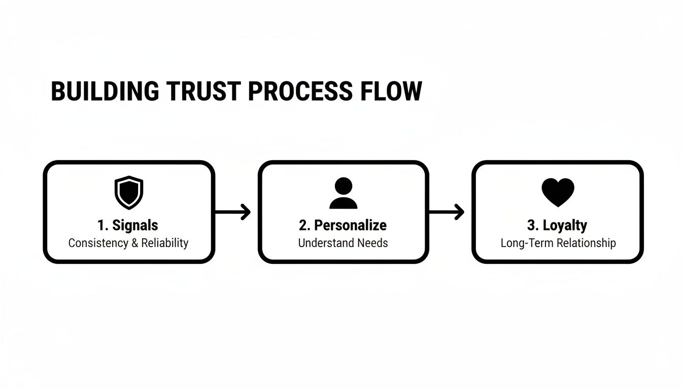
This process shows how establishing solid trust signals, personalizing the experience, and building loyalty all work together to drive more conversions.
Prioritizing Your Optimization Ideas
So, you've got a long list of potential changes. Where do you even begin? The trick is to prioritize based on potential impact versus the effort required. Not every idea is created equal, and focusing on the right ones first is how you build momentum.
I use a simple framework to score ideas:
- High-Impact, Low-Effort: These are your quick wins. Think clarifying your return policy on product pages or adding a guest checkout option. Tackle these immediately.
- High-Impact, High-Effort: These are the big projects, like a full checkout redesign. They promise huge returns but need serious planning and resources.
- Low-Impact, Low-Effort: These are minor tweaks you can knock out when you have spare time, like changing a button color.
- Low-Impact, High-Effort: Just avoid these. They eat up valuable resources for almost no gain.
The goal is to build momentum with high-impact, low-effort changes. These early wins provide the data and revenue needed to justify more resource-intensive projects down the line.
Embracing A/B Testing
Once you've got your prioritized list, it's time to test your hypotheses. A/B testing is just showing two different versions of a page to your visitors to see which one performs better. It takes all the guesswork out of optimization.
Tools like VWO or the features within Google Analytics 4 make it easy to test variations of headlines, calls-to-action, and page layouts without needing a developer. For example, you could test a CTA button that says "Get 20% Off Today" against one that says "Claim Your Discount" to see which one drives more clicks.
By consistently testing and implementing the winning versions, you ensure every single change is backed by real user data. But to see how far you've come, you need a solid baseline. Conducting regular website performance benchmarking helps you track key metrics over time, so you can actually measure your success and build that culture of continuous improvement.
Got Questions About Conversion Rates? We've Got Answers.
Even with a solid game plan, a few questions always seem to pop up when you're digging into how to increase ecommerce conversion rate. Let's tackle some of the most common ones I hear from store owners, with clear answers to help you move forward.
What Is a Good Ecommerce Conversion Rate to Aim For?
Everyone wants that magic number, but the truth is, a "good" rate is all about context. The global average usually hovers between 2-3%, but that figure can be wildly different depending on your industry. A food and beverage brand might easily hit 5%, while a store selling high-end furniture could be crushing it at 1.5%.
Instead of getting hung up on a universal number, your real focus should be on consistent, internal improvement. Beating the 2.5% benchmark is a great first goal to set.
Remember, doubling your conversion rate from 1% to 2% has the exact same impact on your revenue as doubling your ad spend. It's just a far more efficient and sustainable way to grow your business.
How Can I Improve My Mobile Conversion Rate Specifically?
This is a huge one, especially since mobile traffic so often crushes desktop. The first step is to nail the basics: your site absolutely must have a responsive design that looks and works flawlessly on a small screen. No excuses.
From there, simplify everything. Your menu needs to be clean and thumb-friendly, and the search bar should be front and center. But the biggest lever you can pull is optimizing your mobile checkout experience.
- Enable one-click payments like Apple Pay, Google Pay, or Shop Pay. This is non-negotiable.
- Slash your form fields down to the absolute essentials.
- Use big, easy-to-tap buttons for all your CTAs and form selections.
Finally, run your site through Google's PageSpeed Insights. Fixing slow-loading elements is one of the fastest ways to stop mobile visitors from bouncing right before they buy.
Many store owners are shocked to learn that mobile converts at about half the rate of desktop. Closing that gap by relentlessly removing friction for mobile users is one of the biggest revenue opportunities available today.
Where Should I Start if I Have a Limited Budget for CRO?
If you're working with a tight budget, you have to focus on high-impact, low-cost moves. The first thing you need to do is diagnose the problem—and you can do that for free.
Hop into Google Analytics and find your top 5 pages with the highest exit rates. These are the biggest leaks in your sales funnel. Next, install a free heatmap and session recording tool like Microsoft Clarity. Watching how real users interact with those broken pages will give you a clear, data-backed to-do list.
More often than not, you'll uncover simple fixes, like clarifying some confusing product copy or just making your "Add to Cart" button more visible. On top of that, prominently displaying customer reviews and trust badges costs you nothing but can seriously boost a shopper's confidence—and your conversion rate.
Ready to stop guessing and start growing? At Website Services-Kansas City, we specialize in turning website traffic into revenue through data-driven SEO and conversion optimization. Let us help you build a more profitable online store.
