Optimizing your website for a mobile screen is all about creating an experience that just works for people on the go. It means your design has to be responsive enough to look good on any device, your pages need to load lightning-fast, and the whole user experience has to be tailored for someone scrolling with their thumb. In today's world, this isn't a "nice-to-have"—it's the bare minimum.
Why Mobile Optimization Is a Business Imperative
In a world where our phones are practically glued to our hands, a mobile-optimized website is no longer just a feature—it's a fundamental part of doing business. If you ignore this reality, you're essentially putting up a "closed" sign for a huge chunk of your potential customers. The shift to mobile isn't some fleeting trend; it's a permanent change in how people find, research, and connect with companies online.
This whole transformation is driven by user behavior, but it's being heavily reinforced by search engines. Google's mobile-first indexing means it primarily uses the mobile version of your site to figure out its rankings. So, if your site delivers a clunky, frustrating mobile experience, your visibility in search results will take a hit across all devices, not just phones. For local businesses, this is even more critical, as most "near me" searches happen on mobile devices, directly impacting foot traffic and local sales.
The Undeniable Growth of Mobile Traffic
The sheer scale of mobile internet use is hard to wrap your head around. By 2025, over 64% of all global web traffic will come from mobile devices. That's a jaw-dropping leap from just 0.72% back in 2009. We're talking about an 8,837.5% explosion in growth in about 16 years, cementing mobile's total dominance. You can get more details on this mobile traffic surge over at hammeragency.eu. The data tells a very clear story: your customers are overwhelmingly using their phones to find you.

A slow or awkward mobile site doesn’t just frustrate people; it actively damages your brand's reputation and hurts your bottom line. Every extra second of load time and every misplaced button makes it more likely that a potential customer will just leave and never come back.
The Business Case for Mobile Optimization
Failing to optimize for mobile has direct, painful consequences. A bad mobile experience leads to higher bounce rates, lower engagement, and—most importantly—fewer conversions. In a competitive market, that can easily be the difference between thriving and just barely surviving. To get a real sense of the impact, it’s worth seeing how your site stacks up by conducting a thorough website performance benchmarking.
Ultimately, optimizing for mobile is about meeting your audience where they already are. It all boils down to:
- Improving Search Rankings: A mobile-friendly site is a non-negotiable factor for ranking well in Google, especially for local SEO.
- Boosting User Engagement: A smooth, intuitive experience encourages visitors to stick around longer and explore what you have to offer. For instance, a local restaurant with an easy-to-navigate mobile menu will see more reservations than one with a clunky PDF.
- Increasing Conversions: A streamlined journey from discovery to checkout on a mobile device makes it dead simple for customers to buy from you. This could mean a "click-to-call" button for a plumber or a simple appointment form for a salon.
Building a Winning Mobile User Experience
Let's be honest, optimizing your website for mobile isn't just about making sure your desktop design doesn't completely fall apart on a smaller screen. It's a fundamental shift in thinking. You have to get inside the head of someone using their phone and design an experience that feels completely natural to them.
A truly great mobile experience is intuitive and effortless. Every button, every line of text, feels like it was placed there just for the person holding the device. A clunky, frustrating interface doesn't just annoy visitors—it actively sends them running to your competitors. The experience on mobile directly shapes engagement, and a staggering 74% of users are more likely to come back to a site that’s mobile-friendly. You can find more practical advice on these mobile design best practices at webstacks.com.
Embrace Thumb-Friendly Design
Stop and think about how you hold your phone right now. Chances are, you’re using one hand, with your thumb doing all the heavy lifting. This simple, everyday observation is the entire basis of thumb-friendly design, a concept that is absolutely critical for mobile.
It means putting your most important interactive elements—your main call-to-action buttons, navigation menus, and key links—right where the thumb can easily reach them. That sweet spot is usually in the center or bottom portion of the screen. Forcing someone to awkwardly stretch their thumb to the top corners to do something important creates friction and leads to annoying mis-clicks. Actionable Tip: Use a "sticky" bottom navigation bar with icons for Home, Services, and Contact so these key actions are always within thumb's reach, no matter how far a user scrolls.
A seamless mobile UX is not about adding more features; it’s about removing obstacles. The goal is to make it incredibly easy for users to find what they need and accomplish their tasks with minimal effort.
Prioritize Readability and Spacing
Reading on a small screen can be a real strain on the eyes. To make sure your content is easy to digest, you need to zero in on two things: your fonts and your spacing.
- Readable Fonts: Stick with clean, simple web-safe fonts like Open Sans or Roboto. Ditch the overly decorative or script fonts that are a nightmare to read on a phone. Crucially, make sure your body text is at least 16px. Anything smaller forces people to pinch and zoom, which is a classic sign of a poor mobile experience.
- Generous Spacing: On mobile, white space is your best friend. Plenty of breathing room between paragraphs, around buttons, and within text blocks makes your content feel less intimidating and much easier to scan. Actionable Tip: Set your line height (the space between lines of text) to at least 1.5. This small CSS adjustment can dramatically improve readability on a dense mobile screen. It also helps prevent "fat finger" errors, where someone accidentally taps the wrong link because the targets are jammed too close together.
By focusing on these elements, you're not just creating a visually appealing site; you're building an effective website user experience design that respects your visitors' time and attention.
Adopt a Mobile-First Philosophy
The single most effective way to nail your mobile optimization is to design for the small screen from the very beginning. This is the heart of the mobile-first approach. Instead of building a complex desktop site and then trying to cram and shrink it down, you start with the most constrained view—the phone.
This simple switch in process forces you to prioritize what's truly essential. When you focus on the core content and functionality for mobile users first, you naturally end up with a cleaner, faster, and more focused experience. From there, you can progressively enhance the design for larger screens, adding in bells and whistles that make sense in a desktop environment. This approach doesn't just lead to a better mobile site; it results in a more efficient and user-centric design across every single device.
Actionable Steps to Increase Mobile Site Speed
A fast website isn't a luxury anymore; it's a non-negotiable, especially on mobile where patience is thin and connections can be spotty. If your site takes more than a few seconds to load, a huge chunk of your audience will just hit the back button and never return.
Improving your mobile site speed isn’t about guesswork. It’s about making specific, impactful changes that deliver measurable results.
Your first move is always to diagnose the problem. Free tools like Google PageSpeed Insights are invaluable here, giving you a clear performance score and a punch list of exactly what's holding your site back. It grades your site on key metrics like Largest Contentful Paint (LCP), giving you a real-world report card on your mobile user experience. Actionable Tip: Don't just look at the overall score. Scroll down to the "Opportunities" section, which provides specific recommendations like "Serve images in next-gen formats" or "Eliminate render-blocking resources." Tackle these one by one.
Compress and Modernize Your Images
One of the most common speed killers I see is large, unoptimized images. They can bloat your page size and bring loading to a grinding halt.
The fix is a one-two punch: compression and modernization.
Image compression cuts down the file size without a noticeable drop in quality. But even more important is using modern image formats. WebP, for instance, offers file sizes that are 25-34% smaller than traditional JPEGs and PNGs while keeping the same visual quality. This single change can drastically reduce page weight. To get into the nitty-gritty, check out our guide on how to optimize images for the web.
Leverage Browser Caching
Imagine a visitor returns to your site. Instead of re-downloading every single element—your logo, your CSS files, your images—their browser can just pull those files from a local storage space called a cache. That's what browser caching does.
By telling browsers to store static assets locally for a set period, you make repeat visits feel almost instant. It's a simple yet powerful way to improve speed and create a much better experience for loyal customers and returning readers. Actionable Tip: For WordPress sites, plugins like WP Rocket or W3 Total Cache can configure browser caching for you with just a few clicks, no coding required.
The following infographic illustrates the core flow of creating a user-centric mobile experience, where speed plays a vital role in each step.
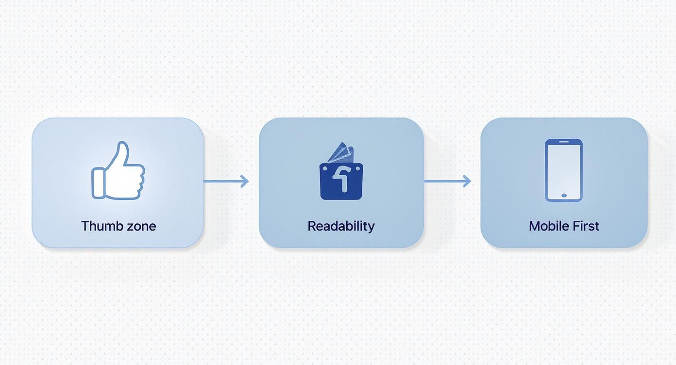
This process highlights how designing for the thumb zone, ensuring readability, and adopting a mobile-first approach are all interconnected pieces of a winning mobile strategy.
Minify Your Code and Use a CDN
Your website's code—HTML, CSS, and JavaScript—often contains unnecessary characters like spaces, comments, and line breaks. While helpful for developers, they just add to the file size. Minification is the process of automatically stripping out all that bloat, making the files smaller and faster for browsers to process.
Finally, think about where your visitors are coming from. If you have a national or even a global audience, a Content Delivery Network (CDN) is an absolute must-have.
A CDN stores copies of your website on a network of servers scattered around the world. When a user visits your site, the content is delivered from the server closest to them, dramatically cutting down latency and speeding up load times.
Instead of a user in New York waiting for data from a server in California, a CDN serves it from a nearby location on the East Coast. It’s a foundational piece for any business serious about providing a consistently fast experience to every visitor, no matter where they are.
To help you prioritize your efforts, here's a quick rundown of the most effective techniques for speeding up your mobile site.
Key Mobile Page Speed Optimization Techniques
This table summarizes the most effective techniques to improve mobile site loading times, their impact, and some recommended tools to get the job done.
| Technique | Impact on Speed | Recommended Tools |
|---|---|---|
| Image Compression & Modern Formats | High | TinyPNG, Squoosh, WordPress plugins (e.g., Imagify) |
| Browser Caching | High (for repeat visits) | Server-side configurations (.htaccess), plugins (e.g., W3 Total Cache) |
| Code Minification | Medium | Cloudflare, build tools (Webpack), online minifiers |
| Content Delivery Network (CDN) | High | Cloudflare, Bunny.net, Amazon CloudFront |
| Lazy Loading Images | Medium | Native HTML (loading="lazy"), JavaScript libraries, WordPress plugins |
Implementing even a few of these optimizations can lead to a noticeable improvement in your mobile site's performance, user experience, and ultimately, your search rankings.
Adapting Your Content and SEO for Mobile Search
A fast, responsive site is the technical ticket to the game, but your content and SEO strategy are how you actually score points with mobile users. You have to remember that people on their phones aren't just using a smaller screen; they're in a completely different headspace.
They're usually multitasking, looking for a quick answer on the go, or just scanning for information while waiting in line for coffee. This means that long, dense walls of text are a one-way ticket to a high bounce rate. To win on mobile, you have to structure your content for easy, on-the-go consumption.
Structuring Content for Scannability
The name of the game for mobile content is scannability. Your visitors should be able to get the gist of your entire article just by scrolling through it. This is where your formatting choices become your most powerful tools.
A few simple principles make all the difference:
- Keep paragraphs short. Seriously short. Aim for one to three sentences, tops. This creates much-needed white space and makes the text feel far less intimidating on a small screen.
- Use clear, descriptive subheadings. H3s and H4s break your content into logical chunks, acting like signposts that guide the reader down the page.
- Lean on bullet points and numbered lists. These formats are perfect for quickly summarizing features, steps, or key takeaways in a way that's super easy to digest.
For example, instead of writing a long, winding paragraph about the benefits of a product, just break them down into a simple bulleted list. The information becomes instantly accessible and much easier for a mobile reader to remember.
Targeting Mobile Search Intent and Voice Queries
Your SEO strategy needs a mobile-first tune-up, too. Keyword research is a different beast on mobile because the queries themselves change. People are far more likely to use longer, more conversational phrases, especially with the explosion of voice search.
Think about the difference between typing and speaking. Someone at a desktop might type "best coffee shop Kansas City." But on their phone, using voice search, they're much more likely to ask, "Where can I find a coffee shop near me that's open now?" This shift toward natural language means you should be targeting long-tail keywords that reflect how people actually talk.
Optimizing for voice search isn't just about keywords. It's about providing direct, concise answers that can be easily read aloud by a smart assistant. Structuring content in a Q&A format is a great tactic for capturing these featured snippets.
To really nail this, you have to understand the nuances of how users are finding you. That's why learning how to track website traffic is so critical; it gives you the hard data to see which queries are actually driving your mobile visits.
Earning Rich Snippets with Structured Data
On a crowded mobile search results page, rich snippets are your best friend. These are the enhanced results that show ratings, prices, FAQs, and more, directly on the results page. They make your listing pop and can dramatically improve your click-through rate.
The way you earn them is by implementing structured data (also known as Schema markup). This is a specific vocabulary of code that helps search engines understand the context of your content. For example, you can use Schema to explicitly tell Google:
- This is a recipe with these ingredients and a 4.5-star rating.
- This is an event happening on this date.
- This is a product that costs $49.99.
Actionable Tip: Use Google's free Rich Results Test tool. Just paste your URL, and it will show you which rich results your page is eligible for and flag any errors in your Schema markup. This is an easy way to debug and ensure your structured data is working correctly.
By giving search engines this clear, organized information, you seriously increase your chances of getting those eye-catching rich snippets that are so incredibly valuable on mobile.
Optimizing the Mobile E-Commerce Journey
For any e-commerce store, the mobile journey is where sales are won or lost. Let’s be honest: a clunky, complicated checkout process on a phone is a guaranteed way to send customers running, and they probably won't be back. Fixing this path isn’t just about making things look pretty; it's about systematically removing every single point of friction.
This has become absolutely critical as mobile commerce takes over the retail world. In fact, mobile devices are on track to drive over 70% of all e-commerce traffic by 2025, and they already make up around 59% of online retail sales worldwide.
With U.S. mobile purchases alone expected to hit $678 billion in 2024, a flawless mobile experience is no longer optional—it's essential for survival. You can dig into more of these mobile marketing stats over at webfx.com.

Simplify the Checkout Flow
The golden rule of mobile checkout is simplicity. Mobile users have notoriously short attention spans and even less patience for long, complicated forms. Your goal should be to get them from their cart to that final confirmation screen in as few taps as possible.
Start by being ruthless with your form fields. Do you really need their phone number, a fax number, and their middle name? Probably not. Stick to the absolute essentials you need to process the order and get it out the door. Actionable Tip: Enable a guest checkout option. Forcing users to create an account before they can buy is one of the biggest conversion killers in mobile e-commerce.
A great mobile checkout feels less like filling out paperwork and more like a simple conversation. Every field you can eliminate is a victory for the user experience and a step toward a higher conversion rate.
Another game-changer is adding one-click payment options. Services like Apple Pay, Google Pay, and Shop Pay let customers bypass the tedious process of digging out their credit card and typing in shipping details. This small feature can have a huge impact on reducing cart abandonment and is quickly becoming something shoppers expect to see.
Showcase Products with High-Quality Visuals
On a mobile screen, your product images are doing all the heavy lifting. Shoppers can't touch or feel the item, so your visuals need to be sharp, clear, and compelling enough to do the job for them. Low-quality, pixelated images scream untrustworthy and will kill a sale in a heartbeat.
Here’s how to make your visuals work for you:
- Use High-Resolution Images: Your photos need to be crisp and professional. Show the product from multiple angles so customers know exactly what they’re getting.
- Implement Zoom Functionality: A tap-to-zoom feature is non-negotiable. It lets people inspect the finer details, which builds confidence and helps them pull the trigger on a purchase.
- Optimize for Speed: While quality is key, you have to make sure these images are compressed. Huge, unoptimized image files will slow your page to a crawl, frustrating users before they even see your product.
These visual and checkout fixes are fundamental if you're looking for ways on how to increase online sales and build a loyal customer base. A smooth, visually rich mobile shopping experience is what turns casual browsers into repeat buyers.
Got Questions About Mobile Optimization? We’ve Got Answers
Even with a solid game plan, a few questions always seem to pop up once you start digging into mobile optimization. Let's tackle some of the most common ones I hear from clients with straightforward, actionable answers.
Think of this as your quick-reference guide for navigating those tricky spots and refining your mobile strategy.
Is Responsive Design All I Need for Mobile Optimization?
While responsive design is the absolute foundation, it’s not the whole story. A responsive theme makes sure your layout adapts to different screen sizes, which is a non-negotiable first step. But true mobile optimization goes much deeper.
It's also about:
- Performance: Mobile users are impatient. This means optimizing images, leveraging browser caching, and minifying your code—tasks that a responsive theme doesn't handle on its own.
- User Experience (UX): It’s about making sure your buttons are thumb-friendly, your navigation is dead simple, and your text is easy to read without anyone having to pinch or zoom.
- Content Strategy: Your content has to be scannable for people on the go. That means short paragraphs, clear headings, and getting straight to the point.
Responsive design gets you in the game, but it's the performance and UX optimizations that actually win it.
Think of responsive design as the car's frame. It’s essential, but you still need to tune the engine (speed) and design a comfortable interior (UX) for it to be a great vehicle. Without those, you just have a shell.
How Often Should I Test My Mobile Site Speed?
You can't treat mobile speed testing as a one-and-done task. It’s an ongoing process. As a good rule of thumb, you should run a comprehensive check at least once per quarter.
That said, you’ll want to test more frequently under specific circumstances:
- After any major site update, like a redesign or adding a new feature.
- Whenever you install a new plugin or any third-party script.
- If you notice a sudden drop in mobile traffic or a spike in your bounce rate.
Regular testing with tools like Google PageSpeed Insights helps you catch performance hiccups before they start hurting your user experience and your search rankings.
Will Pop-Ups Hurt My Mobile SEO?
Yes, they absolutely can. Google’s Intrusive Interstitial Penalty specifically targets pop-ups that get in the way of the mobile user experience. If a pop-up covers the main content, is a pain to close, or shows up the second someone lands on a page, it can drag down your rankings.
However, not all pop-ups are created equal. Those used for legal reasons (like cookie consent), age verification, or small, unobtrusive banners are generally fine. The key is to make sure your pop-ups don't block people from easily getting to the content they came for. When in doubt, always prioritize a clean, unobstructed user experience.
Ready to stop guessing and start seeing real results from your mobile optimization efforts? The team at Website Services-Kansas City specializes in creating fast, user-friendly WordPress sites that perform flawlessly on any device. From comprehensive SEO audits to expert development, we provide the tools and expertise to boost your online presence. Visit us at https://websiteservices.io to learn how we can help your business thrive.
