Before you even think about color schemes or font choices, you need an architectural plan for your website. This plan, your website's structure, is the blueprint that dictates how every piece of content connects and how users—and search engines—navigate your digital space. It's about creating a logical flow that makes your most important pages easy to find, which is a win for both your visitors and your search rankings.
Why a Solid Website Structure Is Your SEO Foundation

Think of it this way: building a website without a plan is like building a house without a blueprint. You might end up with a few nice-looking rooms, but the hallways could lead to dead ends, and finding the kitchen might feel like a maze. A well-organized site architecture is the bedrock of your online presence for two simple reasons: it makes users happy, and it makes search engines understand you.
When someone lands on your site, they want information, and they want it fast. A logical structure guides them intuitively, reducing frustration and keeping them from hitting the "back" button. With first impressions being 94% design-related, a confusing layout is one of the fastest ways to lose a potential customer.
Making Life Easy for Search Engine Crawlers
Google's crawlers aren't that different from human visitors. They need clear paths to follow as they discover and index your content. A logical, interconnected structure helps them see how your pages relate to one another, which content is most important, and how authority (or "link equity") flows through your site.
This whole process is called crawlability, and it's a huge factor in your rankings. An organized site helps search engine bots use their "crawl budget" efficiently, ensuring all your valuable content gets found. On the flip side, a messy structure can create orphaned pages that crawlers can't reach, essentially making them invisible to search engines. For example, if your "About Us" page is only linked from the footer, it signals lower importance than a "Services" page linked directly in your main navigation.
"Good website structure facilitates easy navigation for both users and crawlers. Apart from influencing user experience, it also affects the SEO ranking of a website in search engines."
Setting the Stage for Success
Getting your structure right from the beginning saves you from a world of headaches later on. It helps prevent common SEO nightmares like duplicate content and keyword cannibalization, which happens when your own pages start competing with each other for the same search terms. If you're looking for a deeper look at the technical details, you can learn more about how to improve website SEO in our full guide.
Let's quickly look at the core components we'll be breaking down.
Core Components of Effective Website Structure Planning
A quick overview of the essential pillars involved in planning your website's architecture, which will be detailed throughout this guide.
| Component | Primary Goal | Key Outcome for SEO |
|---|---|---|
| Audience & Keyword Research | Understand user needs and the language they use to search. | Align content with user intent, attracting qualified traffic. |
| Sitemap Creation | Create a visual blueprint of your site's hierarchy. | Ensure all pages are discoverable and logically organized. |
| Navigation Design | Build intuitive pathways for users to follow. | Improve user experience metrics and link equity distribution. |
| URL Optimization | Craft clear, descriptive, and consistent URLs. | Provide context to users and search engines, improving click-through rates. |
These four pillars work together to create a website that is both user-friendly and highly visible in search results.
By focusing on these elements, you're not just building a website; you're building an experience that performs. Let's get into the specifics of how to do it right.
Start with Audience and Keyword Research
Before you even think about sketching out a sitemap, you need to get inside the heads of the people you're building the site for. What language do they use? What problems are they trying to solve? A rock-solid website structure is built on this foundation—on hard data about your audience's needs and search habits, not on assumptions.
Jumping straight into design without this prep work is a classic mistake. It's like an architect designing a house without knowing who will live there or what rooms they need. You can end up with something that looks great but is fundamentally useless because it doesn't align with how people actually think and search. The whole point is to map your site's layout directly to your user's journey.
Uncovering User Intent
The real magic happens when you move past a simple list of high-volume keywords and start organizing them by user intent. Intent is the "why" behind a search, and understanding it is everything. It generally boils down to three core categories that will directly shape your content strategy.
- Informational Intent: These folks are in research mode. They're looking for answers, guides, and information. Think searches like "how to start composting" or "what is a zero-waste lifestyle?" These searches are perfect for blog posts, tutorials, and how-to guides.
- Navigational Intent: They already know you or a specific product and are just trying to get to the right page. A search for "Green Abode contact us" or "brand name login" falls into this bucket. These pages need to be easily found in your navigation.
- Transactional Intent: These users have their wallets out. They're ready to buy or take action, using terms like "buy," "discount," "bamboo toothbrush price," or "best reusable coffee pods." These keywords map directly to your product pages or service pages.
This flowchart shows how all these pieces fit together, moving from initial audience discovery to a logical content map.
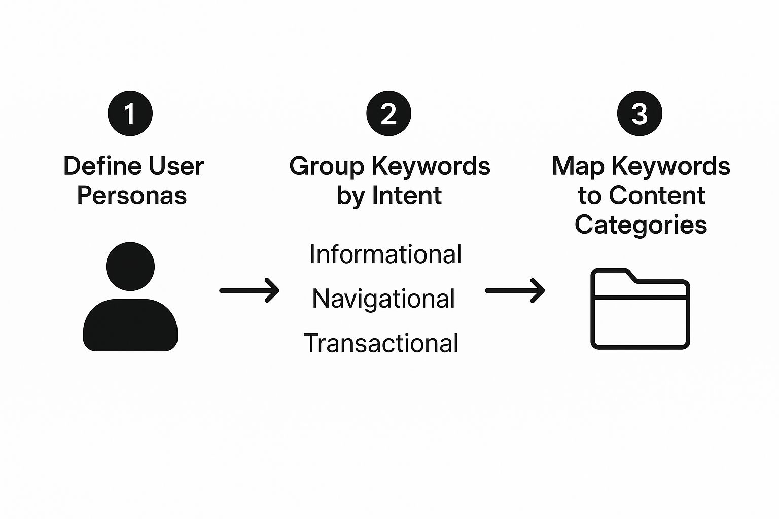
See how each step logically flows into the next? This process ensures your final website structure is directly tied to what real people are actually looking for.
A Practical Example: Eco-Friendly Home Goods
Let's make this real. Imagine you're building a site for an e-commerce store called "Green Abode" that sells sustainable home goods. Your research shows your ideal customer is an environmentally-conscious millennial homeowner who's new to the green scene and watching their budget.
Your keyword research starts to tell their story:
- Informational: They begin with broad questions like "how to reduce plastic waste at home." This is prime real estate for blog posts and in-depth guides like "A Beginner's Guide to a Plastic-Free Kitchen."
- Consideration: As they learn more, their searches get more specific: "best non-toxic cleaning supplies" or "compostable trash bags reviews." These are perfect for category pages or product comparison articles that help them make a decision.
- Transactional: Finally, they're ready to pull the trigger with searches like "buy Dr. Bronner's soap" or "Green Abode coupon code." These map straight to your product and checkout pages.
By organizing keywords this way, a logical hierarchy naturally emerges. You'd have a main "Blog" or "Learning Hub" for all that informational content. Your "Shop" section would then have clear categories like "Kitchen," "Bath," and "Cleaning," which drill down into more specific subcategories and products.
Analyze Your Competitors' Structure
Don't forget to do some digital snooping. A huge part of this process is checking out what your competitors are doing. I'm not just talking about their keywords; I mean digging into their actual website structure. How do they organize their main navigation? Are their product categories easy to follow? Where do they stick their blog content?
This is where you can find some golden opportunities. Maybe you notice a competitor crams all their "Kitchen" products into one massive category. But your research shows people search specifically for "food storage" versus "cookware." Right there, you've found a way to create a more intuitive and user-friendly structure than the competition.
A deep dive into your competitors' sites can give you a serious edge. For a more detailed guide on this, check out our walkthrough on conducting an SEO competitive keyword analysis. It will help you pinpoint not just their strengths but, more importantly, their weaknesses.
Ultimately, all this foundational research turns abstract user data into a tangible blueprint. You'll end up with a data-backed list of core topics and subtopics that will become the primary categories and pages of your site—all built on what your audience actually wants.
Create Your Blueprint with a Visual Sitemap
Okay, you’ve done the hard work of digging into what your audience wants and how they search. Now, it's time to turn all that research into an actual plan. This is where you create a visual sitemap—the blueprint that maps out every single page on your website and shows how they all connect.
Think of it like an architect's drawing for a house. You wouldn't just start building rooms randomly, right? The same goes for your website. Skipping this step is a classic mistake that leads to confusing navigation, dead-end pages, and a structure that both users and Google will hate. The goal here is to get a clear, logical hierarchy down on paper before anyone writes a line of code or picks out a single font.

Choosing the Right Website Structure
Not all websites are built the same. The structure you choose needs to directly support your business goals and the path your visitors will take. For most businesses, one particular model is the gold standard.
- Hierarchical Structure: This is the one you see most often, and for good reason. It looks like a pyramid or an org chart, with the homepage at the very top. From there, it flows down into main categories, which then branch out into subcategories and individual pages. It's the go-to for business sites, e-commerce stores, and blogs because it’s so intuitive and easy to scale.
- Sequential Structure: This model is all about guiding a user through a specific, step-by-step process. Think of an online course, a checkout funnel, or an onboarding sequence—anywhere you need someone to follow a pre-set path. A great practical example is the multi-page checkout process on an e-commerce site.
- Matrix Structure: This is a more complex setup where users can navigate in multiple ways, usually through filters and tags. You see this on massive e-commerce sites like Amazon or news platforms where people want to sort content by topic, date, or author.
For the vast majority of businesses I've worked with, the hierarchical model provides the best foundation for both user experience and SEO.
A clear hierarchy does more than just organize content; it signals importance to search engines. Pages closer to the top of the pyramid (your homepage) are generally seen as more authoritative, and a logical structure helps distribute that authority throughout your site.
Tools for Building Your Visual Sitemap
You don't need fancy, expensive software to map out your site. The goal is clarity, and you can get there with some surprisingly simple tools.
- Whiteboard or Sticky Notes: My personal favorite for a reason. It's low-tech but incredibly effective. Just write each page on a sticky note and arrange them on a wall. This makes it ridiculously easy to move things around and rethink how pages should connect.
- Spreadsheets: A simple Google Sheet or Excel file can do the trick. I usually set up columns to represent the different levels of the site: Level 1 for the Homepage, Level 2 for Categories (e.g., Services, About), Level 3 for Subcategories (e.g., SEO, Web Design), and so on.
- Sitemap Software: If you want something a bit more polished, dedicated tools can make the process a breeze. Platforms like GlooMaps, Miro, or Slickplan are built for this. They're great for collaboration and produce clean diagrams you can easily share with your team or clients.
Keep It Flat with the Three-Click Rule
As you’re mapping everything out, keep one crucial principle in mind: the "three-click rule." It’s a simple guideline suggesting that any page on your site should be accessible within three clicks from the homepage.
Now, it's not a rigid law, but it’s a powerful concept that pushes you to create a "flat" architecture—one with fewer layers of depth. This is a game-changer for two big reasons:
- It makes users happy: Visitors find what they need fast, without getting lost in a maze of menus.
- It helps search engines: Google’s crawlers can discover and index your pages far more efficiently, ensuring your best content doesn't get buried deep within the site.
This streamlined approach is more important than ever. With the global web design market projected to hit $92 billion by 2030, a simple, accessible structure is what separates a successful site from an abandoned project.
Design Intuitive Navigation and User Pathways

So, you've got your sitemap. Think of it as the architectural blueprint for your website. But blueprints don't build houses, and a sitemap alone won't guide your visitors. You need roads and signposts—and that’s exactly what your navigation provides.
A brilliant structure on paper means nothing if people can't easily find their way around. This is where we translate that logical hierarchy into an intuitive experience, guiding people effortlessly toward what they need.
Good navigation is so much more than a list of links in a header. It’s about creating clear, predictable pathways. When someone lands on your site, they should instantly get a feel for where they are, what’s possible, and where to go next. That clarity builds trust, reduces frustration, and keeps people engaged.
Crafting the Main Navigation Menu
The main navigation menu is your visitor's primary tool for exploration. It has to be simple, logical, and a direct reflection of the top-level categories from your sitemap. The goal here is instant understanding, even for a first-time visitor who knows nothing about your brand.
One of the biggest mistakes I see businesses make is cramming their navigation with internal jargon or overly clever labels. A user looking for pricing isn't going to click on "Our Value Proposition." They're scanning for "Pricing" or "Plans." Always stick to clear, universally understood terms that match what people are actually looking for.
Here’s a practical approach:
- Clarity Over Cleverness: Use simple, descriptive labels. If you run an e-commerce store, "Men's," "Women's," and "Sale" will always beat vague terms like "Explore" or "Collections."
- Limit the Options: A cluttered menu is an overwhelming menu. Try to stick to 5-7 main navigation items to avoid causing decision fatigue. If you need more, group them under logical sub-menus. For example, a "Services" tab could have a dropdown with "Web Design," "SEO," and "Content Marketing."
- Order Matters: Put your most important pages—like "Services" or "Shop"—at the beginning of the menu. Less critical items like "About Us" or "Contact" can go toward the end. This is a standard convention, and users expect it.
A well-designed navigation system doesn't just improve usability; it directly shapes how users perceive your brand. That first impression is everything. Research from Hostinger shows that by 2025, a staggering 94% of a customer's first impressions will be design-related, making a clean menu non-negotiable.
Supporting Users with Secondary Navigation
While the main menu is the star, secondary navigation elements play a crucial supporting role. Think of them as the helpful side streets and local signposts that make a city easier to navigate. They provide context and alternative pathways, helping users find what they need without having to retreat to the homepage every time.
These elements are essential for improving the overall website user experience design. They act as a safety net, ensuring visitors never feel lost or trapped.
Some of the most effective secondary navigation tools include:
- Breadcrumbs: This is the clickable trail, usually at the top of a page, showing a user's path (e.g., Home > Services > SEO Audits). They're fantastic for usability, especially on deep sites, as they let people backtrack with a single click.
- Footer Links: Your footer is the perfect spot for important but less-trafficked links. This is where you put utility pages like "Privacy Policy," "Terms of Service," "Careers," or secondary contact details. People instinctively know to scroll down for this stuff.
- Contextual Internal Links: These are the links you place right within your content—like in blog posts or on service pages—that point to other relevant pages on your site. They're powerful for both SEO and user experience, creating a web of related information that encourages people to explore. For instance, a blog post about "The Benefits of a Fast Website" should absolutely link to your "Page Speed Optimization" service page.
By combining a clean main menu with these supportive elements, you create a complete navigation system that serves everyone—from the person who knows exactly what they want to the casual browser who's just looking around.
Make Your URLs Clear and SEO-Friendly
Your website's structure isn't just a backend plan—it shows up front and center in your URLs. Too many people treat URLs as an afterthought, but they're one of the most visible parts of your site's hierarchy. Think of a URL as the street address for a piece of content; it needs to be clean, logical, and dead simple for both people and search engines to understand.
When a URL clearly describes what's on the page, it builds trust before anyone even clicks. A URL like yoursite.com/blog/how-to-plan-website-structure tells a user exactly what they're getting. That small dose of confidence can make all the difference in whether they click your link in the search results.
Let Your URLs Mirror Your Site Hierarchy
The best way to handle URLs is to make them a direct reflection of your site's structure. This creates a logical path that reinforces the content hierarchy you’ve already mapped out. It’s like leaving a trail of breadcrumbs. If someone lands deep within your site, the URL itself shows them where they are in the grand scheme of things.
Let's imagine you run an online shoe store. A logical URL structure would look something like this:
- Homepage:
shoestore.com - Category Page:
shoestore.com/mens-shoes/ - Subcategory Page:
shoestore.com/mens-shoes/running/ - Product Page:
shoestore.com/mens-shoes/running/model-x-trainer
See how intuitive that is? It follows the natural journey from a broad category down to a specific item. Each segment of the URL adds context. Search engines love this kind of clarity because it helps them map out your content and understand the relationships between pages.
The Ground Rules for Great URLs
Crafting SEO-friendly URLs isn't rocket science, but there are a few fundamental rules you should always follow. Sticking to them ensures your URLs are clean, effective, and won’t trip you up with technical SEO issues down the road.
A simple, logical URL is a small detail that packs a huge punch. It’s one of the few elements that impacts usability, SEO, and information architecture all at once. Getting it right is a quick win.
Here’s a quick reference table to keep you on the right path.
URL Structure Do's and Don'ts
This is a quick reference guide for creating URLs that are friendly for both search engines and your users, based on your website structure.
| Practice | Good Example | Bad Example | Why It Matters |
|---|---|---|---|
| Use Hyphens | /womens-summer-dresses |
/womens_summer_dresses |
Google explicitly treats hyphens as word separators, which makes the URL much more readable for bots. Underscores just aren't the same. |
| Keep It Short | /services/seo-audit |
/services/search-engine-optimization/complete-technical-seo-audit-for-your-website |
Shorter URLs are way easier for people to remember, share, and type. They also look much cleaner in search results. |
| Be Descriptive | /blog/content-marketing-tips |
/blog/post?id=12345 |
Descriptive URLs give users and search engines instant context about the page's content, which can seriously boost click-through rates. |
| Avoid Parameters | /shop/products/red-shirt |
/shop/products?category=shirts&color=red |
Dynamic URLs with lots of parameters are messy, hard to read, and can sometimes create duplicate content headaches for search crawlers. |
Tame Duplicate Content with Canonical Tags
Even with the most pristine site structure, duplicate content can creep in. This happens all the time when the same page is accessible through multiple URLs. For instance, an e-commerce product might have URLs with tracking codes or session IDs attached, creating several "versions" of the same page.
Search engines see these different URLs as entirely separate pages with identical content, and that can dilute your SEO authority. To fix this, you need the canonical tag.
A canonical tag is just a small snippet of HTML code that points search engines to the "master" version of a page. By adding <link rel="canonical" href="https://yoursite.com/preferred-url" /> to the head section of the duplicate pages, you're telling Google, "Hey, these other versions exist, but please send all the SEO credit to this main one."
It’s a simple but critical step for keeping your site structure clean and preventing technical issues from undoing all your hard planning work.
Testing and Refining Your Website Structure
Think of your website's structure as a living blueprint, not a one-and-done project. What looks perfect on paper might not hold up once real people start clicking around. The best website architectures are constantly evolving based on user habits and shifting business goals.
Your initial plan is really just your best-educated guess. The real magic happens when you start gathering data from actual visitors. This feedback loop is what turns a good website into a great one, ensuring it stays easy to use even as you add more and more content over the years.
Let Real Users Guide Your Decisions
One of the most eye-opening ways to test your site’s logic is a method called card sorting. It's a classic user experience (UX) technique that's surprisingly simple and incredibly powerful. You just ask people to group your website's topics into categories that feel natural to them.
This process gives you a direct window into how your audience thinks, moving you beyond your own internal assumptions. For instance, you might have a "Company News" section, but you could discover that users consistently try to find those articles under "About Us" or "Blog." That kind of insight is pure gold.
You can run card sorting in two primary ways:
- Open Card Sorting: Here, you give users a list of your pages and let them create their own category names. It’s fantastic for the early stages when you want to see how people organize your content from a completely fresh perspective. For example, give them cards for "Pricing," "Case Studies," "SEO Service," and "Web Design Service" and see if they create a category called "What We Do" or "Our Services."
- Closed Card Sorting: In this version, you provide the topics and the category names. Users then sort your pages into your predefined buckets. This is a great way to validate whether the structure you’ve already designed actually makes sense to anyone else.
Believe it or not, you don't need a huge sample size. Running a card sorting test with just 5-10 participants is often enough to uncover the most glaring usability issues in your navigation. It’s a low-effort, high-impact reality check.
Dig into Your Analytics for Clues
Your analytics platform, whether it's Google Analytics or something else, is a treasure trove of information about how your structure is performing in the wild. If you know where to look, you can spot exactly where people are getting lost or frustrated.
Start with user flow reports. These reports visually map out the paths visitors take from one page to the next. Keep an eye out for strange loops—where people bounce between the same two pages—as that’s a classic sign of confusion. You should also watch for major drop-off points on key pages.
Another metric to watch is the exit rate on your main category pages. If a lot of people land on a category page and then immediately leave the site, it’s a red flag. It often means they didn't find the specific link they were looking for and gave up. This tells you that the category might need a clearer name, more descriptive sub-pages, or better internal links to point people in the right direction. For instance, if your /services page has a high exit rate, it might mean the links to individual services aren't prominent or compelling enough.
Got Questions About Your Website's Structure? We've Got Answers
Even with the best planning, building your website's architecture can feel a bit like solving a puzzle. It's completely normal to have questions pop up along the way. Let's tackle some of the most common ones I hear from clients.
How Do I Structure a Huge E-commerce Site Without It Becoming a Mess?
When you’re dealing with a massive site, especially an e-commerce store with thousands of products, the temptation is to create a deep, complex structure. Don't do it. That's a surefire recipe for a confusing user experience and an SEO nightmare.
The real key is to keep a flat architecture.
Think smart categorization and powerful filtering. Instead of burying products under endless subcategories like Shop > Women > Shoes > Boots > Ankle Boots, you create a much cleaner path. A user should land on a broad page like /womens-shoes and then use filters to narrow down by style, size, color, or whatever else matters.
This approach keeps your money pages just a few clicks from the homepage, which is a huge win for both your visitors and search engine crawlers.
Can I Fix My Website Structure After It's Already Live?
You can, but you have to treat this like digital surgery. Changing the structure of a live site—especially one that's already ranking and getting traffic—is incredibly risky if you don't know what you're doing. Messing with URLs, deleting pages, or renaming categories without a plan can wreck your SEO.
If you absolutely must make a change, you need a meticulous game plan.
- Map everything out: Start with a spreadsheet that tracks every single old URL and its corresponding new URL.
- Use 301 redirects: This is non-negotiable. A 301 redirect is a permanent signal to search engines that a page has moved for good, and it passes most of the link equity to the new location.
- Clean up your internal links: You have to manually go through your site and update every internal link to point to the new URLs. Miss this, and you'll have a site full of dead ends.
I can't stress this enough: making structural changes without a solid redirect strategy is one of the fastest ways I've seen businesses destroy their search rankings. Take your time and do it right to protect the authority you've worked so hard to build.
How Often Should I Re-evaluate My Site Structure?
Your website's structure shouldn't be a "set it and forget it" kind of thing. I always advise clients to give it a thorough review at least once a year. You should also take a hard look at it any time you're about to launch a new product line or kick off a major content marketing push.
Your business evolves, and your website has to evolve with it. New services or content hubs need a logical home. By reviewing your structure regularly, you ensure it always supports your business goals and never becomes a disorganized digital attic. A few small, smart adjustments over time are always better than waiting until you need a massive, painful overhaul.
Ready to build a website with a powerful, SEO-friendly foundation from day one? The experts at Website Services-Kansas City specialize in creating WordPress sites with optimized structures designed for growth. Let us handle the technical details so you can focus on your business. Explore our services at https://websiteservices.io.
